Introduction
With more people accessing the internet on their mobile devices and mobile phones than ever before, adopting a mobile-first approach has become essential. But what exactly does that mean, and how can you implement it effectively?
Let’s dive into the world of mobile-first responsive design and explore the best practices to make your website shine on smaller screens, attracting more web traffic and ensuring your site is optimized for all users.
What is the Mobile-First Approach?
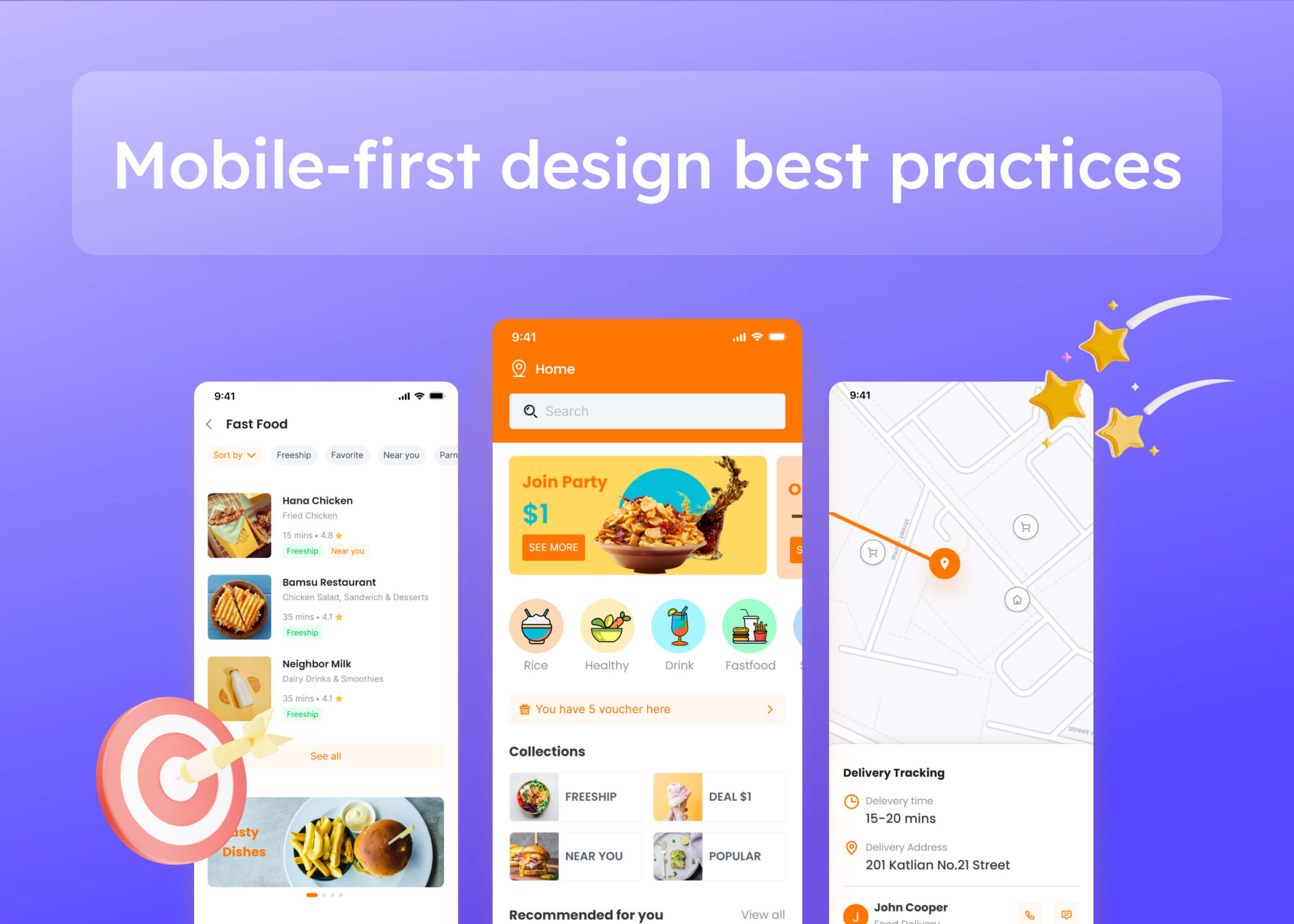
You might be wondering, what is a mobile-first design? In simple terms, it’s a design strategy that starts by creating for mobile devices first and then scaling up for larger screens like tablets and desktop computers.
Focusing on mobile web design from the outset ensures that essential content and functionalities are accessible on small screens, providing a seamless experience for mobile users. This approach contrasts with designing the desktop version first and then trying to adapt it for mobile.
Why is Mobile-First Design Important?
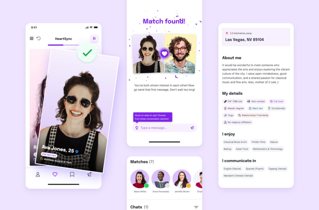
Why is mobile-first design so crucial nowadays? With the majority of internet users accessing websites via mobile devices, prioritizing mobile users means catering to their needs and preferences. A website that doesn’t perform well on mobile may drive users away, impacting engagement, conversion rates, and satisfaction.
Furthermore, search engines prioritize mobile-friendly sites in their search results, meaning that a mobile-friendly website can improve your SEO rankings. Mobile-first design is important because it puts the primary focus on the user’s experience, especially on the devices they use most.
Which Big Companies Use Mobile-First Design?
Many industry giants have embraced mobile-first responsive design. Companies like Google, Facebook, and Amazon prioritize mobile experiences to reach their vast user base effectively. These organizations understand that responsive web design and creating optimized mobile versions of their sites are essential for maintaining engagement in the modern market.
The commitment shown by these companies to mobile-first principles underscores the importance of this approach in today’s market.
Mobile-First Means Content-First
Designing for mobile means dealing with limited space on small screens or mobile screens. Prioritizing what’s most important on your web pages becomes essential. Mobile first means content-first, so identifying the key content and features your users need is the first step. Focusing on essential elements helps create a clean, user-friendly interface without unnecessary clutter.
What is a Mobile-First Design Framework?
Implementing mobile-first design efficiently often involves using frameworks that support this approach. So, what exactly is a mobile-first design framework? Frameworks like Bootstrap or Foundation provide responsive grid systems and components that make it easier to create layouts adapting to various screen sizes.
Starting with mobile styles and scaling up helps maintain consistency and responsiveness across devices. These frameworks streamline the design process by providing pre-built components that facilitate web designs that are responsive and adaptable.
How to Create Mobile-First Design?
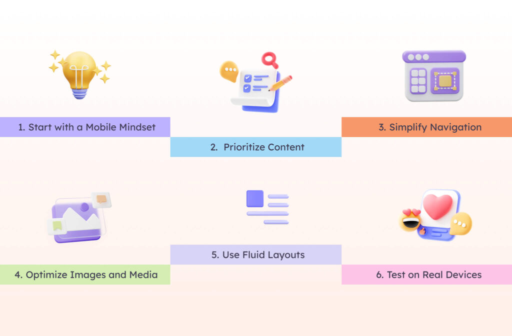
Ready to get started with responsive design for mobile apps and websites? Here are some best practices to consider:
1. Start with a Mobile Mindset
Begin the design process by considering mobile users’ needs on their mobile devices or mobile phones. Think about touch interactions, screen sizes, and mobile browsing behaviors.
2. Prioritize Content
Focus on the most critical content first. If a website is designed with responsive design concepts then scaling up for larger screens becomes more straightforward.
3. Simplify Navigation
Keep navigation menus simple and accessible. Hamburger menus or bottom navigation bars are common in mobile web page design, and these interactive elements help users navigate your site with ease.
4. Optimize Images and Media
Use appropriately sized images and compress them to reduce load times. Remember, mobile users may have limited bandwidth. This ensures your site is optimized for mobile devices, providing a better user experience.
5. Use Fluid Layouts
Design layouts using percentages or flexible units instead of fixed pixels to allow content to adjust smoothly on different devices. This is a core principle of responsive web design, allowing your content to adapt smoothly from small screens of mobile devices to larger desktop screens.
6. Test on Real Devices
Don’t rely solely on emulators. Testing your mobile site on actual devices reveals how it performs in real-world scenarios.
Design Device-Appropriate Layouts with Visily
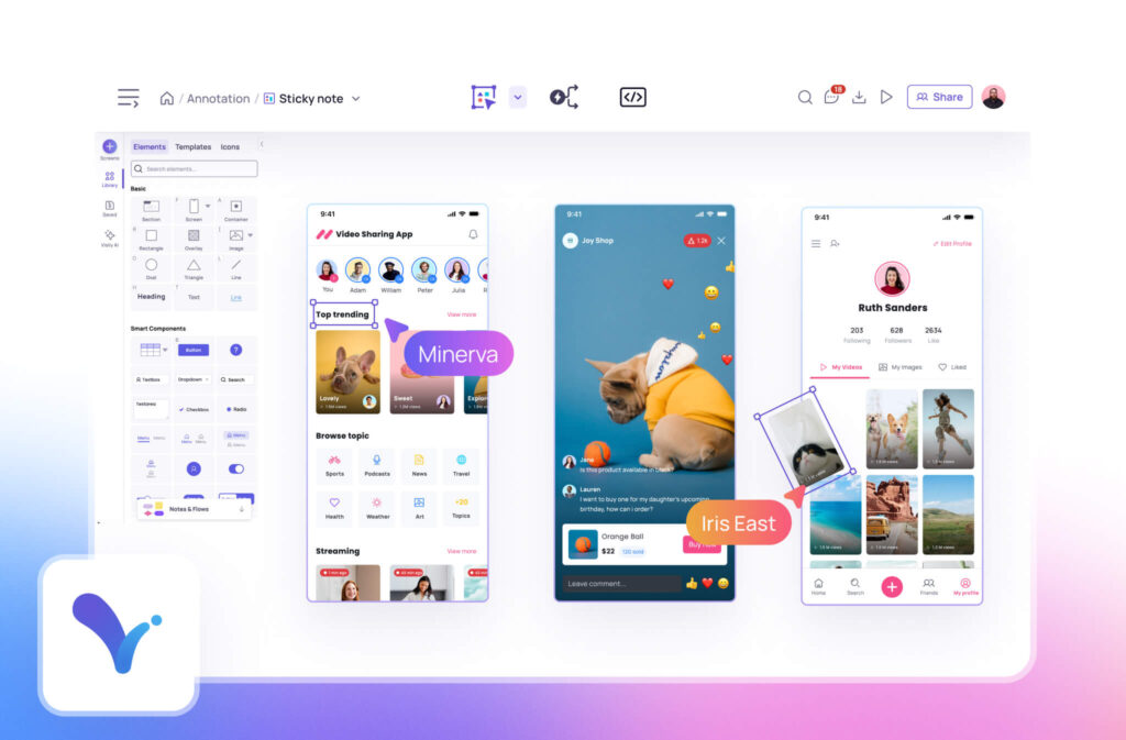
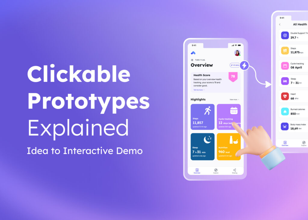
Need a helping hand? Tap into our extensive library of templates tailored for mobile design, complete with preset sizes that match your mobile app’s dimensions. These resources help you hit the ground running with layouts optimized for smaller screens.With Visily’s wireframe tool, quickly create and iterate on designs. Bringing ideas to life becomes easier with Visily’s prototyping features, allowing you to build interactive prototypes without coding.
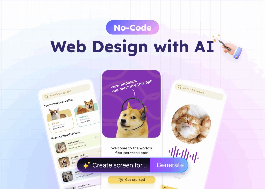
Plus, Visily’s AI design capabilities provide intelligent suggestions, enhancing your workflow. Visily’s tools streamline your design process, helping you create responsive web pages efficiently.
The Benefits and Challenges of Mobile-First Design
Benefits
- Improved User Experience: Focusing on mobile users creates a better experience for the majority.
- Faster Load Times: Mobile-first designs tend to be leaner, leading to quicker loading of pages.
- Better SEO Ranking: Search engines favor mobile-friendly designed sites, improving visibility and driving more web traffic from users on mobile devices.
Challenges
- Limited Space: Designing for small screens can be restrictive.
- Complex Scaling: Adapting designs for larger screens requires careful planning.
- Additional Testing: Ensuring compatibility across numerous devices can be time-consuming.
These challenges can be managed with thoughtful planning and the right tools.
What’s the Difference Between Desktop-First and Mobile-First Design Approach?
In a desktop-first approach, designers start with the desktop version intended for desktop users and scale down to mobile. This can lead to a cluttered mobile experience because elements suitable for desktops may not translate well to smaller screens.
In contrast, mobile-first design starts small and scales up, ensuring that essential features work perfectly on mobile and then enhancing them for larger screens.
When Did Mobile-First Design Start?
The concept of mobile-first design started gaining prominence around 2010, as smartphone usage surged. With more people accessing the internet on their mobile devices, designers recognized the need to prioritize mobile experiences to capture this significant share of web traffic. Since then, it has become a standard practice in the industry.
If a Website Is Designed with Responsive Design Concepts then,
The site’s pages will adjust to fit screen resolutions, especially for mobile devices, ensuring smooth navigation across all platforms. That is the essence of mobile-first responsive design—creating websites that are flexible and user-friendly, no matter how they’re accessed.
The Best Mobile Website Design Practices
Creating the best mobile website design involves more than just shrinking a desktop layout. Consider these tips:
- Focus on Essential Content: Keep it concise and relevant.
- Optimize Typography: Ensure text is readable without zooming.
- Use High-Quality Images Sparingly: Balance visual appeal with performance.
- Incorporate Clear Calls to Action: Make it obvious what you want users to do next. Well-designed interactive elements can boost engagement and conversion rates.
- Ensure Accessibility: Design with all users in mind, including those with disabilities.
Conclusion
Embracing mobile-first responsive design isn’t just a trend—it’s a smart strategy in our mobile-centric world. Focusing on mobile users first creates a more inclusive, accessible, and effective web presence. With the right approach and tools, your mobile site can make a significant impact. The design process might start with a small screen, but the results can reach far and wide.
Looking to streamline your design process? Collaborate seamlessly with your team using Visily’s collaboration tools and get inspired by Visily’s UI templates.
Happy designing!
Mobile First Design: Comprehensive Strategy for Modern Web Development
1. What are the disadvantages of mobile-first design?
While beneficial, mobile-first design can be challenging due to limited screen space, which may restrict design elements. Scaling up to larger screens requires additional effort to ensure designs remain effective.
2. What are the benefits of mobile-first?
Benefits include improved user experience for mobile users, faster load times, better SEO rankings, and a streamlined design process that focuses on essential content.
3. What is a mobile-first design called?
It’s often referred to as “progressive enhancement,” focusing on building a solid foundation for mobile and then enhancing the design for larger devices.
4. When did mobile-first design start?
Mobile-first design started gaining traction around 2010, aligning with the rise in smartphone usage.
5. What is the desktop-first and mobile-first design approach?
Desktop-first design starts with designing for large screens and scales down, potentially causing issues on mobile. Mobile-first design starts with mobile, ensuring core functionality and content are optimized for small screens before scaling up.


