Our Visily AI will assist you throughout the design process by generating and refining designs. It supports creating the following types of outputs:
- UI Screens. Generate mobile apps, web apps, or websites. You can create either a single screen or an entire app flow.
- UI Components. Generate common components such as tables, charts, headers, and menus.
- Images. Create photos or illustrations to support your designs.
- Diagrams. Generate various diagrams, including sitemaps, organization charts, flowcharts, state diagrams, use case diagrams, class diagrams, and entity-relationship diagrams (ERDs).

Access Visily AI assistant
You can access the Visily AI Assistant using the following methods:
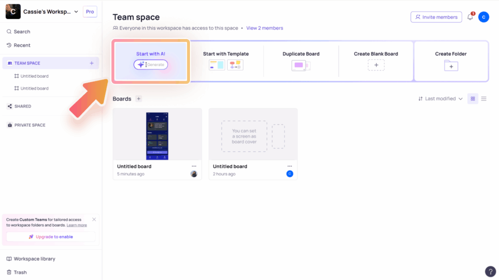
- From your workspace, select the “Start with AI” option.
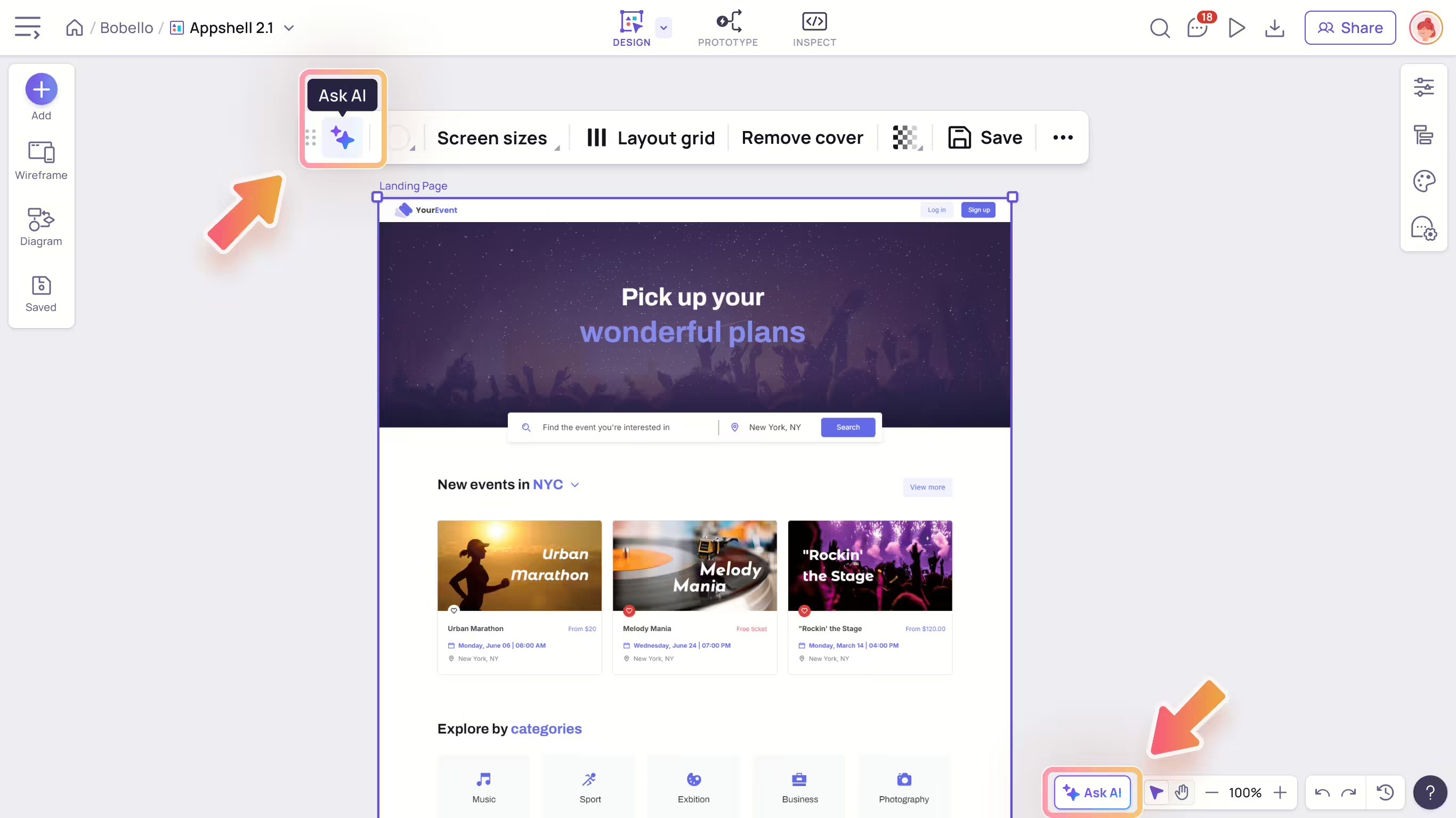
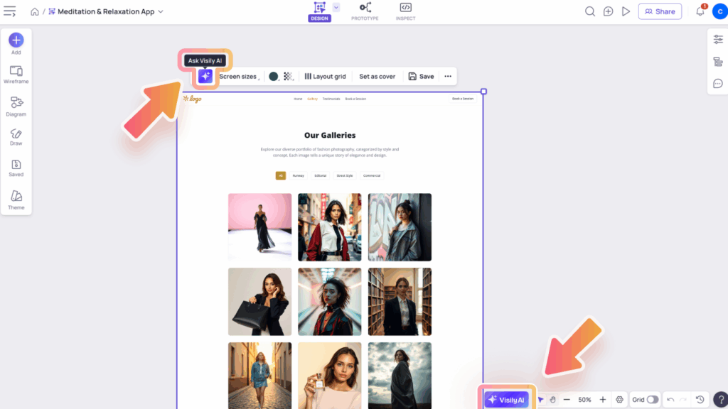
- From inside your board, either click the “Visily AI” button at the bottom of the board or the “Ask Visily AI” icon in the toolbar of containers, screens, or sections.
How to use Visily AI Assistant
Create your design with Visily AI
To create your design with Visily AI, you can start with any of the following methods:
- Using prompt: Enter your prompt in the AI chat box (up to 4000 characters). You can also browse sample prompts by pressing “/”.
- Using prompt with uploaded images for visual guidance: Upload up to 4 images (JPG, PNG, or WebP formats, each under 5MB after compression) to help guide the AI in generating your design visuals. Simply drag and drop images into the chat box or click the “Upload images” icon.
- Using prompt with existing design in board or previous generated outputs as visual references: Select an element on the canvas using the “Select anything on canvas” icon, or reference a previous output using the “Modify / Reference” icon in it. Then, enter your prompt to ask the AI assistant to generate results based on that visual input.

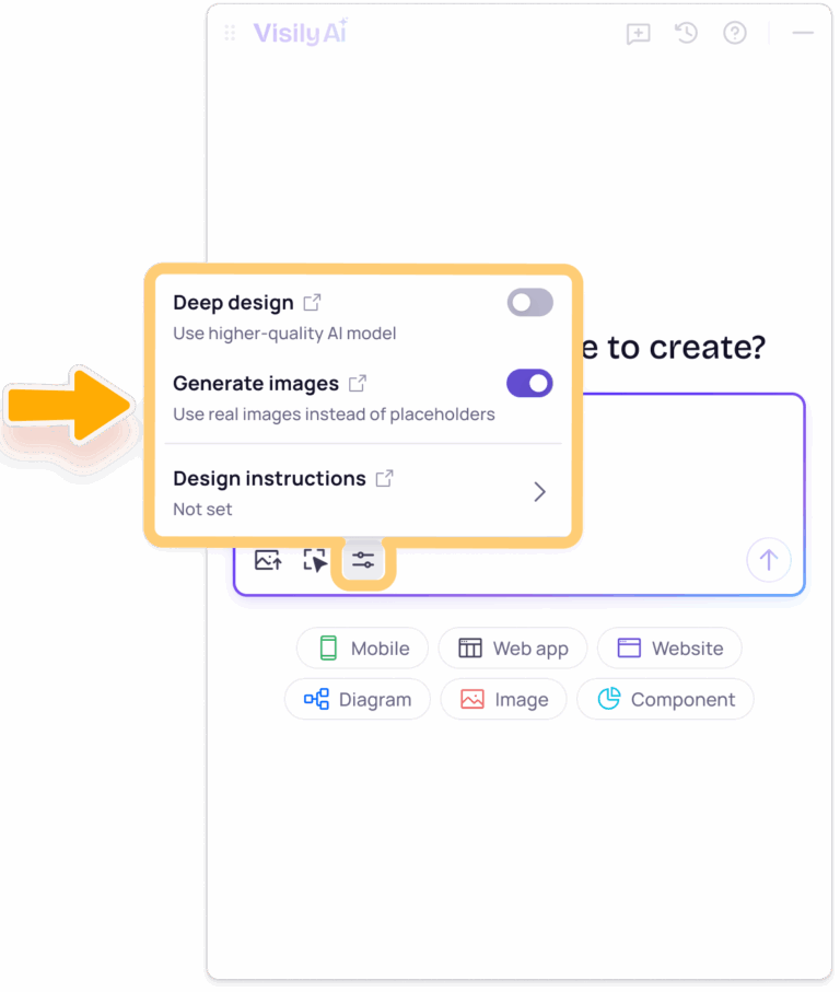
To enhance design output, the Visily AI Assistant offers additional settings: Deep Design and Generate Images. You can turn these settings on or off from the More menu in the Visily AI chat.
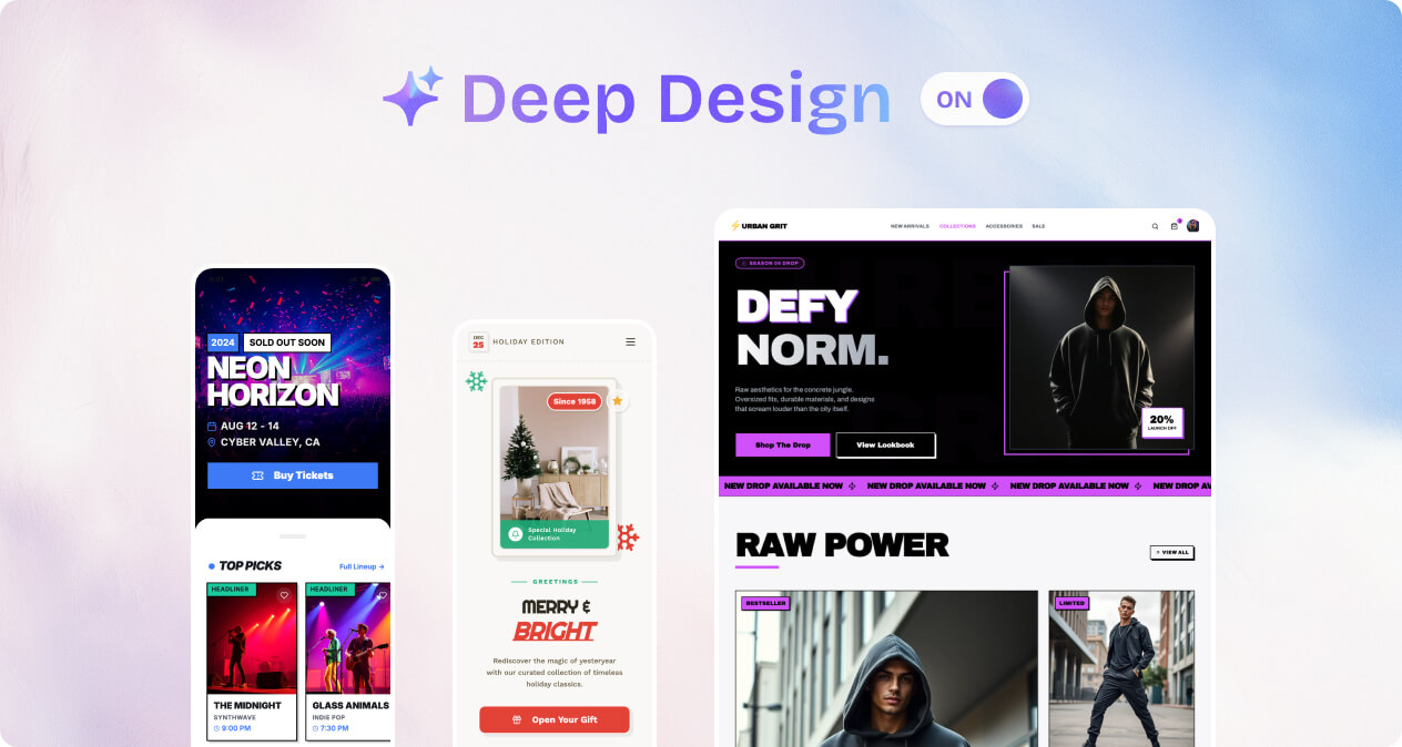
Deep Design Mode
Deep Design allows you to create more refined and sophisticated designs, powered by Gemini 3 Pro. This setting is turned off by default. When it is off, the AI uses the standard mode, which offers faster generation and lower cost. Deep Design is a paid feature and is only available on Pro, Business, and Enterprise plans. Enable it when you need higher visual quality and more detailed design results.
Generate Images Mode
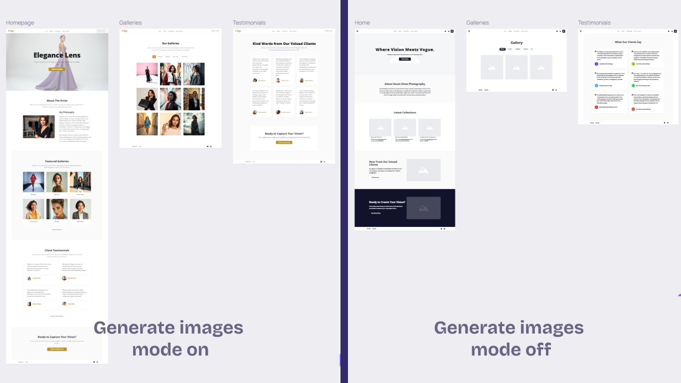
Generate Images controls whether the AI uses real images or placeholders in your generated designs. This setting is turned on by default, so designs are created with images included. You can turn it off if you prefer to work with placeholders instead.
Work with the generated output
Once generation is complete, the output will appear in your AI chat thread, which you can revisit anytime. From there, you can continue working with your design using the following actions:
- Preview output: Click directly on the output to open a larger preview window.
- Switch to Hi-fi mode: If the output lacks colors, you might be in Lo-fi mode. In that case, you’ll see a “Switch to Hi-fi” button in your output. Click it to switch modes and view a more detailed and polished UI.
- In Hi-fi mode:
- Change styles: By default, the AI Assistant generates styles that complement your board theme. Click the “Edit Style” button on the output, or click directly on the output to open the “Edit Style” menu at the top-center of the preview window. From there, you can apply these styles to one or multiple screens.
- Save AI-generated style as board theme: You can save any of the generated styles as your board theme. When you do, all designs and AI-generated outputs currently using the board theme will update to the selected style.
- Add to canvas: Once you’ve finished previewing or applying styles, select the “Add to board” button to place the generated output onto your canvas.
Modify your design
Visily AI can also help you modify your existing designs:
- Refine generated output: Hover over the desired output in the AI chat and click the “Modify / Reference” icon. Then, enter your modification prompt to have the AI continue updating the design.
- Modify designs on the canvas: Click the “Select anything on canvas” icon in the chat box, then select an element on the canvas (e.g., screen, container, image, table) and provide your prompt for modification.

Other actions with Visily AI chat
- Create a new chat thread: Click the “New Chat” icon at the top of the chat box to start a new conversation.
- View and manage chat history: Click the “Chat History” button at the top of the chat box to see a list of all your chat threads. Select a thread to view it. To rename or delete a thread, click the “More” icon next to it.
- Move or resize the AI chat: Click the “Move” icon at the top of the chat box to reposition or resize it. The chat box will remember its position and size the next time you open it.
Design Instructions - an effective way to keep your design consistently
Every project has its own goals, constraints, and preferences. Use the Design Instructions to capture those. Everything you add here is remembered and applied across all generations more aligned.

Access design instructions
To set up your design instructions, open the “More” menu in the Visily AI chat box.
- You can create multiple instruction sets, but only one can be active at a time.
- These instructions are shared with everyone on the board, which helps your team stay consistent across all designs.
Setup your Design instruction
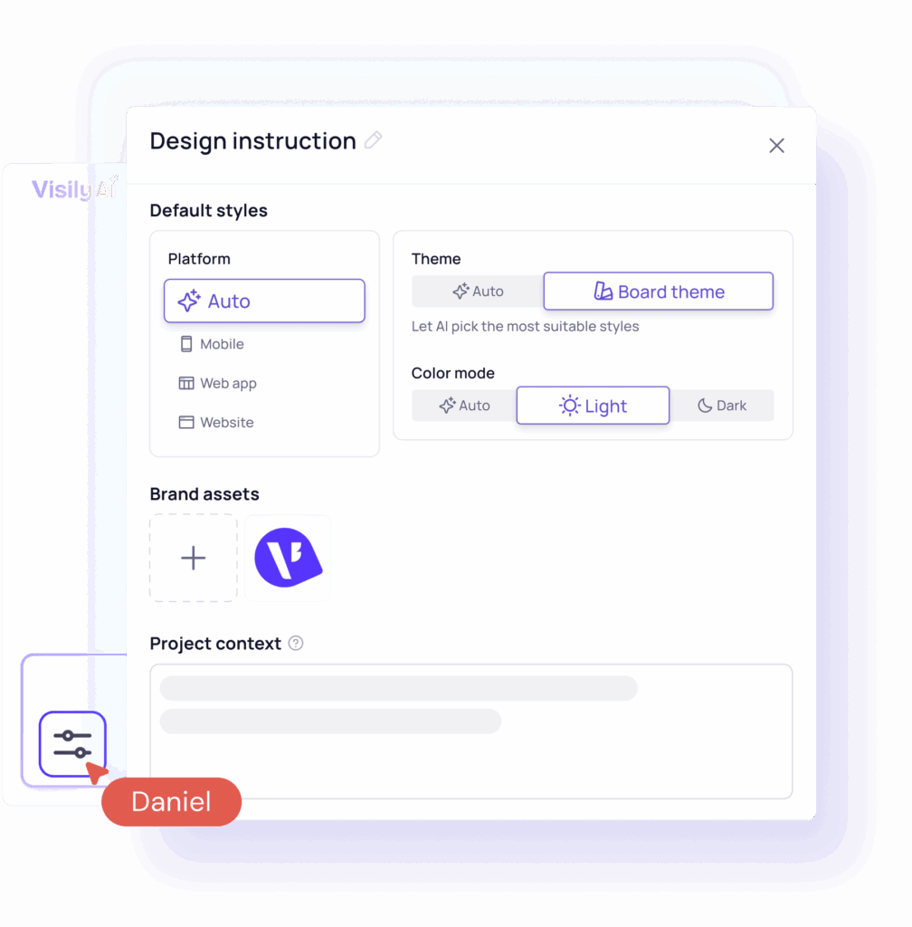
Default style
Use the Default style section to control how designs are generated.
- Platform: Choose Mobile, Web App, Website, or Auto. Select Auto to let the AI determine the most suitable platform based on your prompt.
- Theme:
- Auto: Lets the AI choose the most appropriate style. This is useful when exploring new styles or when your prompt already describes a style.
- Board theme: Uses the board’s existing theme, making it easy to generate designs that match your brand.
- Color mode:
- Choose Light or Dark if you already know the intended color mode and want to keep it consistent across generations.
- Choose Auto to let the AI decide based on your prompt.
Brand assets
- Upload your logos so the AI can use them in your generated designs.
- We recommend logos with a transparent background so they look great on any background color.
- You can upload up to 5 logos (PNG, JPG, WebP, SVG format, max 5MB each).
- If you upload multiple logos, please tell the AI how to use them correctly.
Example: “This logo has white text for dark mode,” or “This is the icon only, without the company name.”
Project context
What to include as your project context:
- App Basics: What it is
- Product name & platform: The name of the product and the platform you are building.
- Product overview: The product’s purpose and its main features.
- Brand identity: The app’s core value (e.g., trust, speed) and its overall personality (e.g., fun, serious).
- Design & Experience: The look and feel
- Logo usage: A description of your logo and key rules for how to use it.
- Color system: All main colors, including their exact codes (HEX/RGB), and what they are used for.
- Typography & Text usage: Describe the font name or font’s style (e.g., modern, academic) and how text sizes compare.
- Imagery and Illustration: The required style for photos, images, and any drawn illustrations.
- UI components & Visual style: Rules for buttons, icons, and interface elements (e.g., rounded or sharp corners).
- Layout & Spacing: Which screen element is most important, and how content should be laid out.
- Accessibility & Inclusivity (WCAG Contrast): Mandatory rules to ensure the app is readable and usable by everyone.
- Brand consistency — Do’s and Don’ts: Rules on how the brand must be used, and what to avoid.
This is an example of an effective project context:
1. App Basics
YouTube is the global video sharing platform, available across Web and mobile devices
Users engage with YouTube for:
– Video discovery and playback.
– Content upload and channel management.
– Interaction via comments and subscriptions.
Brand Identity: The core value is Empowerment, Connection, and Discovery. The personality is Energetic, Immediate, and Essential. All design adheres to the principles of Content Dominance, Low Friction, and Scalability.
2. Design & Experience: The Look and Feel
Logo Usage: The YouTube Logo is the main asset.
– DO use the official logo file and maintain the required clear space.
– DON’T modify, stretch, or alter the logo’s colors or proportions.
Color System: The palette is minimal, high-contrast, and action-focused.
– YouTube Red: #FF0000 — Primary accent for the Play icon and Subscribe button.
– Almost Black: #212121 — Primary base for text (Light Mode) and backgrounds (Dark Mode).
– White: #FFFFFF — Secondary base for backgrounds (Light Mode) and text (Dark Mode).
– Medium Gray: #AAAAAA — Used for secondary text and metadata.
– Highlight Gray: #F0F0F0 — Used for subtle background differentiation.
Typography & Text Usage:
– Font Family: Roboto (Sans-serif) is used exclusively across all platforms.
– Hierarchy: Titles use Bold weight; body text uses Regular.
– Tone: Language is direct, energetic, and supportive; secondary information uses a smaller size and lighter color.
Imagery and Illustration:
– Thumbnails (Imagery): Must be high-resolution, expressive, and high-contrast to maximize clicks.
– Icons (Illustration): Geometric, clean, and minimalist (Material style). The Play icon is the core functional symbol.
UI Components & Visual Style:
– Clean, functional design following Material principles.
– Cards & Shapes: Use subtle rounded corners (4-8px radius).
Layout & Spacing: Adaptive design using a responsive grid.
– Priority: The Video Player or Thumbnail Card is always the focal point of the screen.
– Spacing: Apply an 8dp grid for all margins and padding (Grid Consistency).
Accessibility & Inclusivity (WCAG Contrast):
– All text must meet WCAG 2.1 AA standards with a minimum contrast ratio of 4.5:1 against the background color.
Brand Consistency — Do’s and Don’ts: Rules for third-party use and naming.
– DO link back to YouTube content when referencing the brand externally.
– DON’T use any variant of “YouTube” (e.g., “YT”) in the name of a third-party product.
TIPS
- To keep the style of the generated design consistent, make the “Design & Experience” section very detailed. You can even paste in your design system here.
- Use clear lists in your instructions (like using a dash – for bullet points).
- Update these instructions as your project changes to make sure they’re always accurate.
- Tweak and iterate your context to refine results. Even a few lines can make a meaningful difference.


