Overview of UI Library
Visily’s Library contains thousands of UI elements and templates, plus over 55,000 icons that can be easily added to your designs.
All elements and templates use the color palette and fonts specified in your Project Theme, making them a seamless part of your design system. This helps you achieve beautiful and consistent designs with minimal effort.
Access the Library
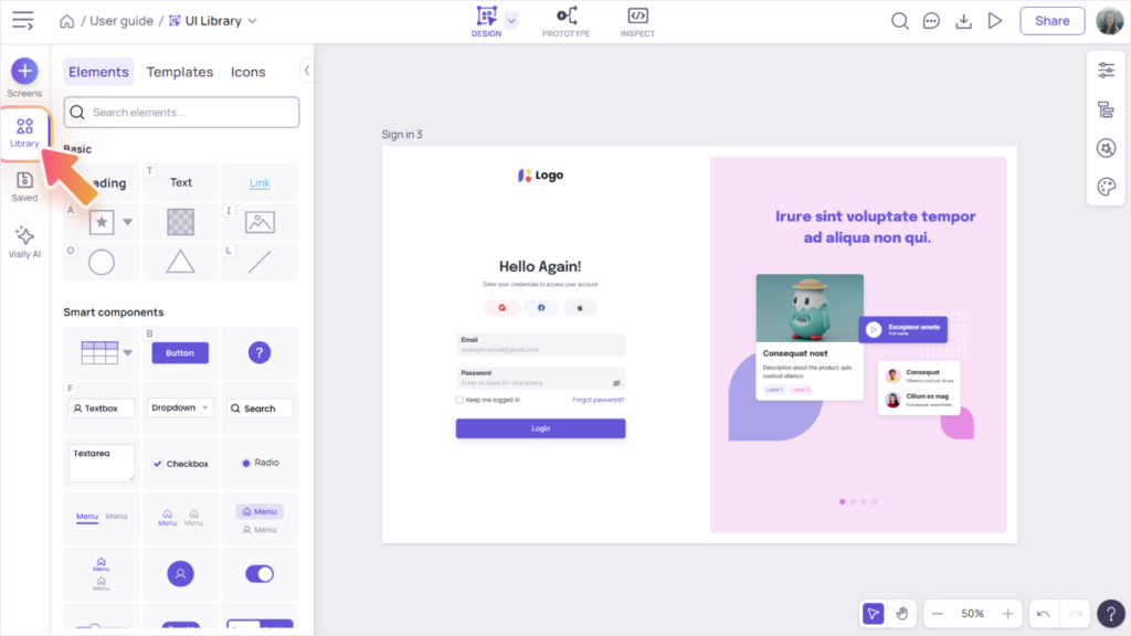
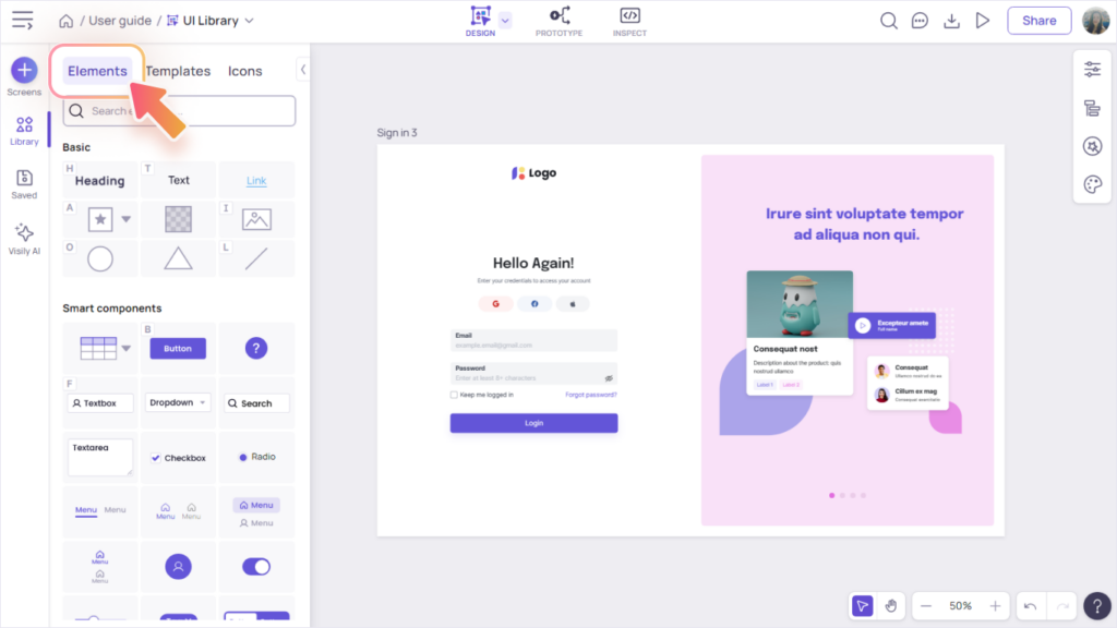
To enter the Library, simply click on the Library icon in the left sidebar menu. Once you’re inside, you can easily switch between the Elements, Templates, or Icons tabs to quickly find the perfect items for your designs.

The Elements Tab
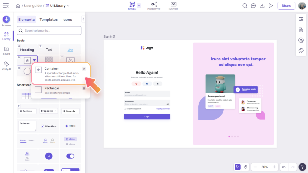
The “Elements” tab in Visily’s Library contains both basic elements and smart components, which are essential building blocks for any design or template.
- Basic elements: These are primitive elements like texts, shapes and images.
- Smart components: These components come with many presets, styles and behaviors specific for their use case. In addition, their layout automatically adjust as you edit or resize their contents. Examples of smart components:
- Button, Textbox, Textarea, Dropdown
- Checkbox, Radio, Switch, Rating, Avatar, Tag
- Various Chart and Menu components

The Templates Tab
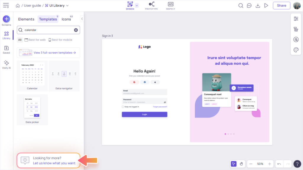
Explore hundreds of beautiful component templates across various categories, such as Forms, Cards, Navigation, Alerts & Messages, Tables & Listings, and more.
If you’re only interested in web or mobile templates, use the filter “Best for web” or “Best for mobile”.
To access full-screen templates, click the “View full-screen templates” button near the top of the Templates tab (under the filter section).

The Icons Tab
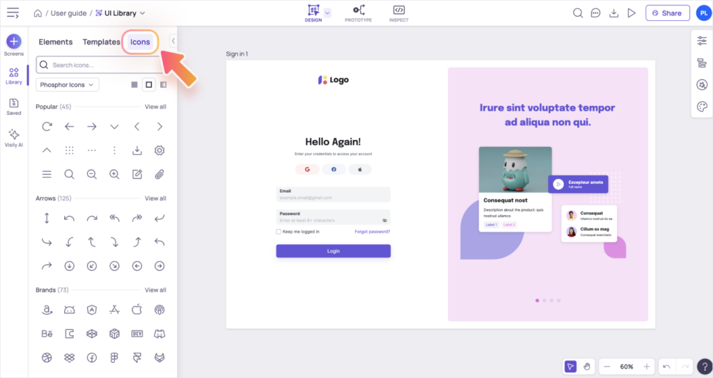
Visily makes finding the perfect icon a breeze! With over 55,000 icons to choose from and powerful search capabilities, you’ll find what you need in no time. Access these icons through the Library (Icons Tab) or the toolbar of smart components such as buttons and menus.
Icon Library
The Icon Library includes tools to help you quickly browse and find icons. You can filter by categories, styles, or search icons by keyword.
Icon’s or smart component’s toolbar
Once you add an icon to the canvas, you can replace/edit it at any time through its toolbar.
Some smart components, such as Button, Textbox, Dropdown, Tag, and Menu have built-in icon support. Click the “Icon” menu item in the smart component’s toolbar to access the icon popup.


