Single Sign-On (SSO) allows users to log into multiple applications or websites using a single identity provider (IDP). The Security Assertion Markup Language (SAML) is a widely-used standard for managing authentication and access.
Team owners and admins on the Business plan can enable and configure SSO for their team in the “Team Settings” page under the “SAML SSO” tab.
Set up SSO
Access SSO Settings
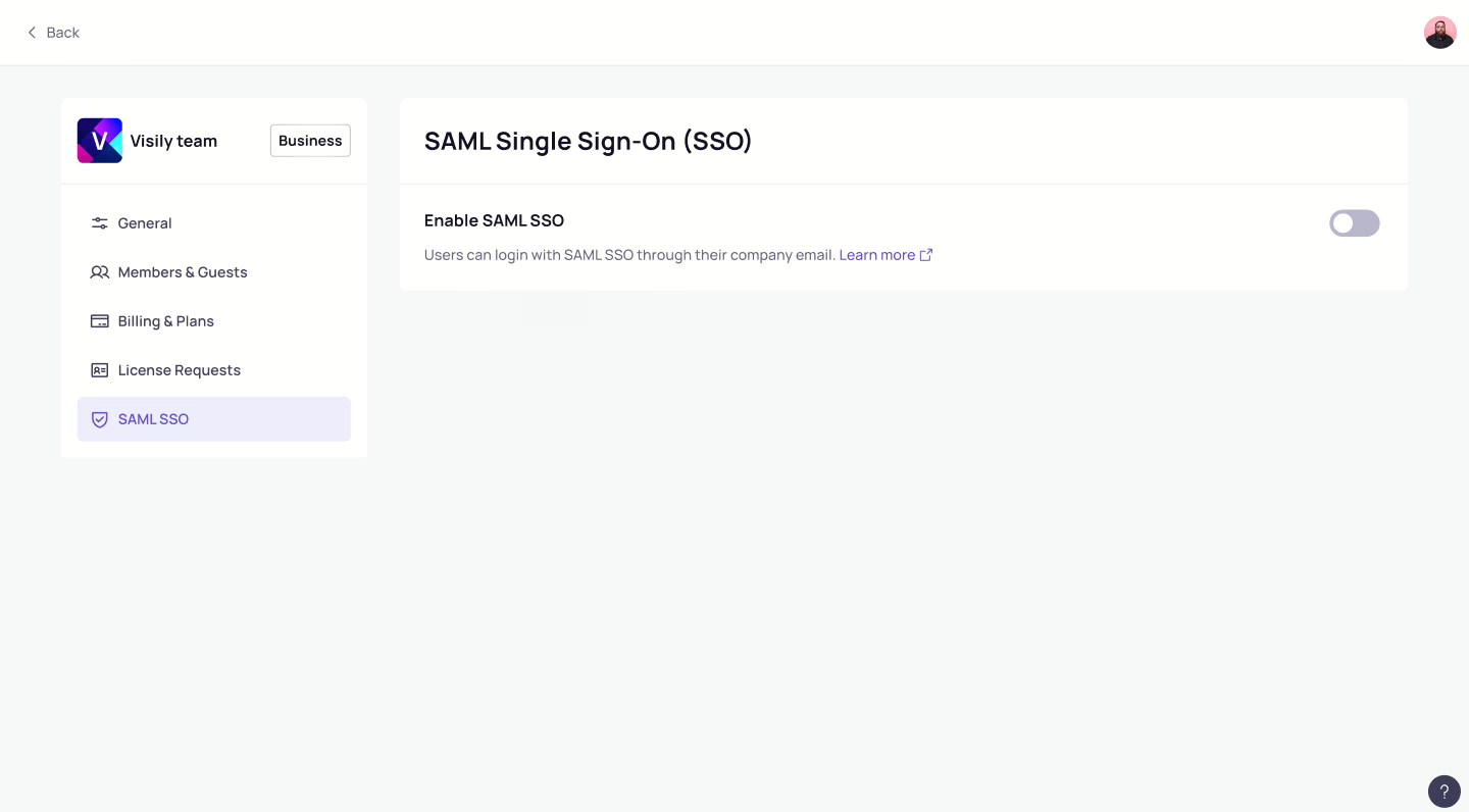
To enable and configure SSO, team owners and admins on the Business plan should go to the Team Settings page. In the “SAML SSO” tab, simply toggle the option to Enable SAML SSO. This will open a dialog where you can complete the SSO configuration.
Configure SAML SSO
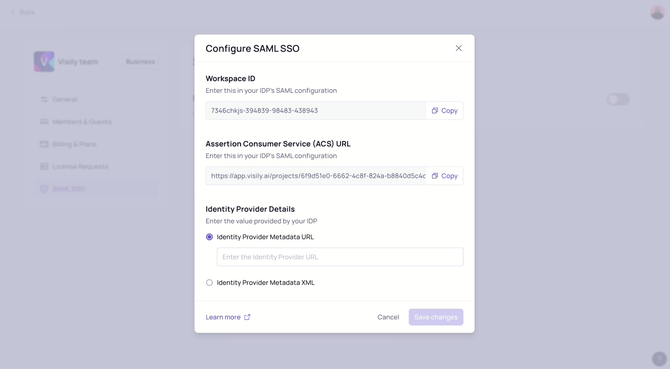
In the SSO configuration dialog, you’ll need to set up a connection between Visily and your identity provider (IDP). Here’s what you need to do:
- Enter the required information from Visily into your IDP configuration:
- Workspace ID
- Assertion Consumer Service (ACS) URL
- Enter your IDP’s metadata into the configuration. You can do this in one of two ways, depending on your IDP and preference:
- Metadata URL
- Metadata XML
Visily supports integrations with the following identity providers (IDPs):
- Microsoft Entra ID
- Okta
- OneLogin
- Google SSO
Verify your domain for SSO authentication
To use a specific domain for SAML SSO, enter an email address with that domain and click Send verification. The domain will appear as pending until verification is complete. During this time, SSO authentication will not be available.
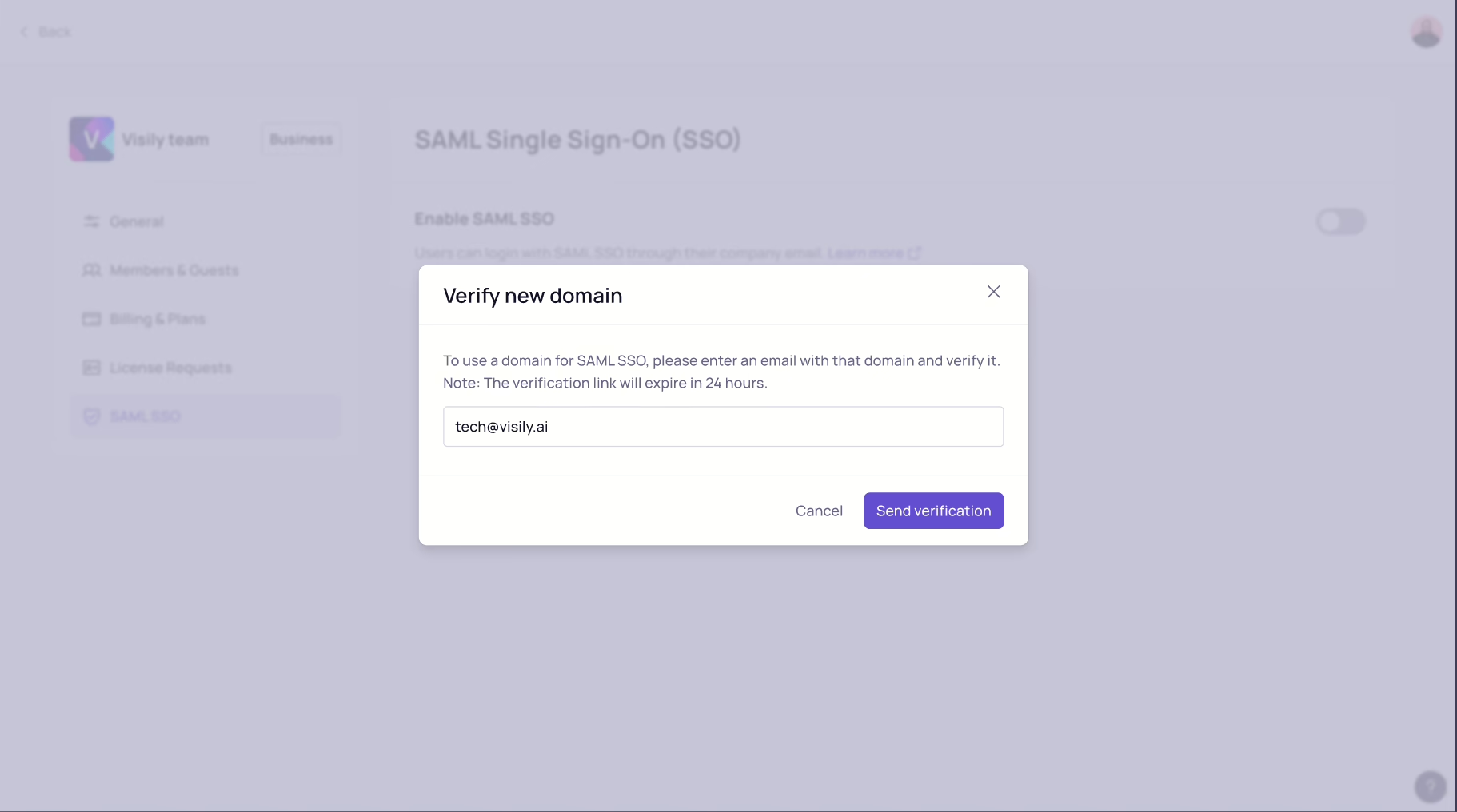
You’ll receive a verification email. Once you verify the email, you’ll be redirected back to the SSO settings page, and the domain will show as verified. After that, SSO setup will be complete and ready for use.
Edit SSO Settings
In the SAML SSO tab, you can manage the following settings:
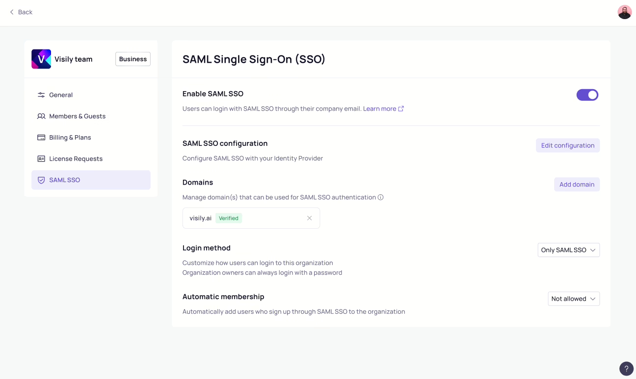
Enable or Disable SAML SSO
You can enable or disable SAML SSO by toggling the option on or off.
SAML SSO Configuration
Manage the domains that can be used for SAML SSO authentication.
Click Edit configuration to review or update your connection between Visily and your identity provider (IDP). You can update the following:
- Visily’s Workspace ID
- Visily’s Assertion Consumer Service (ACS) URL
- Your IDP’s metadata (choose between Metadata URL or Metadata XML)
Domains
To manage the domains allowed for SAML SSO authentication, click Add domain. You can review, add, or remove domains as needed.
Login Method
Choose how users can log in to your organization:
- Only SAML SSO: Users must log in using their SSO credentials.
- Any method: Users can log in using any available method, including SSO.
Automatic Membership
Automatically assign new users who sign up through SAML SSO to your organization:
- Not allowed: New users cannot join the team.
- Allowed as a team viewer: New users will join as viewers.
- Allowed as a team editor: New users will join as editors.


