


Layout grids help aligning elements on a screen, providing a visual structure to your designs. Take advantage of Visily’s Layout grid to ensure your designs stay consistent across different devices.
Applying Layout grids
Access Layout grids
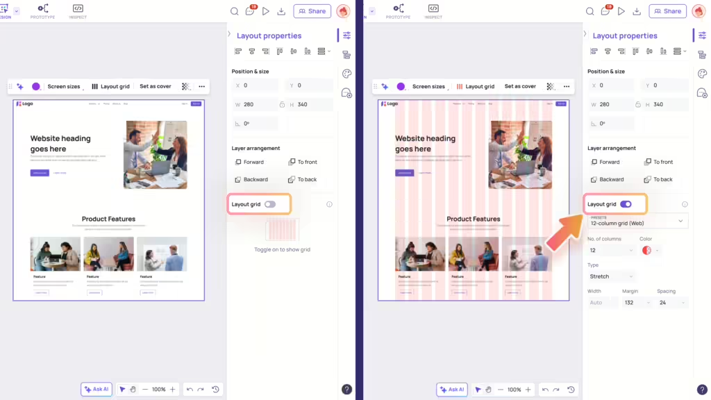
You can apply Layout Grids to one screen or multiple screens you’re working on. To access this feature, you have two options:
- Use the “Layout grid” toggle on the Layout Properties panel.
- Or click on “Layout grid” in the context toolbar of your screen(s) and the Layout Properties panel will automatically expand to show the Layout grid toggle.
Hide/Show Layout grids
In the Layout Properties panel, you can easily control whether the layout grid is visible or hidden by clicking the “Layout grid” toggle:
- Toggle on: Display the layout grid.
- Toggle off: Hide the layout grid.
Editing Layout grids
Selecting a Grid preset
You can quickly choose from common presets for web and mobile screens, such as:
- For web: 12-column grid, 12-column full-width grid, 15-column grid
- For mobile: 3-column grid, 4-column grid, 5-column grid.
Once you select a preset, you can further tailor it according to your needs.
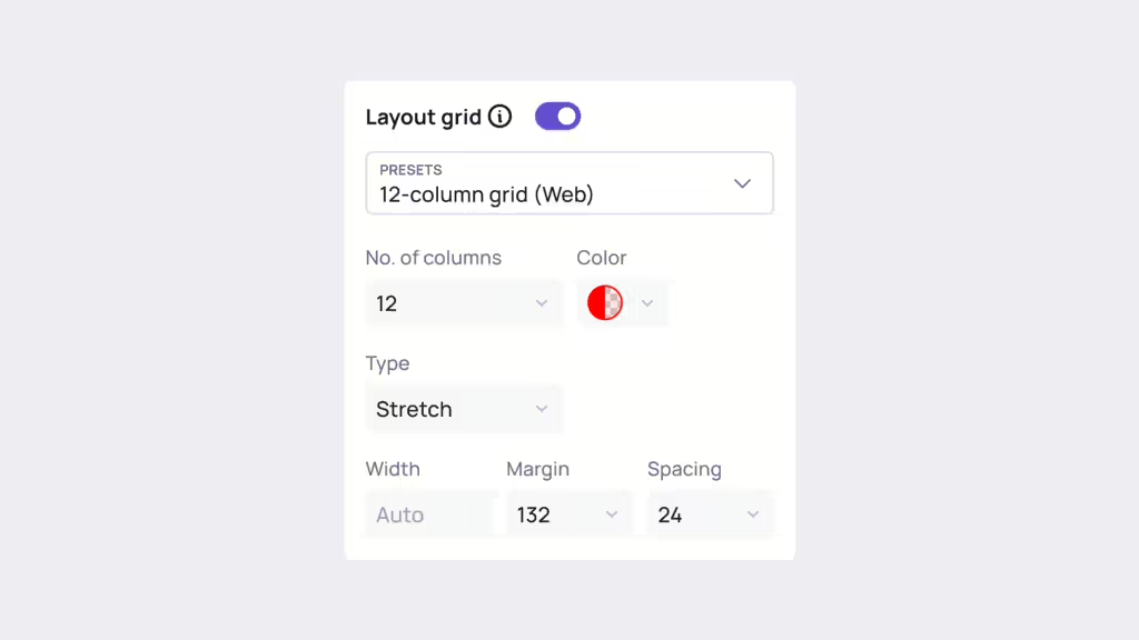
Customizing Grid settings
Beyond using presets, you also have the option to define the following properties of your grid:
- Number of columns: Determine how many columns there are in the grid.
- Color: The default color of a layout grid is red, with an opacity of 10%. You can change both the color and opacity by selecting the Color option.
- Type: Choose how the grid columns displayed in screens, with options such as: Stretch, Left, Right, Center.
- Width: Set the width of the columns. For grids with the Stretch type, the width adjusts automatically.
- Margin: Specify the distance from the edge where each column begins.
- Spacing: Control the spacing between each column.
Design with Layout grids
When you enable the Layout grid, the Layout grid remains visible over the design elements of your selected screen.
As you move and resize these elements, they will automatically snap to the edges of the grid columns, helping you maintain precision and alignment.
 , check us out


