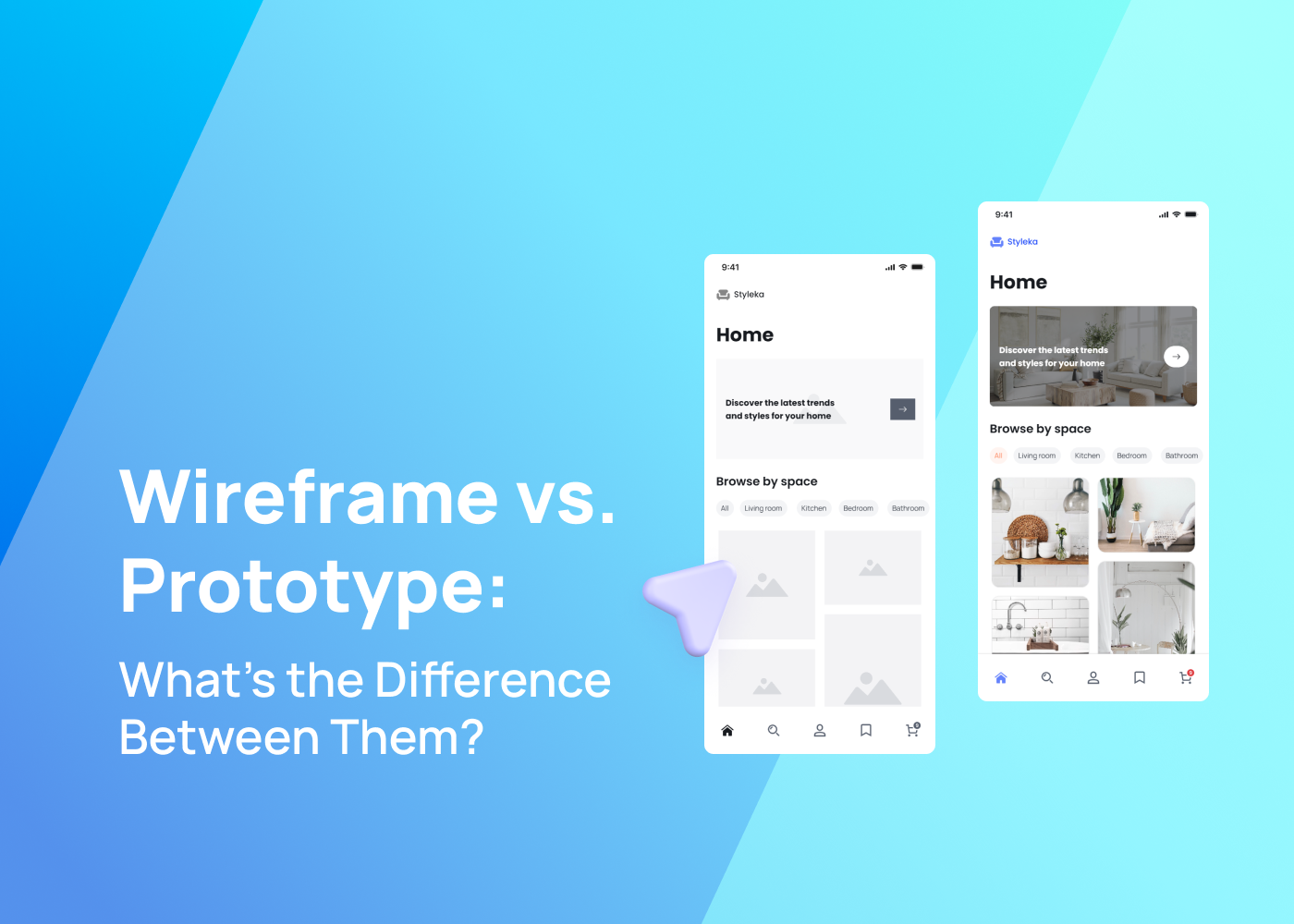
Navigating the world of digital design comes with its own language. Terms like “wireframe” and “prototype” often pop up, especially in UI and UX design. For many, the difference between wireframe and prototype can be confusing. Both wireframes and prototypes play pivotal roles in the design process of any digital product. Think of them as the stages of building a house. While wireframes serve as the blueprint, giving a general idea of the structure, prototypes are like the show house, providing a closer look at the final product.
This blog highlights the main differences and how each contributes to crafting a seamless user interface and interaction.
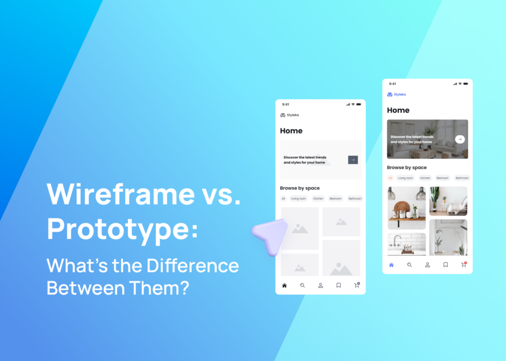
Whether you’re a budding designer, a product manager, or just someone curious about the intricacies of digital products, we’re diving deep into the world of wireframes and prototypes.
Difference between wireframe and prototype
| Feature | Wireframe | Prototype |
|---|---|---|
| Nature and Purpose | Visual representation of a webpage/app’s structure, focusing on core functionality without design elements. | Emphasizes user interaction and provides a closer look at how the finished product will behave. |
| Level of Detail | Low fidelity, a basic layout with minimal visual details. | Can range from low to high fidelity, often with more visual details and interactive elements. |
| User Testing | Used in early stages for feedback on basic structure and user flow. | Usability testing with users to get feedback on functionality and user interaction. |
| Tools Used | Digital whiteboard, paper wireframes, basic design tools. | Specialized prototyping tools that allow for creating interactive prototypes. |
| Visual Design | Lacks color schemes, actual content, and other visual design elements. | High-fidelity prototypes can include all design elements like color schemes and actual content. |
| Interactivity | Generally static with no user interaction. | Can be fully functional with user interactions, simulating the final product experience. |
| Development Phase | Used in the wireframe phase, showcasing abstract design ideas in the early stages. | Used in the prototyping phase, a middle ground between the wireframe and the final version. |
What is a Wireframe?
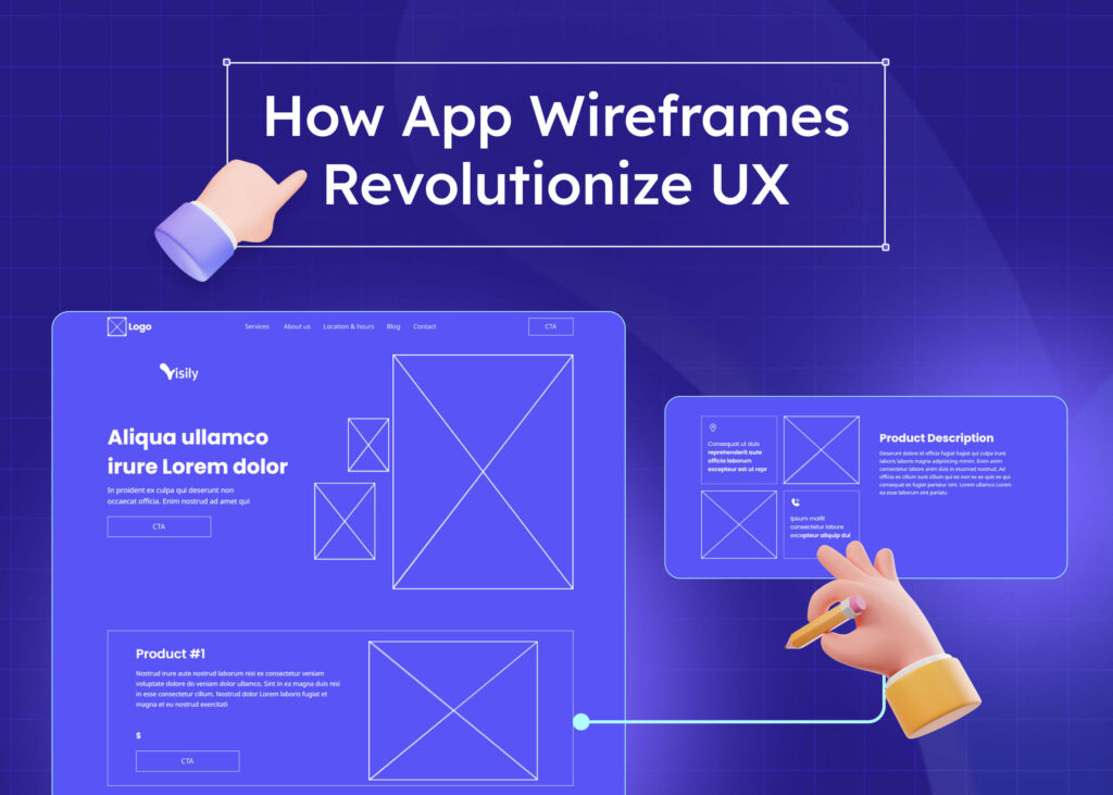
A wireframe is the starting point in the design process of any digital product, be it a website or an app. Think of it as a digital whiteboard sketch. It provides a basic visual representation of the layout and the core functionality. Unlike high-fidelity designs that are rich in details, wireframes are often low-fidelity.
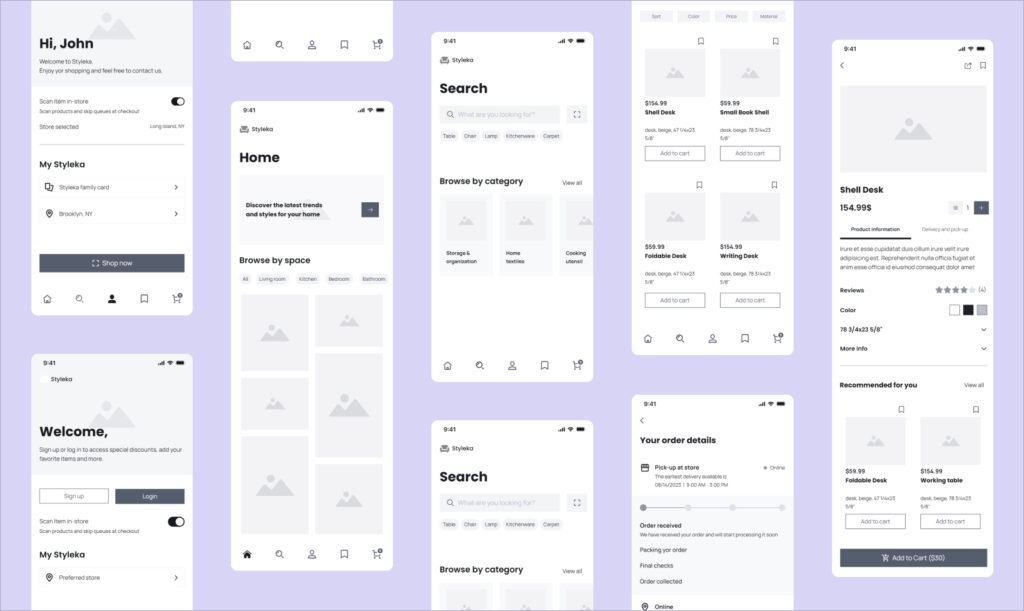
Wireframes serve a specific purpose: they help design teams put their abstract ideas on paper or, more often, on a screen. The main goal is to visualize the user flow and the general layout. Design elements, color schemes, and actual content usually take a back seat during this phase.
Creating wireframes is a bit like drawing the blueprint of a house. Before you think about paint colors or furniture, you’d want to know where the walls and windows will be. In the same way, wireframes help ensure everyone is on the same page regarding the layout and key elements before diving into visual design and user interactions.
In the world of UX and UI design, wireframes are essential. They set the stage for the final product, ensuring that product managers, designers, and stakeholders have a clear and unified vision before moving forward.
Types of Wireframes
Wireframes come in various shapes and forms. They fall into three categories: low, mid, and high-fidelity wireframes. Let’s dive deeper into each of these.
1. Low Fidelity Wireframes:
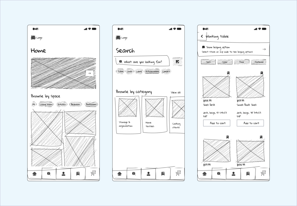
These are the simplest forms of wireframes. Often hand-drawn on paper or a digital whiteboard, they focus on basic structure and layout. Color schemes and detailed design elements aren’t present here. They’re quick to create, making them perfect for brainstorming sessions. In the early stages of design, when ideas are still being hashed out, low-fidelity wireframes are invaluable.
2. Mid Fidelity Wireframes:
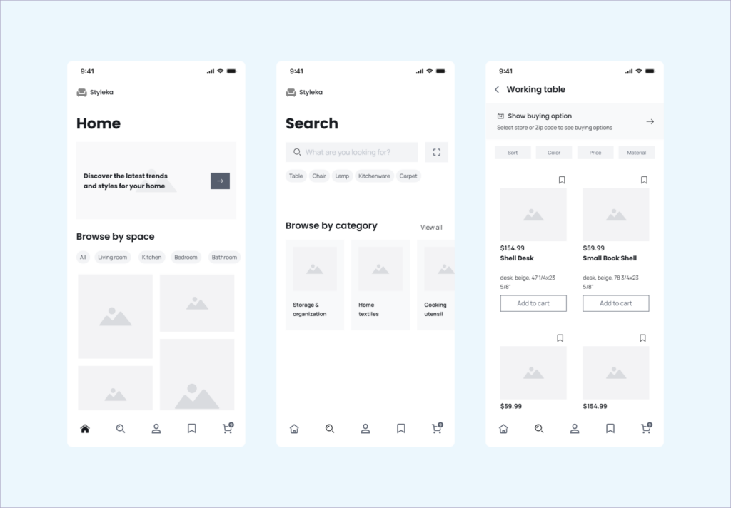
Taking a step further from the basics, mid-fidelity wireframes provide a more detailed visual representation. While they still lack actual content and high-end visual design, they offer a clearer picture of the user flow and key elements. They are the middle ground, bridging the gap between abstract ideas and a detailed draft.
3. High Fidelity Wireframes:
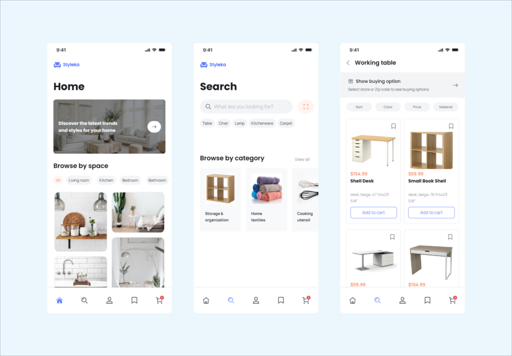
These are the most detailed of the trio. Incorporating more visual details, they give a close-to-final look at the digital product. While they may not be fully interactive like prototypes, high-fidelity wireframes include design elements, making them closer to the finished product’s look.
Benefits of wireframing
Regardless of fidelity, wireframing is an essential step in the design process. But why is it so vital? Here are some key benefits:
1. Clarity and Vision:
Wireframing offers a clear visual representation of the final product, ensuring everyone—from designers to product managers—is on the same page. It lays out the core functionality and design elements, acting as a roadmap for the project.
2. Cost and Time Saving:
By visualizing and finalizing the basic structure early on, teams can avoid major late-stage changes. This proactive approach saves both time and money in the development process.
3. Improved User Experience:
Creating wireframes allows designers to focus on the user flow and usability testing. It ensures the final product is user-friendly, enhancing user interaction and satisfaction.
4. Feedback and Collaboration:
Teams can gather user feedback in the initial stages with a tangible layout. It facilitates open discussions and collaborative efforts, refining the design ideas further.
5. Streamlined Development:
When the time comes for developers to step in, wireframes serve as a blueprint. They guide the layout and functionality, ensuring a smoother transition from design to the finished product.
In essence, wireframing is a foundational step. It’s the bridge between a mere idea and the tangible, well-crafted digital product we interact with daily.
When to Use a Wireframe?
Understanding when to incorporate wireframes into the design process is crucial. Here’s a breakdown of the ideal moments to use them:
1. Brainstorming Phase:
At the project’s inception, when ideas are flying around, wireframes serve as a digital whiteboard. They help transform abstract ideas into something more concrete, making them perfect for early brainstorming sessions.
2. Gathering Feedback:
Before diving into high-fidelity designs or the prototyping phase, it’s wise to use wireframes for initial feedback. This can be from team members, stakeholders, or even potential users. Getting insights early on can prevent costly revisions later.
3. Streamlining Communication:
Wireframes ensure everyone is on the same page when multiple teams are involved—like UI design, UX design, and development. They offer a unified vision, eliminating misunderstandings about the product’s layout and core functionality.
4. Testing Layouts:
If you’re uncertain about a layout or design element, wireframes are the way to go. They allow for quick changes and iterations, facilitating A/B testing and letting designers find the most effective user flow.
5. Planning Development:
For developers, wireframes act as a preliminary guide. They provide a clear picture of the design elements, helping outline the coding structure and functionality.
Wireframes are versatile tools. Whether you’re in the initial stages, gathering feedback, or prepping for the final product, they can enhance the overall design and development journey.
Limitations of wireframing
While wireframes are an invaluable tool in the design process, they come with certain limitations. Recognizing these can help teams use them more effectively.
1. Lack of Interactivity:
Wireframes, particularly low-fidelity ones, are generally static. They don’t showcase user interaction or the behavior of interactive elements. For this, the design teams often transition to prototypes.
2. Missing Visual Details:
By nature, wireframes focus on structure rather than visual design. Aspects like color schemes, fonts, and final graphics are usually absent, which might not give a complete picture of the finished product.
3. Potential Misunderstandings:
Because they lack detailed visual elements, wireframes can sometimes lead to misinterpretations. Stakeholders might find it hard to visualize the final product based solely on a wireframe.
4. Not Always User-Test Friendly:
Wireframes might not be the best for detailed user testing, given their simplicity. Users might struggle to provide feedback without more tangible, interactive elements.
While wireframes are essential for laying the groundwork, understanding their limitations helps determine when to progress to more detailed stages, like prototyping or high-fidelity designs.
What is a Prototype?
A prototype is a preliminary model or sample of a product or system that is created to test and validate its design and functionality. It is an iterative process that involves building, testing, and refining the prototype until it meets the desired outcome.
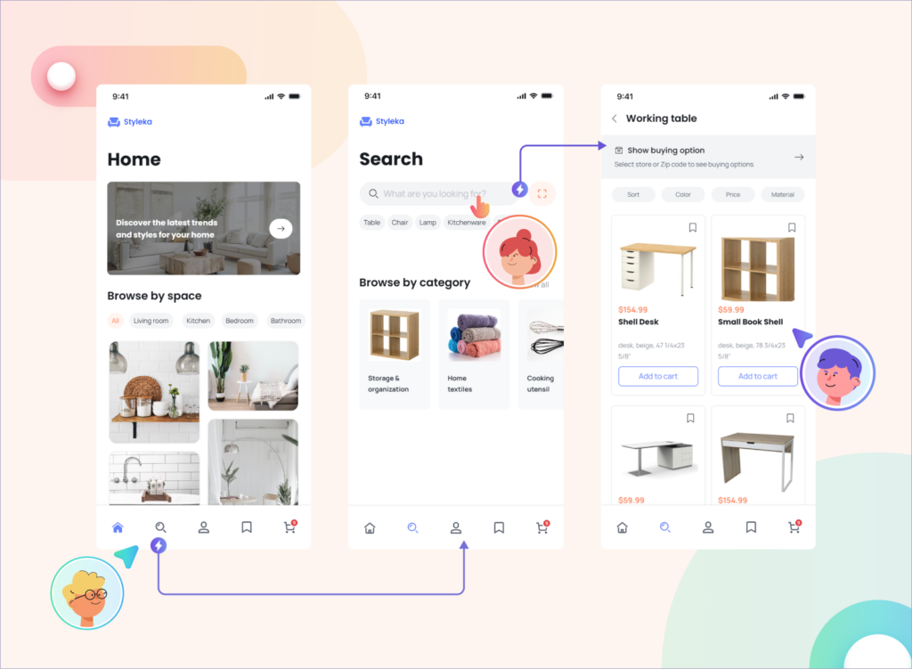
There are different types of prototypes, such as feasibility prototypes, low-fidelity user prototypes, high-fidelity prototypes, and live data prototypes. Each type of prototype has its own purpose and method of prototyping.
Feasibility prototypes are used to test the feasibility of a concept or idea. They are usually low fidelity and quick to build. They allow designers to test multiple ideas and concepts in a short amount of time. Low-fidelity user prototypes are used to test the usability and functionality of a product or system. They are usually paper-based or digital wireframes that simulate the user interface and interactions.
High-fidelity prototype is more advanced than low-fidelity prototypes and is used to test a product or system’s user experience and design. They are usually interactive and may include animations, transitions, and other advanced features.
Live data prototypes use real data to test the functionality and performance of a product or system. They are usually high fidelity and require more time and resources to build than other types of prototypes.
The main difference between a prototype and a final design is that a prototype is an early version of a product that is used for testing and validation purposes. In contrast, a final design is a finished product that is ready for production or release. Prototyping helps designers better understand the product concept, test its feasibility, secure buy-in, create alignment, save time and resources, and create value early in-product discovery.
Benefits of prototyping
Diving deeper into the design process, prototyping is a vital step. Why is it so impactful? Here’s a closer look at its benefits.
1. Real-time Interaction:
Prototypes focus on user interaction. Unlike static wireframes, they allow users to click, navigate, and experience the product, making usability testing more effective.
2. Refining User Experience:
By simulating the actual user flow and interaction, prototypes help in pinpointing areas of improvement. Design teams can identify and rectify pain points, ensuring a seamless user experience in the final product.
3. Faster Feedback:
With a more tangible and interactive model in hand, gathering user feedback becomes quicker and more accurate. Stakeholders, designers, and potential users can provide insights that shape the final version.
4. Risk Reduction:
Prototyping reduces the risk of expensive changes in the development phase. By addressing issues early on, teams can avoid costly revisions after the product’s launch.
5. Enhanced Collaboration:
Prototypes unify direction. Designers, developers, product managers, and stakeholders can come together to discuss and align their vision, ensuring the final digital product meets everyone’s expectations.
Prototyping offers a hands-on, interactive approach to design. It bridges the gap between conceptual design ideas and the finished product, ensuring a successful and user-centric outcome.
When to Use Prototypes
Prototyping, with its interactive nature, fits into specific stages of the design process. Recognizing when to use it can amplify its advantages.
1. Detailed User Testing:
Once the basic layout is established via wireframes, it’s time to see how users interact. Prototypes focus on user interaction and are ideal for in-depth usability testing.
2. Stakeholder Reviews:
When presenting to stakeholders, having an interactive model is invaluable. Prototypes allow them to navigate, offering a real feel of the final product and making feedback more precise.
3. Refining Design Elements:
Incorporating visual elements and actual content, prototypes provide a clearer picture. If there’s uncertainty about certain design choices, prototypes can help finalize these elements.
4. Before Development Starts:
Before developers begin coding, it’s beneficial to have a working model. Prototypes lay out the user flow and core functionality, acting as a guide for the development phase.
5. Validating Ideas:
If there’s a new feature or a unique design idea, prototyping it first can validate its effectiveness and user acceptance.
The prototyping phase shines brightest when the need for interaction and feedback peaks. It ensures that the digital product is fine-tuned and ready to seamlessly meet users’ needs and expectations.
What comes first, wireframe or prototype?
In the design process, wireframes come first, followed by prototypes.
Wireframes are the initial blueprint or skeletal framework of the digital product. They offer a simplified visual representation, primarily focusing on the layout, structure, and basic user flow without the intricate visual details. This foundational step allows design teams to map out a product’s core functionality and structure, ensuring everyone is aligned with their vision.
After establishing this foundation with wireframes, prototypes are introduced. They build upon the basic structure set by the wireframe, adding interactivity, visual design elements, and sometimes even actual content. Prototypes simulate user interaction, providing a closer look and feel to the finished product.
Starting with wireframes ensures a strong foundational layout while moving to prototypes refines and enriches the user experience. This progression from wireframes to prototypes streamlines the design process, ensuring clarity and precision as the product develops.
Conclusion
Venturing into the intricate digital design world can sometimes feel like navigating a maze. However, this journey becomes more straightforward and rewarding with the right tools and knowledge. As we’ve explored, wireframes and prototypes are the pillars of the design process. They transition a mere idea into a fully functional digital product, guiding every step with clarity.
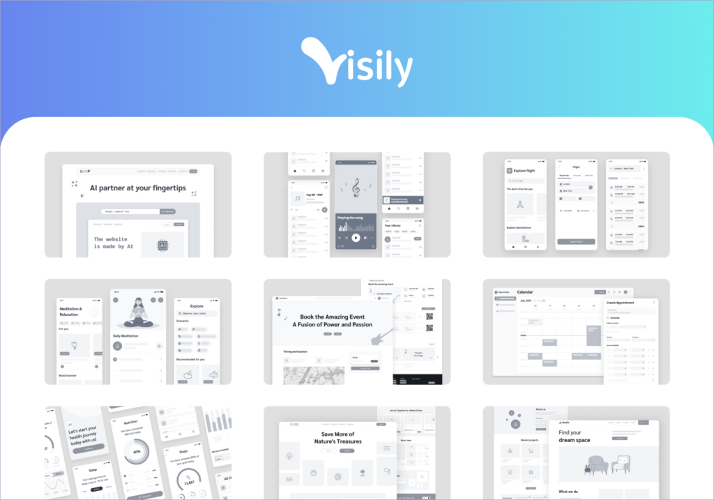
Starting with wireframes, we sketch out our ideas. It’s the initial blueprint that shapes our digital product’s foundation. And as we progress, prototypes refine these sketches, adding depth and interactivity. They allow us to test, iterate, and fine-tune our designs, ensuring our end users get an optimal experience.
Yet, mastering these stages requires skill and the right tools. That’s where platforms like Visily shine brightly. Catering to wireframing and prototyping, Visily streamlines the design process, allowing designers to craft and refine easily.
In conclusion, remember the significance of wireframes and prototypes, whether you’re a budding designer or a seasoned expert. And with platforms like Visily by your side, you can transform ideas into remarkable digital products.


