In the digital design world, the terms wireframe, and mockup are frequently spoken in the same breath. These two distinct stages in the design process, however, differ significantly in their functionality and purpose. In this article, we will delve into the specifics of each to provide a clear and comprehensive understanding of the wireframe vs mockup conundrum.
Table of Contents
- Understanding Wireframes and Mockups
- Wireframes: The Backbone of Design
- Mockups: The Aesthetic Blueprint
- Wireframe vs Mockup: The Fidelity Spectrum
- The Role of Wireframes and Mockups in the Design Process
- Wireframe vs Mockup vs Prototype: The Evolution of Design
- Utilizing Visily: Your Companion for Wireframes and Mockups
- Conclusion
Understanding Wireframes and Mockups
While both wireframes and mockups are integral components of the digital design process, they serve different purposes and are used at different stages of the process. Let’s break down the basic differences between wireframe vs mockup.
Wireframes: The Backbone of Design
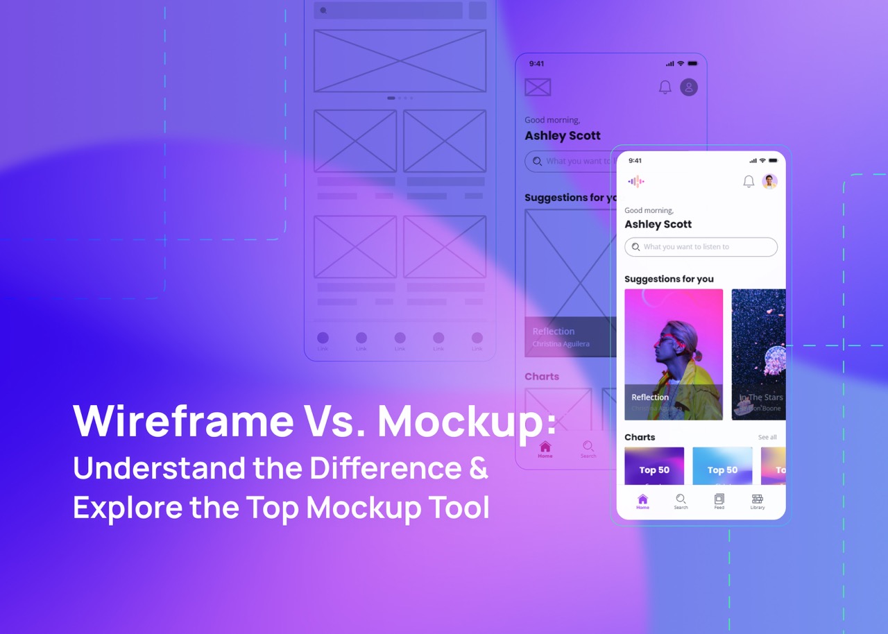
A wireframe is essentially a skeleton of your digital product. It lays out the structure, functionality, and content placement of your design. Wireframes are typically created by UX designers and product managers and serve as a guide for collaboration with both UI designers and developers.
Mockups: The Aesthetic Blueprint
A mockup, on the other hand, is a visual model of your product. It showcases the design elements such as branding, color, typography, and iconography, providing a creative direction for the final product. A mockup represents the look and feel of the finished product, helping stakeholders visualize the end result.
Wireframe vs Mockup: The Fidelity Spectrum
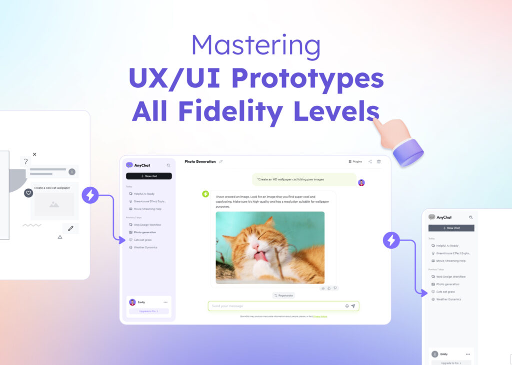
When it comes to the level of detail in a digital product design, we often refer to fidelity. In simple terms, fidelity indicates how closely a design resembles the final product. Let’s delve into the relationship between fidelity and wireframes and mockups.
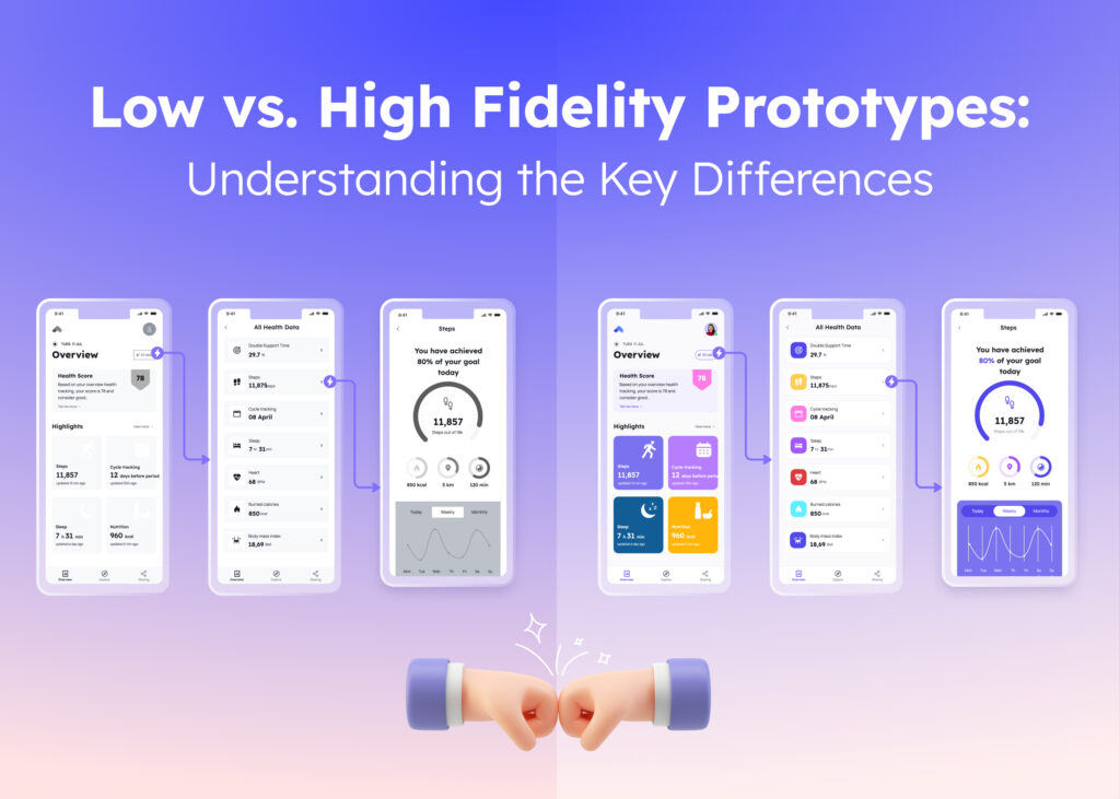
Low-Fidelity Wireframes: Rough Sketches
Low-fidelity designs are simple sketches providing a basic sense of a web or app design concept. They are often hand-drawn or created using specialized online design tools.
Mid-Fidelity Designs: Refined Ideas
Mid-fidelity designs are more refined versions of your sketches. They are digitally structured, semi-functional, and usually feature placeholder text. However, they lack final design aesthetics or graphics.
High-Fidelity Mockups: Near-Real Experience
High-fidelity mockups are polished representations of the holistic design vision. They illustrate the detailed UI design, highlighting a cohesive look and feel, providing the closest experience to the real thing.
Read this article to learn more about Low fidelity vs. High fidelity Wireframes.
The Role of Wireframes and Mockups in the Product Design Process
Generally, wireframes precede mockups in the design process. Wireframes provide the basic guidelines for content and functionality, which are then refined into mockups. This progression reflects the iterative and collaborative nature of design work. However, mockups can sometimes be a starting point, particularly when trying to impress potential clients or investors.
While mockups can help stakeholders envision the future state of your product, they can also set unrealistic expectations, making it crucial to manage these expectations effectively.
Wireframe vs Mockup vs Prototype: The Evolution of Design
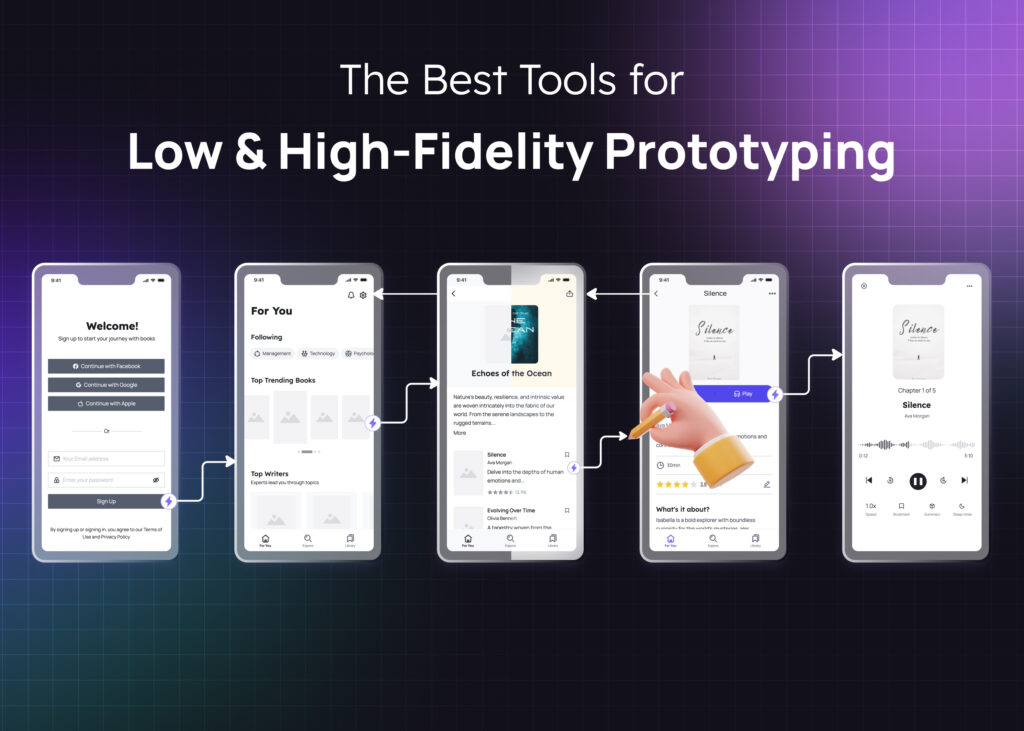
Feedback and iteration drive the design process forward. The journey from wireframes to mockups to prototypes is an evolutionary path. Prototypes differ from wireframes and mockups primarily in terms of interactivity. While wireframes and mockups are static, prototypes allow users to interact with the design, providing a more realistic user experience.
Utilizing Visily: Your Companion for Wireframes and Mockups
The design process is rarely linear. It involves testing different directions and approaches, changing ideas, gathering user feedback, and constantly iterating. Tools like Visily can make this journey smoother. As an AI-powered tool, Visily is the best wireframe and mockup tool that supports you throughout the entire design process, from creating wireframes to functional prototypes. Its drag-and-drop editor is fast and easy to use, making it an ideal companion for your UI design journeys.
Whether you’re new to the design world or working on a time-crunched project, Visily can streamline your design process and help you bring your ideas to life.Conclusion
The wireframe vs mockup debate is really about understanding the different stages of the design process. While wireframes provide the structural blueprint, mockups add the aesthetic elements, and together, they pave the way for interactive prototypes.
Remember, each step of the process serves a unique purpose and contributes to the success of your digital product. As you navigate your UI journey, tools like Visily can be a valuable ally, making the process more efficient and enjoyable.Find this article helpful? Follow our blog for more!


