When you embark on web design, a website wireframe is your blueprint. What is a website wireframe, and why is it so pivotal in crafting an effective site? We’ll uncover these essentials and guide you through a streamlined process of constructing your own website wireframes. Expect to learn not only the ‘what’ but also the ‘how’ as we break down the types, tools, and best practices.
Key Takeaways
- Wireframes serve as foundational blueprints for website design, focusing on functionality and user experience without the distraction of aesthetic elements. They can be low-fidelity, providing basic structure, or high-fidelity, with more detail on finalized elements.
- The wireframing process is crucial for aligning team objectives, clarifying project goals, and improving the overall user experience by facilitating the assessment and iteration of layouts, and user flows before the final design is implemented.
- Creating effective website wireframes involves researching user needs, planning content and navigation, sketching out designs (often digitally for greater precision and collaboration), and continuously refining based on feedback to ensure the final design meets usability standards and business objectives.
Understand Website Wireframes
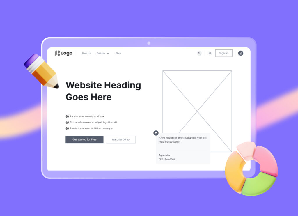
Website wireframes are akin to the scaffolding used in construction. They represent the skeletal framework of a website, serving as the blueprint for the entire design. The beauty of website wireframes lies in their simplicity. By stripping away the distractions of design elements, website wireframe allows us to strategically place key elements on a canvas, guiding the design process and clearly communicating a website’s structure and functionality. Their use isn’t limited to web design; they are also employed in mobile app design, demonstrating their adaptability in the design process.
Website wireframes can either be low-fidelity or high-fidelity, each carrying its unique benefits. Low-fidelity wireframes provide a basic visual representation, while high-fidelity wireframes offer more detailed visual information. We’ll further explore these terms.
What is a website wireframe?
Imagine a website wireframe as a skeletal representation of a website’s content. It emphasizes functionality, hierarchy, and relationships between content (aka pages), without the distractions of aesthetics. It’s like a map, providing a basic foundation to communicate website ideas and understand the expected appearance of the product.
A wireframe includes important features and formats for user interaction. It sets the stage for adding interactive elements like buttons, text, images, and navigations.
By zeroing in on the web design’s usability aspects, website wireframes help integrate user experience considerations right from the early stages of website design and development process.
Low-fidelity vs. High-fidelity website wireframes
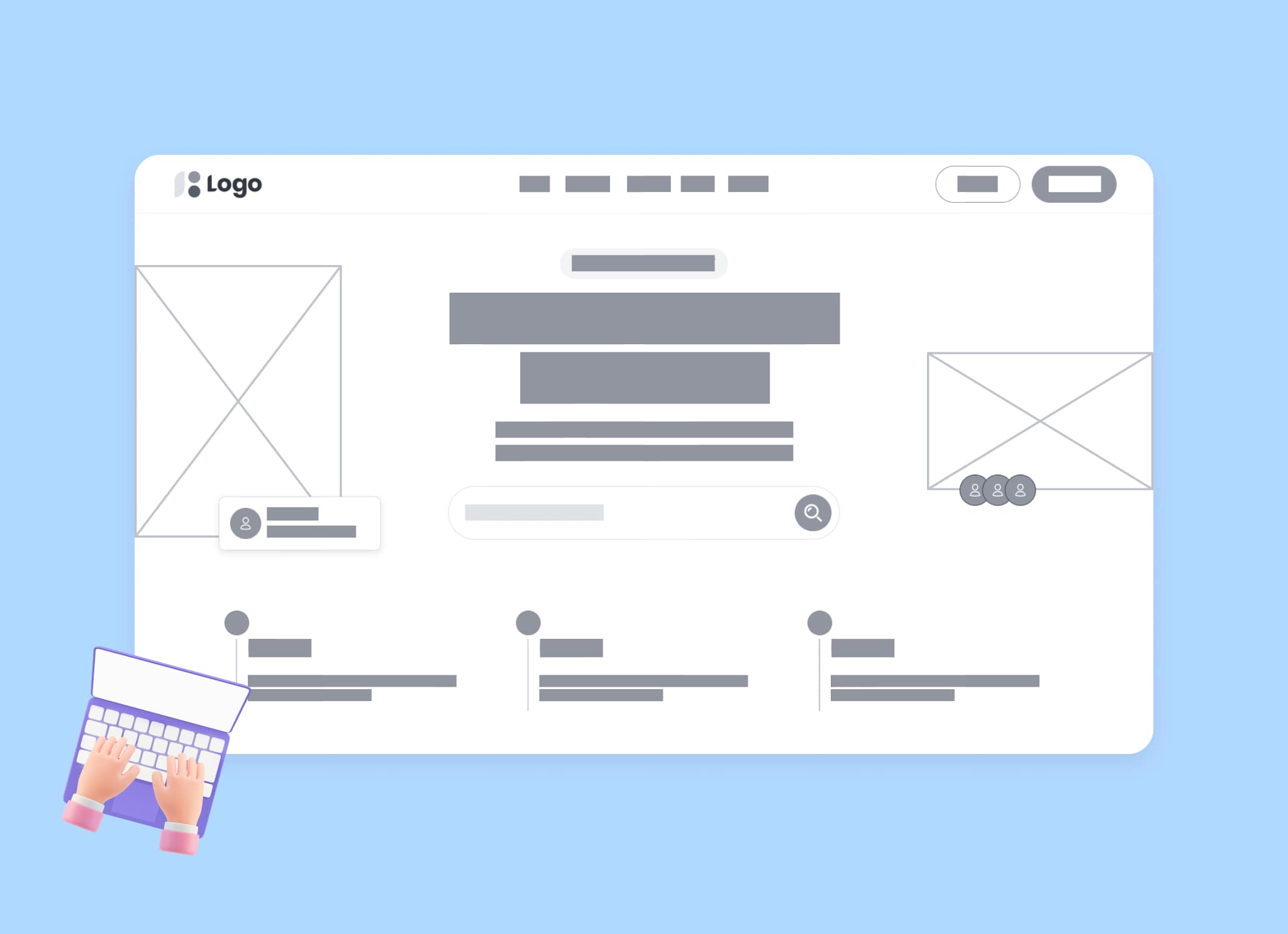
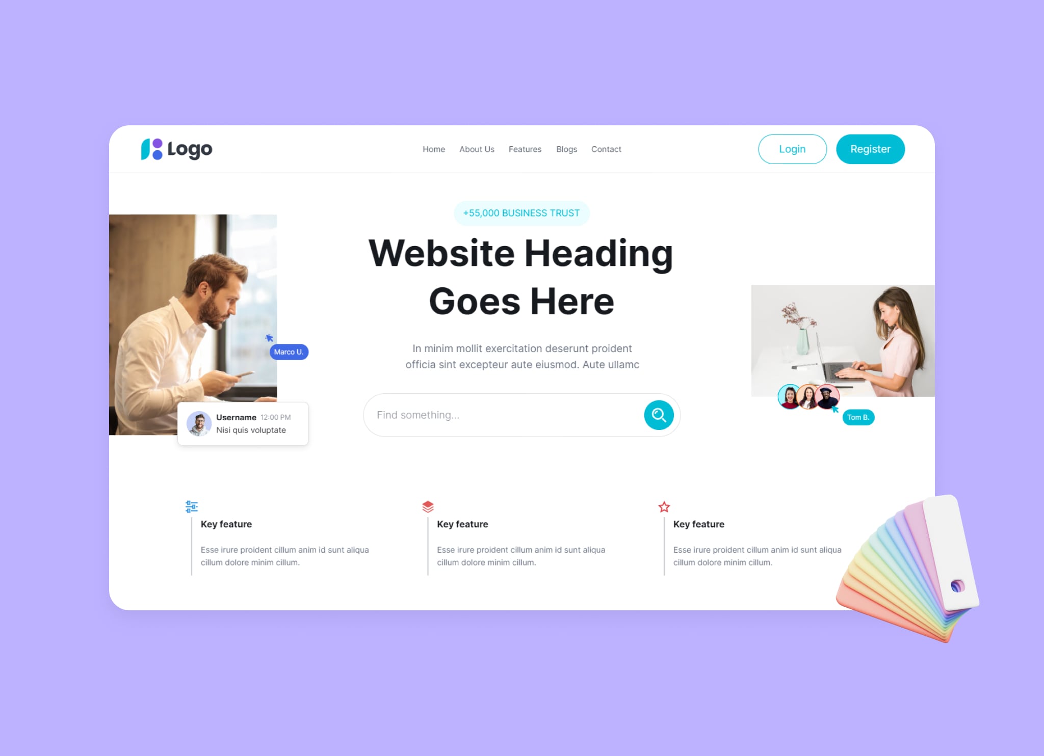
Low-fidelity website wireframes are like rough sketches, showing the general location of elements, while high-fidelity website wireframes provide more detailed visual information, indicating what the final elements will look like. You can utilize low-fidelity site wireframes to outline a website’s content and layout without delving into intricate details. Such wireframes, often created using rudimentary tools or even pencil and paper, primarily aid in establishing fundamental layout and functionality.
On the other hand, high-fidelity website wireframes are typically created to include the necessary details for final design elements. The choice between low-fidelity and high-fidelity depends on project needs. It’s generally advised to commence with low-fidelity wireframes for the preliminary placement of elements. Grasping the distinction between the two types can help prevent potential confusion during the design process. Visily is a robust wireframe tool that enables you to create website wireframes ranging from low to high fidelity. You can easily switch between lo-fi and hi-fi modes, and all the screens will be adapted according to each one!
The Importance of Website Wireframing

Wireframes are essential tools for successful website development, as they convert complex flowchart ideas into clear, user-friendly visual layouts. They allow for early assessment of page layouts and user flows, helping identify and correct potential mistakes that could affect a site’s functionality and inhibit conversions. Wireframes, by emphasizing usability and convenience, help align the website’s design with user objectives like making purchases or subscribing to services.
Wireframing websites provide several benefits, including:
- Project clarity, allowing team members to work through interactions and layout requirements
- Better understanding of project goals, fostering effective team collaboration
- Ability to explain concepts to clients and integrate feedback efficiently
We’ll examine these aspects in more detail.
Aligning team goals
Website wireframes serve as a common visual reference that guides all team members and stakeholders throughout the development process. They assist in visualizing the structure and layout of a website, ensuring that everyone is on the same page. Regular collaboration, enabled by wireframes, plays a vital role in maintaining an effective design workflow that encompasses elucidating concepts to clients and ensuring cohesive teamwork.
Successful wireframe-driven design processes account for a balance between what is desirable from a user standpoint, what is viable from a business perspective, and what is feasible technologically.
Enhancing user experience (UX)
Creating a website wireframe is a crucial step in focusing on the user experience as an integral part of website design and functionality. Testing page layouts and user flows through website wireframes before adding visual elements is essential for identifying and resolving potential usability issues.
Wireframe software is useful for outlining the main features and navigation of websites, improving the user experience by initially focusing less on aesthetics. Prioritizing content relevance for mobile devices during wireframe design contributes to user-friendly and navigable website experiences on smaller screens.
Conversion points like buttons and hyperlinks are strategically planned in the wireframe to facilitate user interaction and guide them through their intended journey on the site.
Creating a Website Wireframe: A Step-by-Step Process
Building a website without a wireframe is like constructing a house without a blueprint. It’s possible but not wise. The wireframing process starts with identifying the goals of the website design to ensure that it meets the end objectives. Following this, website wireframes are roughly sketched, emphasizing the mapping of the user’s journey through the website using various interactive elements.
Low-fidelity to Mid-fidelity website wireframes are then built using tools like Balsamiq (only low-fidelity), or Visily (both low and mid-fidelity), which facilitate visualization of the website layout and the user’s interaction with page elements. Finally, website wireframes undergo multiple iterations where unnecessary steps are removed, conversion points are decided, and screen sizes are considered for different device types, all while continuously incorporating feedback.
We’ll examine these steps in more detail.
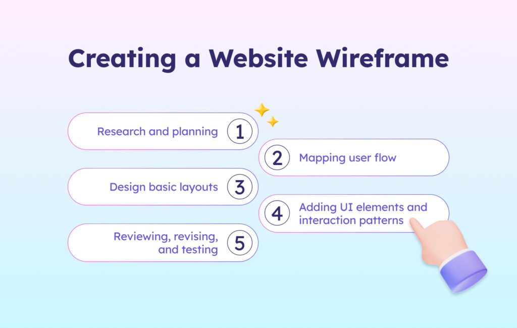
1. Research and planning
Using website wireframes early in the project helps define client goals and provides a clearer overall project definition. Wireframes and prototypes confirm business analysis, ensuring strategic alignment with business objectives. Empathy in wireframing is vital for understanding the users’ perspective and their unstated needs.
Insights into effective website wireframes, including menu layouts and content positioning, are gleaned from UX design research. For example, if you’re building an e-commerce store, your goal might be to increase sales. Your target audience would be potential customers, and key features include product listings, a shopping cart, and a secure checkout process.
The evaluation of end-user experience with the website wireframe necessitates mapping out site features.
2. Mapping user flow
A well-defined user flow is crucial for creating an intuitive user interface and shaping the layout of wireframes. User flow diagrams assist in establishing how many pages are needed and what type of content should be placed on each page.
Drafting user flow in text format is helpful because it makes it easier and faster to adjust the steps before turning them into wireframes. To understand how visitors will interact with the website’s pages, one must identify and assess user flows within wireframes.
3. Design basic layouts
Once you’ve determined the user flow, start with the website wireframe. Outlining various website sections makes it easier to convert your thoughts into digital representations. This can help avoid problems that come up when digitizing your wireframes.
Consider using pre-designed templates to quickly establish the basic layout, incorporating key components like headers, footers, navigation bars, buttons, cards, and more. Alternatively, try AI-powered design tools like Visily to convert website screenshots into editable wireframes. Additionally, adding annotations in wireframes helps clarify and effectively communicate design intentions, which is crucial for collaborative projects.
Remember, the focus is establishing a clear information hierarchy and user flow.
4. Adding UI elements and interaction patterns
Website wireframes are helpful for figuring out the placement and behavior of user interface (UI) elements. They usually include various UI elements like buttons, text fields, checkboxes, menus, and radio buttons, which help visualize the user interface and the functionality.
In website wireframes, detailed elements like interactive components and content structure offer developers direction for coding and implementation. The primary elements incorporated in wireframes should assist in transforming user research, personas, and business requirements into a practical visual guide for the website’s layout and features.
5. Reviewing, revising, and testing
Website wireframes demand an iterative review process in which designs are fine-tuned based on comments from multiple stakeholders to achieve optimal layout and functionality. Tools like Visily, which offer brainstorming, wireframing, and prototyping functionalities, can be a great fit for anyone to streamline this process. Visily’s interactive prototype elements like text inputs and buttons within wireframes facilitate effective prototyping and testing, which is essential to uncover usability issues before product launch.
Best free website wireframe tool
Though wireframing may appear simple, the right tools are fundamental to facilitate the process effectively. Here are the top 5 wireframe tools for beginners or anyone on a budget.
- Visily: An AI-powered tool that’s ideal for non-designers due to its user-friendly interface. It offers a free plan, pre-built templates, and excellent collaboration features, although it might be less suitable for more complex projects.
- Figma: Known for its intuitive design and real-time collaboration capabilities, Figma is perfect for professionals with a design background. While it provides a robust free plan, it lacks built-in templates, which can be added via plugins.
- Adobe XD: This tool is user-friendly and comes with pre-built UI kits. Adobe XD excels in collaboration and integrates seamlessly with other Adobe products, though its subscription model may be costly. Available for both Mac and Windows.
- Sketch: Exclusively for Mac users, Sketch offers extensive design elements and recently added real-time collaboration features. It’s ideal for detailed design work on a vector-based canvas but isn’t compatible with Windows or mobile devices. The one-time payment model might seem expensive upfront.
- Axure RP: Best suited for complex projects requiring advanced prototyping. Axure RP has a steeper learning curve and operates on an expensive subscription model, making it more fitting for seasoned professionals.
While these tools are fundamental, remember that collaborative platforms and templates also play a significant role in streamlining the website wireframing process. Choosing the right wireframing tool is pivotal, as the wrong choice can hinder your ability to effectively realize and communicate your design vision.
Common Wireframing Mistakes and How to Avoid Them
Despite wireframing’s integral role in web design, it’s not exempt from errors. Over-elaboration in website wireframes could shift focus from the design flow and squander time. Overlooking the wireframe’s objective might lead to ambiguity and a lack of guidance for the design team.
The website wireframe creation process is iterative, often undergoing multiple rounds of sketching and feedback. Creating wireframes for every page can lead to inefficiency, and it’s essential to identify and focus on the most critical pages. Documenting mistakes offers excellent learning opportunities and can help avoid repeated errors.
Overlooking user needs
Website wireframes ought to be designed keeping the end-user in mind, as they aid in planning the website’s layout and interaction from the user’s viewpoint. When user needs are ignored during the wireframing process, the final design may result in an interface that is not intuitive or user-friendly.
A lack of understanding of the user’s tasks and goals can lead to wireframes that don’t support the user’s journey through the website effectively. User testing of wireframes can reveal insights into user behavior and preferences, which should be integrated back into the wireframe revisions. Ignoring user feedback on wireframes may lead to a final product that does not adequately solve user problems or meet their needs.
Website wireframes must consider accessibility guidelines to ensure the website is usable by people with various disabilities.
Neglecting responsive design
Giving precedence to responsiveness in wireframe design augments user experience boosts SEO, and potentially leads to higher conversion rates. Website wireframes should be designed with specific dimensions for different screen sizes to ensure accuracy and functionality across devices.
It is recommended to create separate website wireframes for mobile devices, such as smartphones and tablets, in order to accurately cater to their unique screen sizes and usability requirements. Designs created for larger screens can become cluttered and lose their intended impact when simply scaled down to fit smaller screens, emphasizing the need for careful planning when dealing with responsive wireframes.
Overemphasizing visuals
While crafting website wireframes, the focus should be on how components interlock and the efficacy of user flow instead of the visual design. Overemphasis on the visual aspects of the design during the wireframing process can distract from vital aspects of functionality.
Unlike mockups and prototypes that address visual and interactive elements, wireframes should focus primarily on layout and function. Spending excessive time on minutiae during the wireframing stage can impede progress and hinder the development of a cohesive user experience. You need to maintain a balance between detail refinement and design momentum to ensure a clear and functional framework for your website.
Explore Website wireframe templates
Marketing Website Template
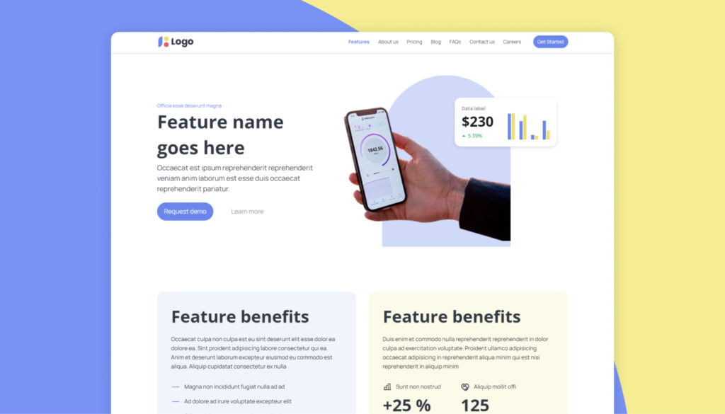
A Marketing Website Template is the perfect solution for businesses, marketing agencies, or any organization looking to create a professional and effective marketing website. This website wireframe template is designed to showcase your services, highlight your expertise, and facilitate easy contact and lead generation.
AI Website Template
AI Website Template is designed to help tech businesses, particularly those focused on AI, establish a compelling online presence. Whether you’re an AI startup, a machine learning agency, or an AI services provider, this template is crafted to effectively present your services, showcase your projects, and engage potential clients.

Business Consulting Website Template
Business Consulting Website Template is designed to help consulting firms establish a professional online presence. Whether you’re a large consulting firm or a freelance consultant, this template is crafted to effectively communicate your services, showcase your expertise, and attract potential clients.

Conclusion
Wireframes are fundamental in web design, acting like a blueprint that showcases the layout and functionality of a webpage rather than its visual appeal. They are essential for assessing page layouts, guiding user flows, and aligning team goals, ensuring a user-friendly and functional website. However, it’s important to consider user needs, ensure designs are responsive, and not overly focus on aesthetics at this phase. With the right approach, website wireframes can be a powerful tool for any team.
Start your website wireframing today: Visily AI


 , check us out


