In the world of UX design, complexity arises from the need to create engaging and intuitive user interfaces for websites, mobile apps, and web apps. As these platforms become more advanced, so do the interactions users have with them. These interactions can range from simple tasks, like clicking a button, to complex workflows involving multiple steps and decision points.
To effectively design these interactions, UX designers needed a tool that could document these complex workflows in a clear and easy-to-understand way. This is where the concept of wireflow came into the picture.
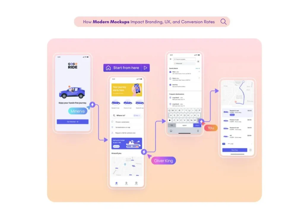
Wireflow is a unique design tool that combines the visual layout of a wireframe with the directional flow of a flowchart. This tool is used in UX (User Experience) design to map out how users interact with a website or app. It provides a clear visual representation of the user’s journey from start to finish.
This blog post will delve deeper into what wireflow is, how it’s used, and its importance in the design and development process. So, if you’re curious about wireflows, keep reading!
What is a Wireflow?
Wireflows are the combination of wireframes and flowcharts. A wireframe is a basic and static visual guide used in interface design to suggest the structure of a website or app, and a flowchart is a type of diagram that represents a process or workflow.

When combined, these two elements create a wireflow. A wireflow is a detailed visual representation of the user’s journey through a website or app. It shows how the user interacts with the interface, from the starting point to the ending point.
This tool is particularly useful for documenting task flows, or the sequence of steps a user takes to complete a particular task. It can also be used to map out complex interactions and data flows within a system.
Wireflows are typically created during the design process before any actual development begins. They provide a clear and detailed structure of the user interaction design, which can be invaluable during the building process.
What is a Wireframe?
A wireframe is a static and simple visual guide that gives a basic outline of a web page or app’s layout and functionality. It’s like the skeleton of a website or app that shows where elements such as text, images, buttons, and other interactive features will be placed. Wireframes are created in the early stages of the design process. It serves as a blueprint for the layout possibilities of the final product.
Wireframes can be created for all types of platforms, including traditional static websites, mobile screens, and web apps. They are typically simple and abstract in nature, focusing more on functionality and user interaction than on visual design.
Creating custom wireframes for unique pages within a website or app is a common practice. This allows designers to map out all the interactions and pathways a user can take. Wireframes can range from a few core pages to detailed layouts of every single page.
A wireflow combines wireframes with flowcharts to create more detailed user flows.
What is a Flowchart?
A flowchart is a visual tool used by UX designers to map out the sequence of steps in a process or system. It shows how tasks are connected and how task flows through a system. Flowcharts are often used to document complex workflows and to provide a clear, visual representation of how a task is completed.
Flowcharts can be very simple, showing a linear sequence of steps, or they can be more complex, showing multiple paths and decision points. They are typically used to document common user tasks, such as signing up for an account or making a purchase on a website.
In a flowchart, each step in the process is represented by a different symbol, and arrows are used to show the direction of the flow. This makes it easy to see at a glance how the user moves through the process, from the starting point to the ending point.
Flowcharts can also be used to show how different pages or screens are connected to a website or app. For example, a flowchart might show how a user moves from a login page to a profile page, or from a product page to a checkout page.
In the context of wireflows, flowcharts are used to show the flow of user interactions, rather than just the task flow. This allows designers to see not only what the user is doing, but also how they are interacting with the interface. This can be especially useful when designing complex interactions or multistep user tasks.
Benefits of a Wireflow?
- Clear Understanding: Wireflows help in understanding the user’s journey in a clear and detailed manner. It shows how users interact with a website or app, from the starting point to the ending point. This can be particularly useful when you’re dealing with complex interactions and workflows.
- Visual Feedback: Wireflows provide a clear visual representation of the user’s journey. This can be especially beneficial for stakeholders who may not be familiar with UX design. They can see how the user interacts with the website or app and understand the flow of tasks.
- Improved Design Process: Wireflows can improve the design process by providing a detailed structure of the user interaction design. This can be invaluable during the building process, helping designers and developers understand the flow of user interactions and tasks.
- Effective Documentation: Wireflows are great for documenting complex designs and interactions. They can help in creating a detailed layout of the entire site or app, including all possible user pathways.
- Hybrid Method: Wireflows offer a unique approach that combines wireframe style page layout with flow diagrams. This provides a more detailed view of how the user interacts with the site or app, making it easier to design an intuitive and user-friendly interface.
- Dynamic Content: If your website or app incorporates dynamic content or micro-interactions, a wireflow can help you understand and document these interactions. This can be particularly useful when designing mobile apps, which often involve more detailed flows and interactions.
- User-Friendly Design: By using wireflows, you can ensure that your design is user-friendly and intuitive. This can lead to a better overall user experience, making your website or app more appealing to users.
How to Create a Wireflow?
Creating a wireflow might seem like a big task, but it’s actually pretty straightforward. Here’s a simple step-by-step guide to help you create your own wireflow.
1. Understand the User: Before you start designing, it’s important to understand who your user is and what they want to achieve. This is often called a user story.
2. Identify the Task: Once you understand the user’s goals, you can identify the tasks they need to complete. For example, if the user wants to sign up for an account, the tasks might include entering their email address, creating a password, and clicking a confirmation link.
3. Create a Wireframe: Next, use a simple wireframe to sketch out the layout of the website or app. This should include key screens like the sign-up page, home page, and account page. You can use pen and paper or a digital tool to create your wireframe.
4. Map Out the Flow: Now it’s time to add the flow to your wireframe. Start with the user’s starting point and map out the steps they take to complete their task. This could include clicking a button, filling out a form, or navigating to a different page.
5. Add Details: Once you have the basic flow mapped out, add more details to your wireflow. This could include smaller screen representations, what happens if a user forgets their password, and any other important details.
6. Review and Refine: Finally, review your wireflow and make any necessary changes. It’s a good idea to get feedback from others, including product managers and developers, to make sure your wireflow is clear and accurate.
7. Document: Once you’re happy with your wireflow, document it in a design specification format. This will help everyone involved in the project understand the user’s journey and how the website or app should be built.
Remember, a wireflow is a tool to help you design better user experiences. It’s not a set-in-stone plan, but a guide that can be adjusted and refined as you learn more about your users and their needs. Happy designing!


