UI mockups are a key part of the design process, especially in web design and mobile apps. They help UI designers create a visual reference of the user interface before the final product is developed. With the help of a UI mockup tool, designers can build mockups that give a realistic perspective of the final interface. These tools allow designers to drag and drop visual elements, making the design workflow much easier. They can also generate interactive prototypes, which are functional prototypes that show how the final product will work. This is a great way to fix errors and layout issues before the development phase begins.
In this blog post, we will explore more about UI mockups, the best mockup tools, and how they can lead to better UX.
What is Mockup in UI Design?
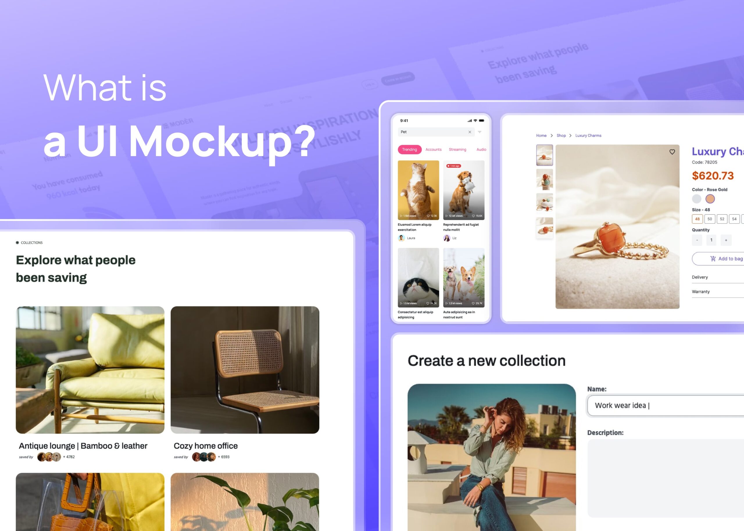
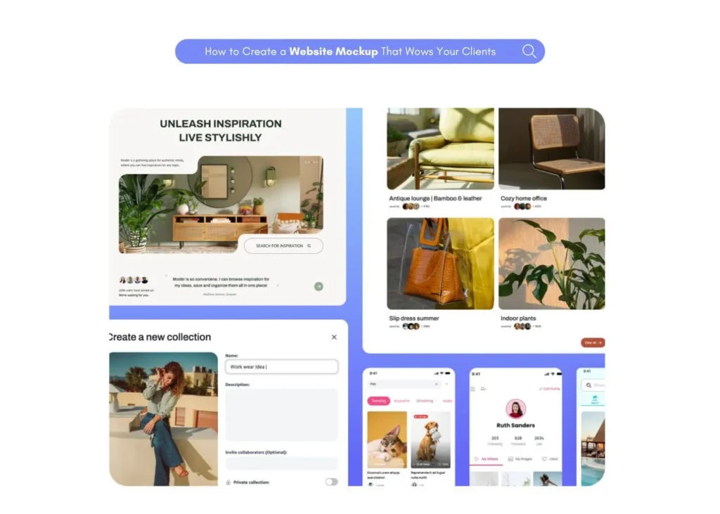
A mockup in UI design is a visual model that shows the final design of a web page, app, or other digital product. It’s like a detailed picture that includes all the design elements such as color schemes, layout, typography, and content.
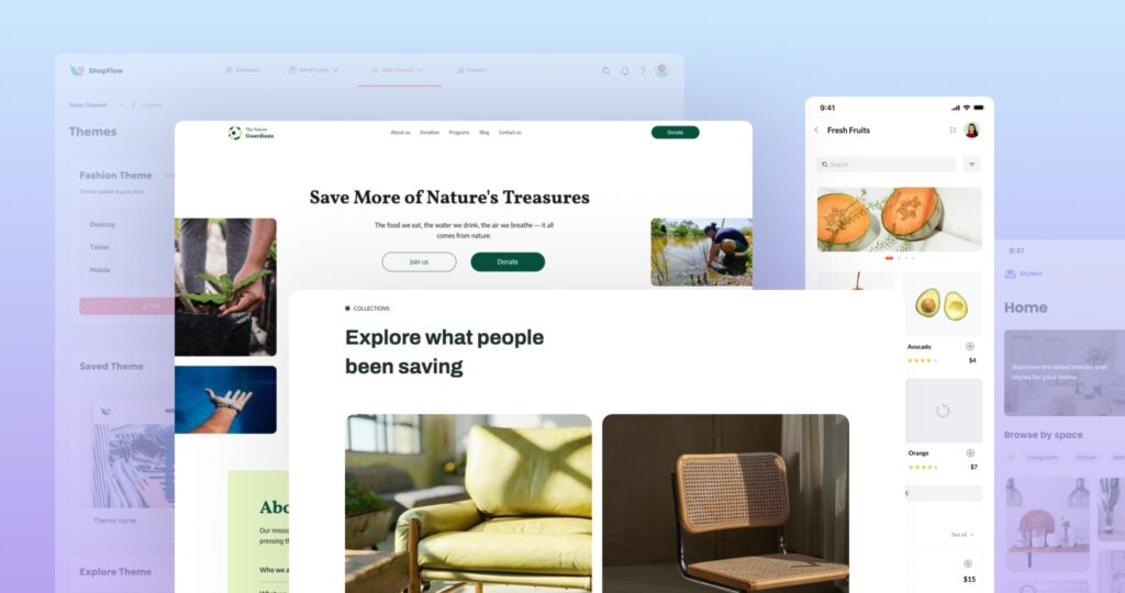
UI designers use mockup tools to create these designs. These tools have a wide range of features. For example, they allow designers to drag and drop elements, and swap parts to design the mockups. Some tools also offer UI kits, which are pre-made design elements that can be used in the mockups.
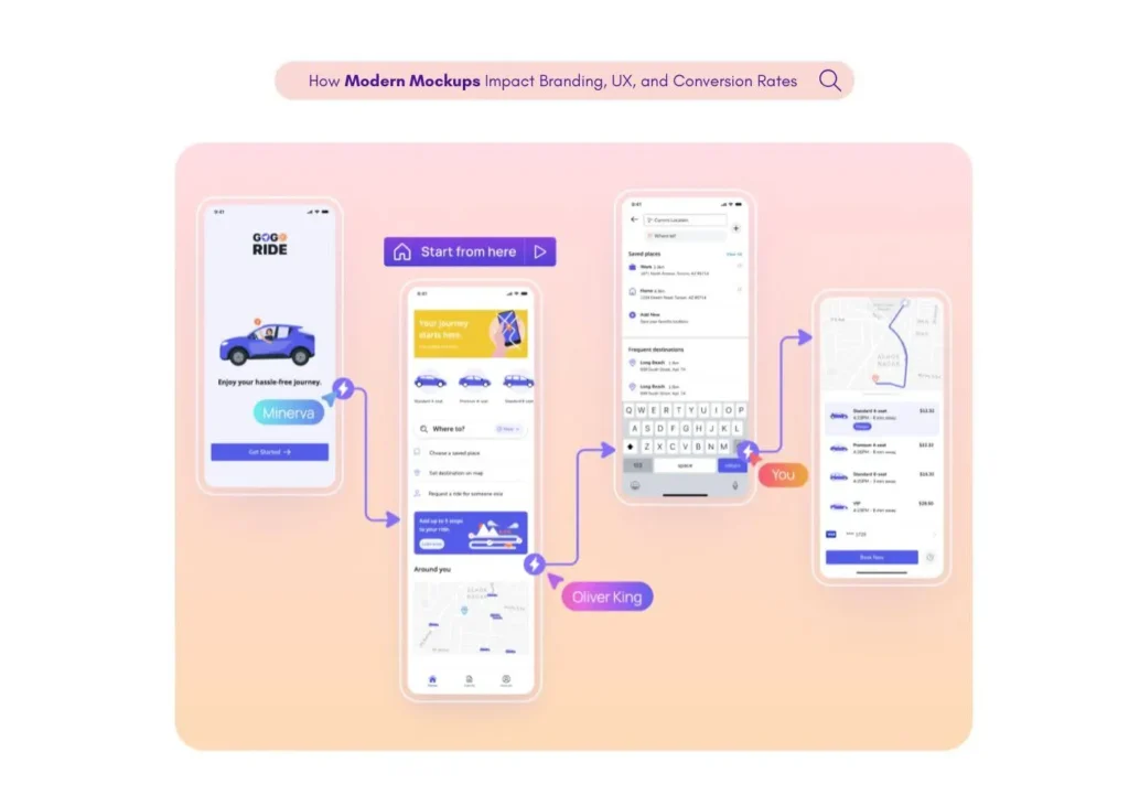
One of the main uses of a mockup is to communicate and work together with different people involved in the product design process. This includes clients, developers, and even users. By showing them a mockup, they can better understand the design and give useful feedback.
Another important use of a mockup is to evaluate and improve the design. By creating a mockup, designers can see how the design works and make changes based on user feedback and usability testing. This can help prevent usability issues and layout errors before the actual development phase starts.
Elements of UI Mockup
UI mockups are made up of different parts, or elements. These elements are the building blocks of a UI design. Let’s take a look at some of them.
1. Visual Elements: These are the parts you can see, like colors, shapes, and images. They give your mockup a look and feel. They also help to guide users through the design. For example, a big, bright button might tell users where to click.
2. Text Elements: These include headings, labels, and paragraphs. They provide information to users. The font choices and sizes can also affect how easy it is for users to read and understand the information.
3. Interactive Elements: These are parts that users can interact with, like buttons, text fields, and sliders. They let users do things like enter text, select options, or move to another page.
4. Layout Elements: These are how the parts are arranged on the page. They can help guide users through the design and make it easier to use.
5. Content Blocks: These are groups of elements that work together to show a piece of content. For example, a blog post might have a title, an image, and a paragraph of text.
6. Accessibility Elements: These are features that make the design easy to use for everyone, including people with disabilities. For example, high-contrast colors can make text easier to read.
These elements are just a starting point. A great UI mockup can include many other things, depending on the needs of the project and the users. But by understanding these basic elements, you can start to create effective and user-friendly UI mockups.
Are Mockups Static or Dynamic?
Mockups are usually static. This means they don’t move or do anything when you click on them. They just show what the design looks like and where everything goes. People who make products use mockups to show others their thoughts and get their ideas across. They also use them to see what works and what doesn’t, based on what people say and how they react. But sometimes, mockups can have dynamic elements by creating an interactive prototype.
When to Use UI Mockups?
There are many situations where a UI mockup can be very helpful.
First, you should use a UI mockup when you have a great idea for a new app or website and you want to show others what it might look like. With a mockup, you can create a visual picture of your idea that others can easily understand.
Second, you can use a UI mockup when you’re planning the design of a product. A mockup can help you figure out where to put all the different parts, like buttons, text, and images. It can also help you decide on colors, fonts, and other design elements.
Third, you can use a UI mockup when you’re testing the design with users. A mockup can help you see how users interact with the design and what problems they might have. This can help you make the design better and more user-friendly.
Finally, you can use a UI mockup when you’re handing off the design to developers. A mockup can give developers a clear picture of what they need to build. This can make the development process smoother and faster.
Best Practices for Creating UI Mockups
Creating UI mockups is a fun and creative process. But to make sure your mockups are effective, there are a few best practices you should follow.
1. Use Design Tools: There are many design tools available that can help you create your mockups. These tools have many features that can make your work easier. For example, Figma is a popular tool that lets you design and prototype your ideas. If users prefer a more user-friendly tool that doesn’t need design experience, they can choose Visily.
2. Start with Low-Fidelity Wireframing: Before you start adding colors and details, it’s a good idea to start with a basic layout. This is called low-fidelity wireframing. You can even do this on paper, which is called paper prototyping.
3. Use a Design System: A design system is a set of rules and guidelines for your design. It can include things like color schemes, fonts, and button styles. Using a design system can make your design more consistent and professional.
4. Consider Accessibility: When designing your mockup, remember to think about all users. This includes people with disabilities. Make sure your design is easy to use for everyone.
5. Test Your Designs: After creating your mockup, it’s important to test it with users. This can help you find any problems and fix them before the final product is built.
6. Learn and Improve: Designing is a learning process. Don’t be afraid to make mistakes and learn from them. Keep practicing and improving your skills.
7. Keep it Simple: Don’t overcomplicate your design with too many elements. Keep it simple and easy to use.
8. Use Real Content: Instead of using placeholder text, use real content in your mockups. This can give you a better idea of how the final product will look.
9. Collaborate: Work with your team and share your ideas. This can lead to better designs and new ideas.
10. Stay Updated: The world of design is always changing. Keep learning and stay updated with the latest trends and tools.
Remember, creating a great UI mockup takes time and practice. But with these best practices, you can create effective and user-friendly designs. Happy designing!
Difference between UI mockup and Wireframe
A UI mockup and a wireframe are both tools used in designing websites or apps. However, they are not the same thing and are used at different stages of the design process.
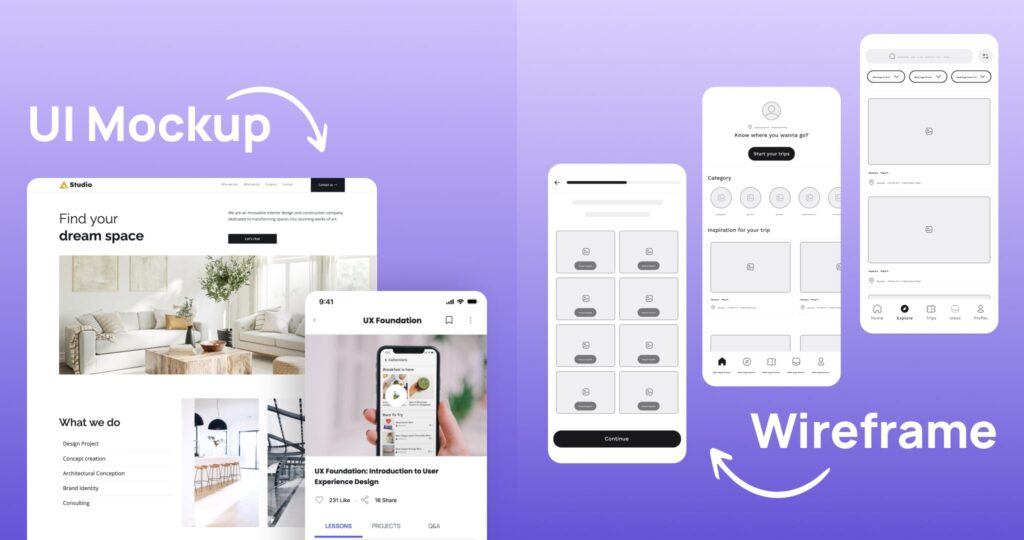
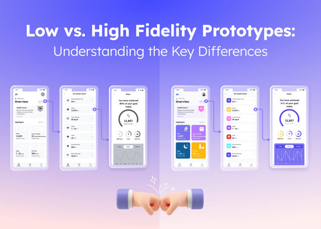
In the design process, a mockup is a step above a wireframe. Wireframes are simple, low-fidelity representations of the design. They are like handwritten notes or sketches that show the core functionality of the software. However, mockups are high fidelity and include actual content, color, and font choices. They give a more realistic perspective of the final product.
So, a wireframe is a simple layout, and a UI mockup is a detailed visual model. Both are important parts of creating a great website or app.
How to Create a UI Mockup with Visily?
Visily is a web-based tool that allows you to create UI mockups with the help of AI. You can use Visily to design stunning apps, web pages, and digital products without design skills, generate themes from text descriptions or screenshots, and convert sketches or screenshots into high-fidelity mockups. Here are some steps to create UI mockups with Visily:
Step 1:
Go to Visily’s website and sign up for a free account.
Step 2:
Once you are logged in, you will see a dashboard where you can create new projects, access existing projects, and browse templates and themes. To create a new project, click on the “Create Project” button in the top right corner.
Step 3:
You will be taken to the editor, where you can design your mockup using various tools and features. You can use the left panel to access page templates, component templates, icons, and images. You can also use the search bar to find what you need. You can drag and drop any element onto the canvas and customize it as you like.
Step 4:
You can also use the AI features to create your mockup faster and easier. You can use the Screenshot to Design AI feature to upload a screenshot of an existing app or website and let Visily convert it into a customizable mockup. You can also use the “Sketch to Design AI” feature to draw your app on paper and have Visily convert it into a high-fidelity mockup. You can access these features from the top menu bar.
Step 5:
Once you are happy with your mockup, you can save it, preview it, or export it as an image, or export it to Figma for final polishing. You can also share it with others using a link or invite them to collaborate on your project. You can access these options from the top menu bar or the bottom right corner.
Final Words
Visily lets you share your ideas easily, and it has all the tools you need to go from the first idea to a functional prototype, all in one place. You can even turn your pencil sketches into professional-looking designs, or use Visily’s AI helper to add smart design touches.
Creating mockups in Visily is all about making your ideas come to life without having to learn code or use complex design software. It’s a fantastic design tool that lets you focus on creativity and bringing your vision to the screen. Happy designing with Visily!


