High-fidelity wireframes contain detailed information, often including interactive elements, demonstrating how the user will interact with the interface. Gone are the days of static blueprints. With hi-fi wireframes, individuals get a feel for what it’s like to use the final product before it’s even built.
In this blog, we’ll delve deeper into hi-fi Wireframes, including what they are and when they should be employed in the design process. We’ll also look at how to create these wireframes using Visily.
What is a Wireframe?
In the UX design realm, a Wireframe serves as an essential roadmap for the development process. It offers a simple visual representation of a page or app’s layout, comparable to the foundational blueprint of a building.
High-Fidelity Wireframe
In digital design tools, “fidelity” specifies the level of detail and realism a wireframe possesses. Hence, wireframes are generally categorized into low-fidelity, mid-fidelity, and high-fidelity wireframes.
Low-fidelity wireframes are basic models, typically monochrome, centered around functionality, layout, and potential user interaction. These wireframes can be viewed as initial sketches, delivering insights into the fundamental structure of an interface.
Medium-fidelity wireframes are a step further. They incorporate more details than their low-fidelity counterparts. These wireframes help bridge the gap between layout functionality and visual aesthetics. While they may not include colors, the mid-fidelity wireframes may accurately represent shapes and sizes, text placements, and even basic placeholder elements.
The high-fidelity wireframes, the most detailed of the trio, incorporate specifics about dimensions, colors, typography, images, and, sometimes, functional behavior. These wireframes provide an interactive experience, articulating how users would navigate and interact with the interface, making it easier to test specific UI components.
The creation of wireframes facilitates streamlined communication between UX designers, stakeholders, clients, and developers. It allows the team to visually create solutions, driving a clear and shared understanding of the project making the overall development process more efficient. It helps designers focus on the layout and interface interaction without unnecessary distractions posed by detailed graphic design elements.
What is a High Fidelity Wireframe?
High-fidelity wireframes, often referred to as hi-fi wireframes, are a more detailed and polished version of low-fidelity wireframes. They are created with digital tools and are instrumental in the later stages of the design process.
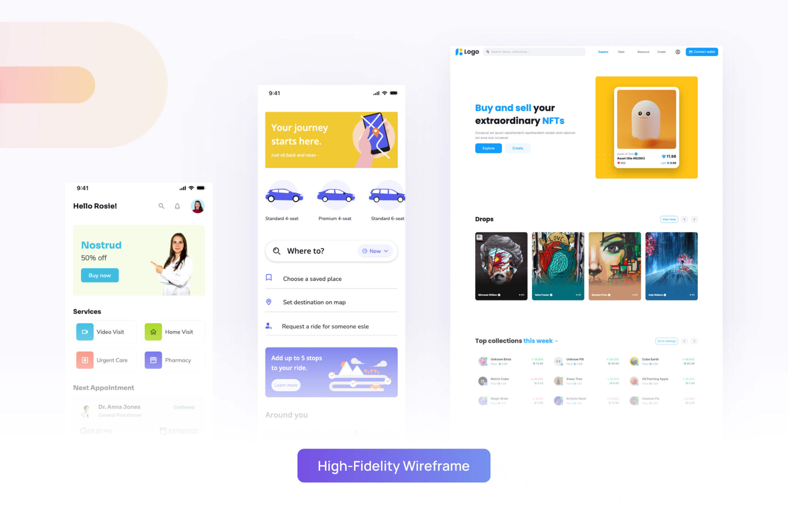
The term wireframe ‘fidelity’ refers to the level of detail and realism in a design. While a low-fidelity wireframe might show the basic layout of a site or app, it typically doesn’t go much deeper into specifics. In contrast, hi-fi wireframes are almost exact replicas of the final site or app, with detailed dimensions, precise layouts, meticulous typography, specific color schemes, and even interactive elements included.
High-fidelity prototypes are essential in creating solutions that are as close to the final product as possible. These wireframes not only show how different elements are arranged on pages, but also provide a detailed representation of user interaction, navigation, and functionality.
A major reason for using high-fidelity wireframes is user testing. These wireframes can be interactive, almost like the final product. The comprehensive design and realistic interactivity of hi-fi wireframes allow users to experience the product or service, helping teams collect direct feedback on usability and functionality before the development stage.
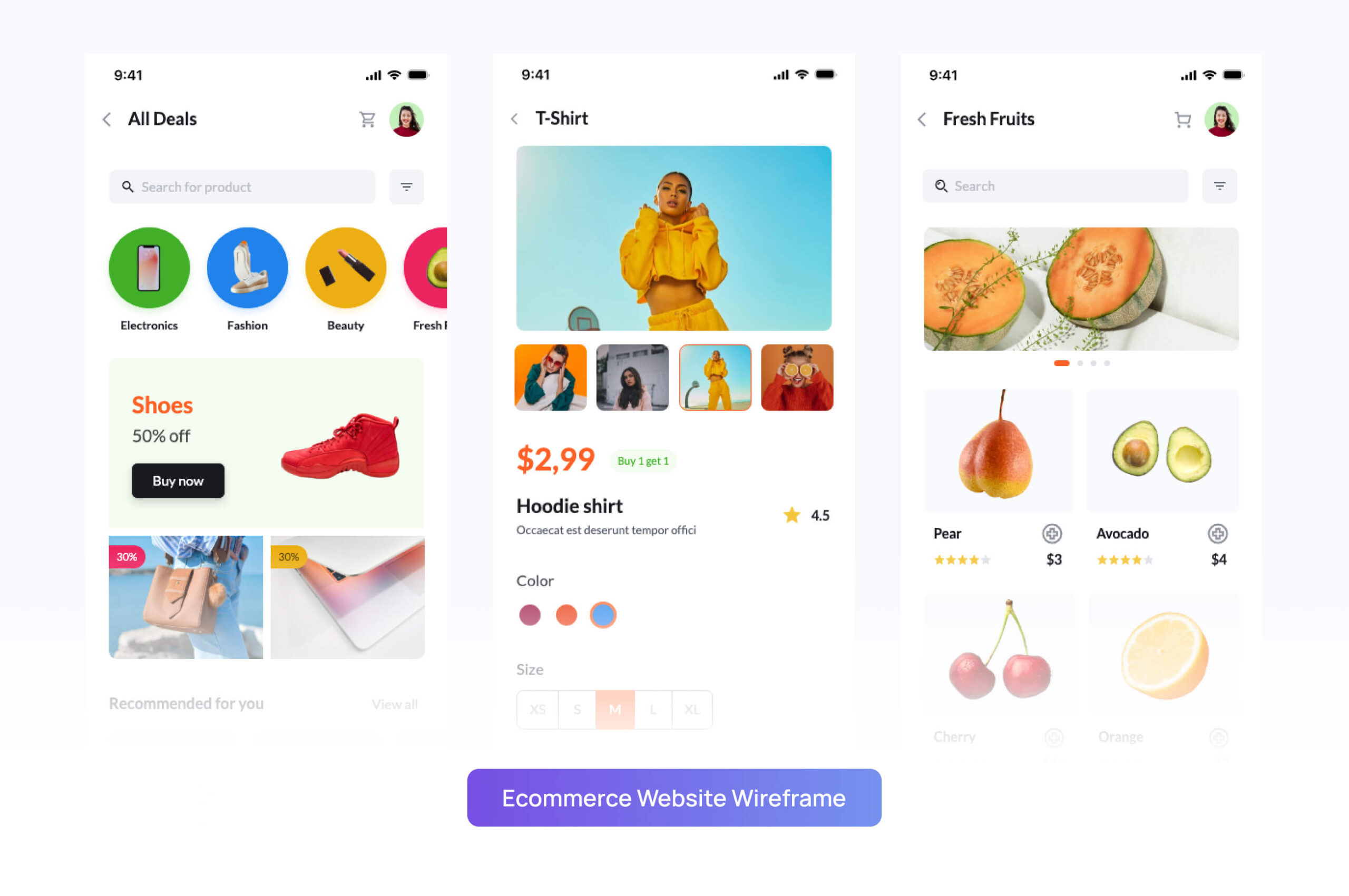
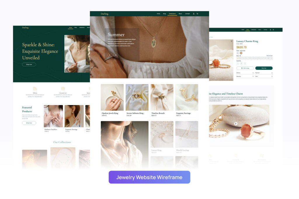
High-Fidelity Wireframe Examples 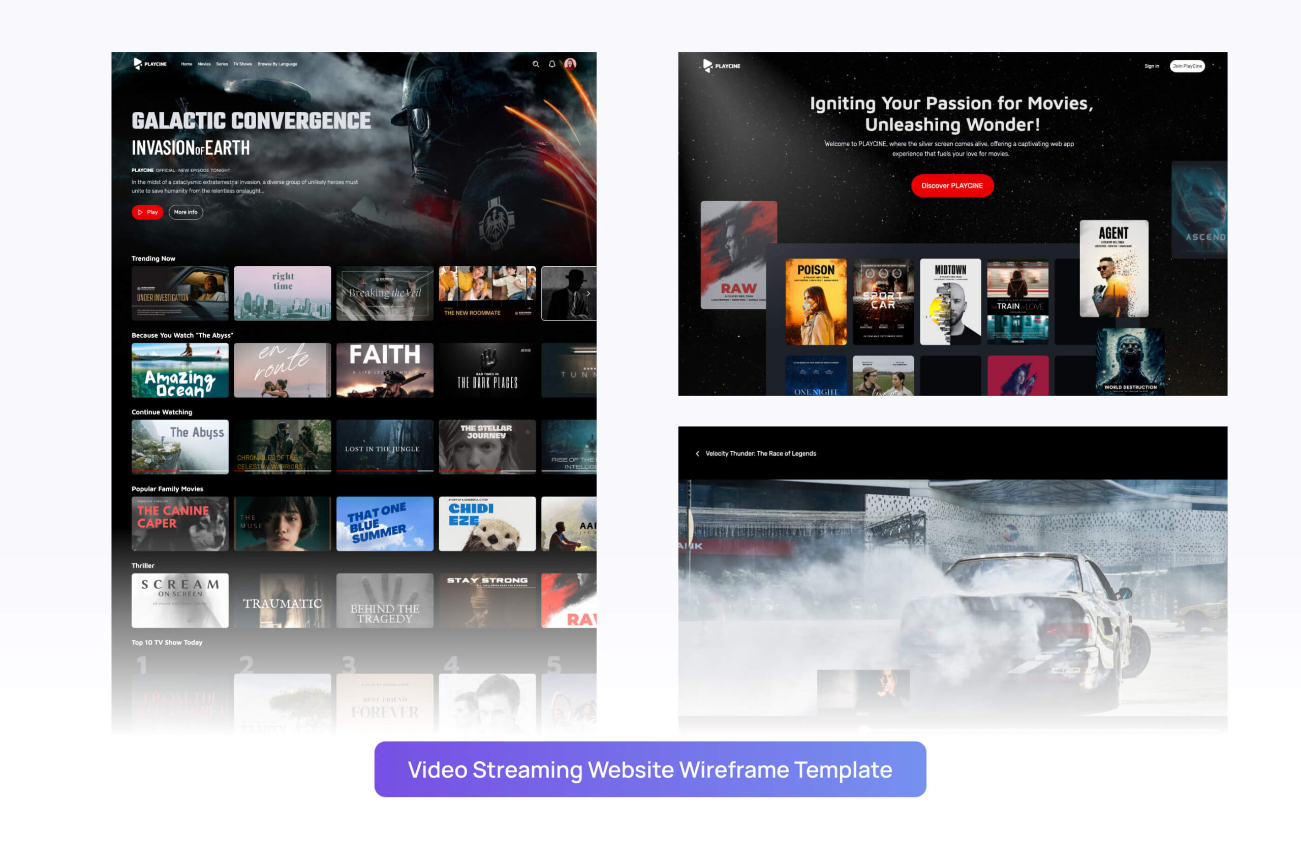
Video Streaming Website Wireframe Template
When to Use Hi-Fi Wireframes?
Deciding when to use hi-fi wireframes in your design process depends upon numerous factors. Here are ten instances when employing hi-fi wireframes is helpful:
- Usability Testing: The interactive nature of hi-fi wireframes allows for comprehensive usability testing. Users can interact with the interface, providing valuable feedback.
- Client Presentations: Hi-fi wireframes create a visual representation that is closer to the final product. This helps clients understand the vision and functionality of the design.
- Stakeholder Approval: Stakeholders can get a better grasp of the end project with a hi-fi wireframe, enabling them to provide more precise feedback.
- Developers Guideline: Detailed hi-fi wireframes can act as a useful guide for developers, showcasing how each component should function and appear.
- Designer Collaboration: They aid in collaboration between designers, providing a detailed roadmap for consistency across all design stages.
- Marketing Plans: Hi-fi wireframes can support in drafting marketing strategies by giving the marketing team an idea of what the final product would look like.
- Investor Pitches: They can be used in investor pitches, offering a realistic example of what investors are putting their money towards.
- Training Material: Hi-fi wireframes can be used to train customer support and sales teams before the product launches, preparing them for potential user inquiries and sales pitches.
These instances justify the versatility of hi-fi wireframes as powerful visual representation tools in the design process.
Advantages of Hi-Fi Wireframes
Hi-fi wireframes come with an array of benefits for both the design team and the overall project outcome. Let’s examine some of these advantages:
- Detailed Specifications: High-fidelity wireframes offer more comprehensive visual representation, including specific color schemes, typography, graphics, and interactions.
- Effective Communication: These wireframes serve as an effective communication tool, conveying the design ideas and interactivity more effectively to stakeholders, developers, and clients.
- Improved Usability Testing: Hi-fi wireframes include interactive elements, enabling a realistic end-user experience during usability testing. This leads to more accurate feedback and better design improvements.
- Greater Accuracy: The depth of detail in these wireframes reduces ambiguity, providing clear visual guidelines for developers and designers.
- Enhanced User Experience: They result in a better user experience, as the meticulously detailed design elevates the overall aesthetics and effectiveness of interface interaction.
- Efficient Feedback Loop: Stakeholders and clients can provide useful feedback during the design phase, saving precious time and resources in rectifying issues that might occur in later stages.
- Effective Marketing Tool: Hi-fi wireframes can also be used for sales and marketing. They help in creating powerful presentations for potential clients or investors.
High-fidelity wireframes help create a more robust and interactive design while enhancing collaborative efforts, allowing for precisely targeted feedback and swift design improvements.
Low Fidelity vs. High Fidelity Wireframe: What’s the difference?
Both low-fidelity (lo-fi) and high-fidelity (hi-fi) wireframes constitute integral parts of the wireframing process, serving different but equally important purposes at different stages of design and development.
Let’s compare low-fidelity (lo-fi) and high-fidelity (hi-fi) wireframes in the context of the design process.
- Level of Detail: Lo-fi wireframes are simpler, bare-boned, and clean with basic detailing. They focus on functionality, structure, and navigation. Conversely, hi-fi wireframes are intricate, detailed, and fine-tuned. They encompass specifics such as color, typography, imagery, and interaction details, offering a high level of realism.
- Functionality: In lo-fi wireframes, functions are often represented abstractly, only intended to give a broad overview. In the case of hi-fi wireframes, functionalities are well-defined and made to mimic the final design as closely as possible.
- Purpose: Lo-fi wireframes, being quick and easy to create, are highly useful during brainstorming and early-stage designs. They facilitate fast feedback loops and multiple iterations. Hi-fi wireframes, on the other hand, come into play in the latter stages of design. They are beneficial for conducting accurate usability testing, presenting designs to stakeholders, and providing the development team with a clear vision.
- Time and Resource Investment: Lo-fi wireframes require less time and resources due to their lower level of detail and complexity. This makes them perfect for the initial stages when ideas are more likely to change. Hi-fi wireframes, due to their intricate nature, require more time and are best suited when the design is more refined and the team is moving towards finalizing the product.
- User Testing: Given the abstract nature of lo-fi wireframes, they are less viable for user testing. In contrast, hi-fi wireframes enable realistic user interaction, making them ideal for user testing and gathering relevant feedback.
The choice between lo-fi and hi-fi wireframes depends largely on the stage of the project, the level of detail required, and the purpose they need to serve. Both have their unique strengths and play essential roles in the overall wireframing process.
How to Create High-Fidelity Wireframes in Visily?
Follow this easy guide to craft high-fidelity wireframes using Visily, an AI-powered wireframing & design tool:
Step 1: Define the App’s key features
Begin by pinpointing the main features of your app. This initial step will clarify the screens you should design. For instance, if you’re crafting an e-learning platform, you might need screens for course listings, lesson details, progress tracking, and user profiles.
Step 2: Seek inspiration & draft your thoughts
Start by gathering screenshots or exploring designs from other apps for inspiration. This can help you visualize your intended design. If you prefer, you can also draft out basic layout ideas, deciding where buttons, images, and text will be placed.
Step 3: Harness Visily to transform screenshots and templates into editable wireframes
Leverage the power of Visily’s AI. It can quickly convert screenshots and templates into editable wireframes and prototypes. This way, you can begin your design with existing inspirations without building everything from the ground up. Moreover, Visily has diverse templates that can be an excellent starting point for your wireframe journey.
Step 4: Refine your wireframes with specifics
At this stage, delve deeper. Establish a hierarchy for your design elements. Label your buttons. Specify interface components. The aim is to make things as detailed as possible.
Step 5: Link the screens to shape a user flow
Now, bring it all together. Connect your individual screens, crafting a prototype. This allows you to envision how a user will seamlessly navigate from one part of your app to the next.
Final Thoughts
Both lo-fi and hi-fi wireframes serve as fundamental building blocks in the design process. Whether starting from scratch or fine-tuning a design, they provide invaluable insights into the structure, functionality, user journey, and interactivity, aiding the creation of user-centric designs.
If you’re aiming for an efficient, quick, and stunning wireframe creation, Visily is the tool for you. Visily empowers its users to quickly generate beautiful wireframes, cutting down the time and frustration of the traditional design process.
Visily also has an extensive template library of 1,000+ options tailored for different industries, sizes, or screenshots. And coming soon – Visily allows you to create wireframes from plain text prompts! Simply describe what you envision, and Visily’s AI will generate a design.
To seamlessly transition your high-fidelity wireframes into fully interactive prototypes, explore this article, to enhance and streamline your design workflow.
With Visily, you can convert existing UIs into editable designs swiftly and in bulk. What about those traditional, hand-drawn sketches you absolutely adore? Feed them into Visily’s Sketch to Design tool and watch them transform into hi-fi wireframes.



 , check us out


