Introduction – What Is Visual Design in UI/UX?
Some people find themselves admiring an interface without fully grasping why it’s so captivating. Maybe carefully chosen colors interact perfectly, or the spacing guides the eye smoothly from one area to another. That sense of harmony springs from visual design, a craft that shapes how audiences perceive and navigate digital products.
Plenty of folks ask, “What is visual design in UI UX?” Some assume it only covers appearances, while others recognize its deeper impact on interaction and brand character.
A skillful blend of visuals and usability goes beyond meeting a subjective idea of beauty. Emotional resonance, trust-building, and clear guidance all stem from thoughtful execution. Many stakeholders wonder about the difference between UI and visual design, concluding they might be identical.
Another frequent question focuses on the difference between UX and visual design, especially because UX takes on the entire user journey. Each specialty has its own focus, yet all remain tightly bound in current product development.
Designers typically investigate color theory, typography, iconography, and layout tactics. The mission is to produce visually cohesive interfaces that minimize friction, sharpen emotional engagement, and reinforce brand identity.
The importance of visual design in UX extends well beyond flashy components, affecting how quickly individuals accomplish goals and how comfortable they feel about returning. Confusing or mismatched patterns might drive users away, whereas cohesive aesthetics can heighten brand loyalty.
5 principles of visual design in UX
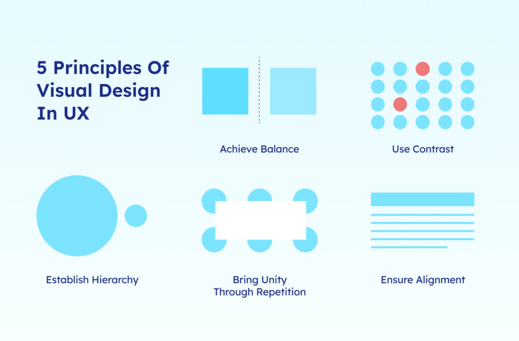
Professionals often highlight foundational guidelines that shape sturdy visual compositions. The following 5 principles of visual design in UX refine how information is displayed and how visitors journey across a screen. A balanced interface respects user attention, while a cluttered one irritates them. Every principle tackles a unique aspect of presentation, making certain that all design components matter.
- Achieve balance by creating a feeling of stability through symmetrical or asymmetrical arrangements. Symmetry tends to create a polished, traditional look, whereas asymmetry injects vibrancy and motion. Both choices can align well with a brand’s style and content flow.
- Use contrast by applying differences in color, size, or shape to draw eyes toward key elements. Bold text headings or vibrant buttons help users spot essential details. That tactic saves them from excessive scrolling.
- Establish hierarchy by guiding viewers from the most important elements to secondary details. Large headlines or bright primary buttons usually stand out first, ensuring a smooth path through available information.
- Bring unity through repetition by reusing colors, fonts, or motifs throughout the design. A cohesive palette builds brand recognition and reassures visitors that every screen ties into one shared identity.
- Ensure alignment by organizing text and objects so everything lines up neatly, avoiding confusion. Aligned edges shape a refined aesthetic, helping visitors scan information without feeling lost.
All of these guidelines connect to clarity, consistency, and user ease. Designers rely on them to craft experiences that weave brand personality with smooth information flow.
Importance of visual design in UX & other key elements
True visual design involves more than surface-level prettiness by merging style and function. Many overlook the importance of visual design in UX, which can lead to user frustration or confusion if neglected.
A well-structured interface minimizes mental effort and allows visitors to lock onto their objectives. Cluttered layouts may force them to search anxiously for key features, unsure if they’re on the correct path.
Color theory, typography selection, iconography, and spacing all shape the overall experience. These elements influence readability, establish mood, and guide a user’s eyes toward relevant sections.
A brand might prefer bold, lively hues to spark energy, or gentle tones to inspire trust. Different fonts convey distinct personalities, and icons can swiftly illustrate options or features.
Several teams rely on Visily’s brainstorming tool to collect ideas about color schemes and thematic direction. That platform keeps discussions organized, encouraging designers, developers, and stakeholders to chime in quickly.
Early refinement of visual design often proves its worth once feedback confirms certain visuals resonate with user preferences. Thoughtful visual design helps a product stand out in competitive spaces, ultimately nurturing trust and loyalty.
Difference between UI, UX & visual design
Long paragraphs can blur subtle distinctions among these abbreviations. But, remember that each field contributes unique value:
- UI Design focuses on how interactive elements, such as buttons or sliders, perform and feel.
- UX Design analyzes the broader user journey, including discovery, usage flow, and emotional takeaways.
- Visual Design hones in on color palettes, typography, and overall aesthetics that define the brand’s presence.
The difference between UI and visual design rests on function versus style, even though they overlap.
The difference between UX and visual design orbits around the bigger picture of user research and satisfaction. All three roles intertwine in modern product teams to produce cohesive and meaningful experiences.
Best practices for implementing visual design in UI/UX
Momentum in visual design typically grows from clarity and consistency. A few suggestions might help craft a successful layout:
- Maintain clarity over clutter by keeping designs simple so users focus on key elements.
- Do not overload screens with flashy visuals as they can push visitors away from crucial actions.
- Establish clear hierarchy by guiding users to essential actions or information.
- Larger headings or strategic placement help highlight main tasks, reducing confusion.
- Ensure consistency by sticking to uniform fonts, colors, and icon styles for familiarity.
- Uniform design language lowers guesswork and invites trust.
- Test color contrast by checking readability, especially for those with visual impairments.
- Strong contrast settings keep text legible and respectful of diverse needs.
- Be inclusive by considering diverse screen sizes and accessibility needs.
- Adaptive layouts and accessible design expand reach and user satisfaction.
Some prefer using Visily’s wireframe tool before finalizing visuals, which helps spot structural flaws early. Iteration and feedback often ward off major reworks down the line.
Trends in visual design for UI/UX (2024 and beyond)
Forward-thinking brands watch evolving design trends to keep interfaces fresh without alienating users. Rapid technological changes, user preferences, and cultural movements influence these directions:
- Embrace minimalism with bold accents by combining clean designs and vibrant colors.
- Lean compositions place the spotlight on significant features, while eye-catching hues bring personality.
- Incorporate micro-interactions by adding subtle animations that enrich user engagement.
- Tiny gestures or transitions reveal a thoughtful approach to detail, encouraging users to explore further.
- Adopt 3D illustrations to add depth and intrigue to modern layouts.
- Three-dimensional images create visual impact but must remain mindful of performance constraints.
- Prioritize inclusive design by ensuring readability through better contrast and scalable typography.
- Accessibility fosters inclusivity, preventing potential frustrations.
- Use AI-driven design with Visily’s AI design feature to expedite mockups and spark creativity.
- Automation can simplify tedious tasks and free designers to focus on innovation.
Not every brand or industry calls for the latest design trend. A considered approach blends new ideas with a product’s identity and user expectations.
How visily overcomes the challenges of visual design in UI UX?
Visual creation sometimes runs into deadlines, edits from multiple angles, and ever-changing requirements. Visily addresses core obstacles with an integrated toolbox:
- Facilitate integrated collaboration by using the collaboration hub to consolidate real-time feedback.
- Everyone stays on the same page, reducing confusion over multiple design versions.
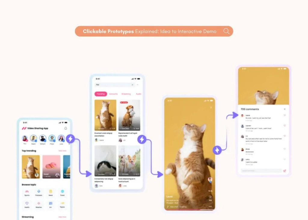
- Enable interactive prototyping by turning static designs into clickable demos with the prototyping tool.
- Testing real flows reveals potential friction spots long before launch.
- Offer ready-made templates by providing a UI template library for cohesive patterns.
- Prebuilt layouts speed up the process and preserve style consistency.
Teams of different sizes benefit from an all-in-one platform that keeps brand identity intact while allowing flexibility. Clear feedback channels and swift iteration cycles pave the way toward well-crafted solutions.
Conclusion
Visual design holds a significant place in UI/UX. Even small details like spacing, color contrast, refined typography, and logical alignment elevate an interface beyond average. The difference between UI and visual design hinges on function versus aesthetics, but they often intertwine.
Meanwhile, the difference between UX and visual design highlights how visual design resides within the broader realm of user satisfaction, troubleshooting, and emotional rapport.
A well-executed design strategy balances brand personality with user demands, resulting in experiences that look engaging and function flawlessly. The importance of visual design in UX goes beyond superficial polish since many users instantly judge an interface based on how it presents itself.
Mastering key concepts such as balance, hierarchy, and consistency transforms seemingly complex tasks into manageable, appealing journeys that keep people coming back.
Ready to elevate your team’s design workflow? Visily offers advanced brainstorming, wireframing, and collaboration features in one unified platform. Those capabilities simplify the process of building memorable interfaces, accelerating iteration cycles, and ensuring design cohesion. Embrace a smoother path toward intuitive user experiences by checking out everything Visily has to offer.
Visual UX guide: essential design questions explained
What are the 5 visual design principles in UX UI?
Balance, Contrast, Hierarchy, Repetition, and Alignment. Each one clarifies the structure and directs user attention.
What is a visual UI designer?
A specialist who curates the overall look and feel of interfaces by combining color, typography, layout, and brand guidelines.
What is visual design in UX design?
An approach that focuses on how aesthetics—such as color, fonts, and imagery—enhance usability and emotional appeal.
What are the 7 pillars of UX design?
Useful, Usable, Findable, Accessible, Desirable, Credible, and Valuable. These dimensions ensure a comprehensive user experience.
Why do some teams merge UI design vs visual design roles?
Smaller organizations may assign both tasks to one person, streamlining decision-making and maintaining aesthetic consistency.


