Many designers have come across terms like honeycomb definition, honeycomb meaning, or definition of honeycomb, but wonder how these ideas connect to user experience. Peter Morville’s User Experience (UX) Honeycomb offers a framework that clarifies what matters most in user experience.
Each “cell” points to a key dimension of product quality, reminding teams to address crucial factors from utility to credibility. Setting aside the buzzwords for a moment, a closer look reveals how the UX Honeycomb helps designers, developers, and stakeholders deliver experiences that resonate with real people.
Peter Morville introduced the Honeycomb UX model to organize seven distinct aspects of UX design honeycomb, each addressing a specific question about how users interact with products.
People often see the phrase honeycomb design or honeycomb designs, but may not realize it symbolizes the structure that holds everything together.
Morville’s takeaway was simple: design requires more than just aesthetics. Usability, accessibility, desirability, and other elements play a central role in whether users feel satisfied.
What is the UX Honeycomb?
The User Experience Honeycomb is a visual representation that outlines seven core facets of a successful user experience. Each facet highlights a user-focused principle, urging designers to consider utility, usability, desirability, findability, accessibility, credibility, and value.
Seeing all seven in a honeycomb shape underscores how every piece works with the others. Energy flows from one cell to the next, ensuring that no element gets overlooked.
Who is Peter Morville, the author of the UX Honeycomb?
Peter Morville is an information architecture pioneer credited with creating the famous Honeycomb User Experience framework. Users might know him from his books on information design and findability strategies. Many in the UX community consider him a thought leader who emphasizes clarity, structure, and empathy in digital experiences. That holistic view inspired the UX Honeycomb, which remains relevant in modern design conversations.
Understanding the 7 elements of the UX Honeycomb
The definition of Honeycomb typically refers to a structure made of cells arranged in a hexagonal pattern, but here it stands for something bigger. Each of the seven elements in UX Design Honeycomb covers a crucial dimension of user experience, shaping how products deliver on user expectations.
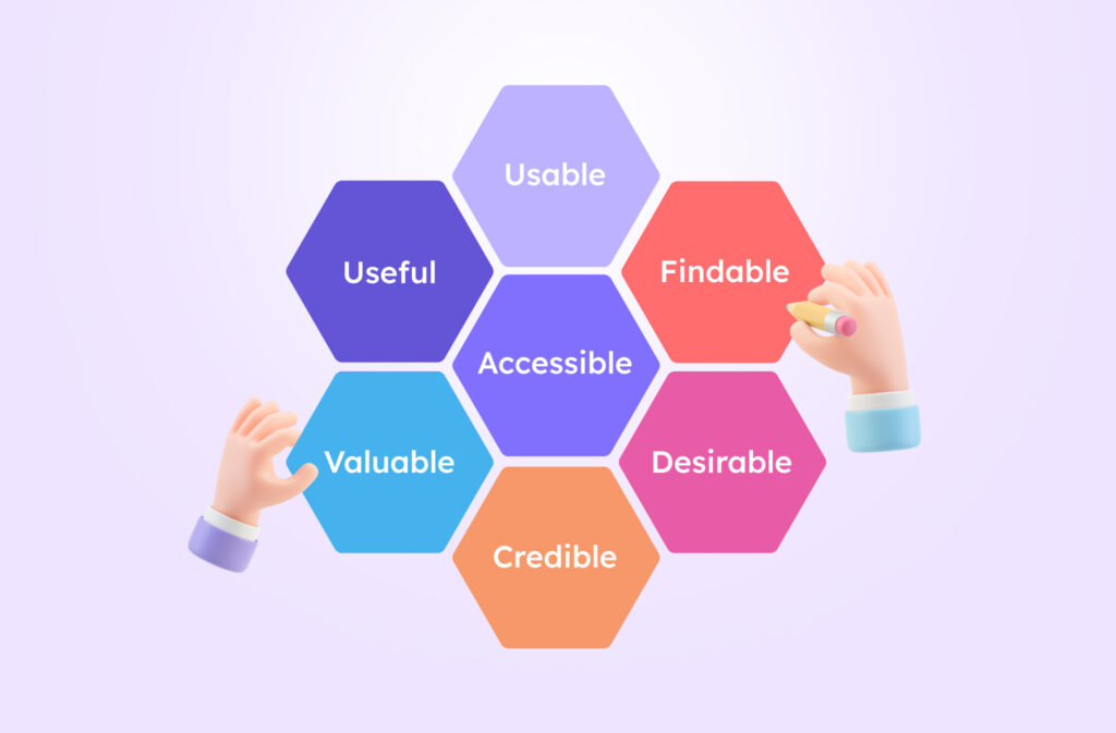
Peter Morville named them: Useful, Usable, Findable, Accessible, Desirable, Credible, and Valuable. Thinking about them as connected “cells” helps us see how each attribute informs the others.
Below are the seven elements and why they matter:
- “Useful” addresses whether the product solves a real problem or meets a genuine need. Many designs fail because they look great but offer nothing of true value. That is why teams ask, “Does this feature help users accomplish their goals?” That question sits at the heart of “useful” in the context of the User Experience Honeycomb.
- “Usable” focuses on how easy it is for people to navigate and interact with a design. Clunky interfaces frustrate users, so teams test layouts, flows, and labels to ensure tasks can be done without confusion. Imagine a labyrinth of menus versus a smooth, intuitive interface; usability often makes or breaks the experience.
- “Findable” highlights the importance of users locating what they need, whether it’s information, products, or features. Sorting content logically and providing robust navigation ensures nobody feels lost. That might involve careful categorization, search functionality, or content tagging that surfaces relevant results quickly. A scattered design undermines findability and discourages users from exploring further.
- “Accessible” asks whether people of varying abilities or circumstances can use the product effectively. That might mean ensuring good contrast for text, keyboard navigation for users who can’t use a mouse, or descriptive alt tags for images. Accessibility opens the door for a wider audience and aligns with ethical design principles.
- “Desirable” looks at emotional appeal and aesthetic attraction. People often choose products based on how they feel about them, so inspiring positive emotions can foster loyalty. Visual design elements, brand storytelling, and interactive flourishes all play into this aspect of the Honeycomb UX. Bland interfaces might function, but they rarely delight!
- “Credible” covers the trustworthiness and legitimacy of a product or brand. Skepticism arises quickly if the content appears outdated, misleading, or riddled with errors. Visual cues like professional design or authoritative tone can boost credibility. Clear contact information and social proof also reassure users that they’re in capable hands.
- “Valuable” zooms out to assess how the product supports user goals and business objectives simultaneously. A design might be fun to use, but does it deliver tangible benefits for both the user and the organization? When all elements of the Honeycomb UX work together, value emerges naturally and fosters long-term loyalty.
Why use the UX Honeycomb? Practical applications
Many UX teams adopt the UX Honeycomb as a checklist for product quality. That approach clarifies project requirements early on and reduces guesswork. Each cell in the Honeycomb design offers a lens to evaluate decisions, from how content is structured to the overall brand image.
Such an approach also helps stakeholders communicate goals more effectively since everyone can talk about whether something is usable, accessible, or valuable without confusion. A quick reference to the Honeycomb meaning can keep discussions on track.
Tools like Visily make it simpler to align each Honeycomb element with your design choices. Teams can start projects using the brainstorming feature to gather initial ideas.
The wireframe tool offers a space for exploring layout options, ensuring content is findable and usable from the start. The prototyping feature allows teams to test interactive flows, checking if each cell of the Honeycomb UX holds up. Even advanced features like AI design can accelerate the process, guiding you toward well-structured interfaces.
Collaboration often becomes easier using Visily’s collaboration options. Everyone from product managers to developers can review the design in real time, commenting on aspects like accessibility or credibility.
That feedback loop directly supports Honeycomb designs, ensuring no pillar gets ignored. Streamlined collaboration also keeps momentum high, preventing bottlenecks that could derail timelines.
Takeaway
The Honeycomb User Experience reminds us that effective UX involves more than just snazzy visuals. Each cell signals a bigger question about value, trust, usability, or accessibility.
Peter Morville’s framework resonates with teams looking to build products that users truly love. Those aiming to weave each honeycomb facet into their workflow may find that tools like Visily make the journey smoother. A balanced approach to Honeycomb design results in experiences that leave a lasting impression.
Real-world example: E-commerce website
An e-commerce site illustrates how each Honeycomb UX facet works in practice. Think of a clothing retailer that wants to boost online sales.
- “Useful” means the store offers items people actually want, from everyday wear to special occasion outfits.
- “Usable” ensures that shoppers comfortably navigate product categories and checkout without confusion.
- “Findable” includes robust filters, search tools, and clear categorization so nobody wastes time hunting for the right size or style.
- “Accessible” means images have alt text and buttons can be used with assisted technologies.
- “Desirable” comes from an appealing layout, brand storytelling, and that spark of joy when a shopper sees an outfit they love.
- “Credible” might involve secure payment gateways, visible return policies, and honest reviews.
- “Valuable” ties everything together, ensuring the store meets user needs and business goals in a balanced way.
Common pitfalls
Some teams get excited about visuals and forget about the deeper layers of Honeycomb User Experience.
Oversight in “accessible” or “usable” leads to frustration for certain user groups. Others concentrate heavily on “useful” while ignoring brand personality, making the product functional but bland.
Another pitfall occurs when “credible” is undervalued, resulting in a mismatch between brand messaging and actual user perceptions. Balancing each cell fosters trust and delight across the board.
Linking the Honeycomb to project management
Project managers sometimes question how Honeycomb designs fit into timelines and budgets. Mapping each cell to a project milestone can align cross-functional teams: design, development, marketing, and more. Sprints might focus on usability testing, then shift to accessibility fixes, ensuring no element gets neglected.
An early conversation about Honeycomb’s meaning clarifies the scope from the outset. Everyone knows what useful entails, or which metrics measure valuable. Milestones become more purpose-driven with that shared understanding.
Honeycomb as a team communication tool
Conversations about user experience can get muddled with jargon or differing priorities. The definition of Honeycomb keeps discussions grounded since each cell is straightforward yet impactful. A developer can raise accessibility concerns, a marketer can champion desirability, and a designer can verify usability.
Having a common language saves time and reduces conflict because everyone agrees on what the Honeycomb design demands from them. That synergy is reflected in the final product, amplifying its effectiveness.
Using AI to enhance the Honeycomb
Artificial intelligence sometimes feels intimidating, but tools like Visily’s AI design show how machine learning can simplify iterative tasks.
A feature that auto-generates layout suggestions might boost usable and findable aspects because it identifies best practices faster than manual guesswork. That doesn’t replace creativity or empathy.
The human touch remains irreplaceable for ensuring “desirable” or “credible.” AI simply offers a head start, letting teams refine designs with more confidence.
Better brainstorming with collaborative tools
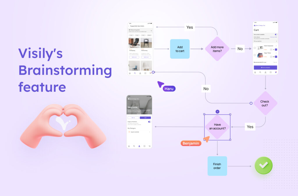
Brainstorming often sparks the initial ideas that shape how each Honeycomb cell takes form. Tools like Visily’s brainstorming feature give teams a digital canvas for gathering inspirations, user insights, or brand concepts.
Early sketches might highlight “useful” aspects, while comments from stakeholders question “valuable.” That synergy ensures big ideas don’t get lost before the project moves into wireframing. Quick references to the Honeycomb mean keeping everyone aligned on overall objectives.
Scaling the Honeycomb for large projects
Large organizations might wonder if Honeycomb designs work when dozens of teams and multiple managers handle one product. The Honeycomb model can scale surprisingly well because each cell addresses fundamental user needs.
An enterprise website with massive content libraries can break down tasks into “usable” guidelines, “findable” structures, or “credible” editorial standards. Product owners oversee “valuable” metrics, tracking how well the platform meets user goals and aligns with business outcomes.
Frequent checkpoints allow for adjustments before a problem snowballs. That approach ensures consistency across different sub-teams, each responsible for a piece of the puzzle. Having a shared Honeycomb definition unifies efforts at every scale.
Maintaining a Honeycomb mindset post-launch
Product launches sometimes feel like an endpoint, but the UX Honeycomb encourages continuous evolution. Real-world feedback might reveal that a feature isn’t as “useful” as anticipated, or that certain accessibility issues persist.
A review cycle guided by UX Design Honeycomb helps prioritize tweaks that keep the user at the forefront. Ongoing measurements of user behaviors, such as bounce rates or dwell time, can pinpoint whether “desirable” is faltering.
A product that addresses these signals quickly remains competitive in crowded markets. Reassessing each Honeycomb User Experience cell ensures the product grows with evolving user needs. That mindset fosters a culture of continuous improvement, where success isn’t static but adaptive.
Blending with other approaches
Certain teams combine UX Honeycomb principles with models like Double Diamond, gaining both high-level vision and day-to-day practicality. That synergy fosters design consistency and deeper insight.
Modern Honeycomb Design: expert questions explained
What are the 7 pillars of UX design?
They are Useful, Usable, Findable, Accessible, Desirable, Credible, and Valuable. All seven form the core of the UX Honeycomb framework.
What is the meaning of Honeycomb design?
The phrase Honeycomb design refers to a hexagonal structure that represents crucial aspects of user experience. Each cell highlights a key factor like usability, desirability, or credibility.
What is the Honeycomb design process?
That process uses each Honeycomb cell as a lens for refining a product’s UX qualities. Teams evaluate the usefulness, accessibility, and more before finalizing designs.
What does “useful” mean in the context of the UX Honeycomb?
‘Useful’ indicates the product solves a genuine need or addresses a real user problem. It focuses on whether each feature delivers tangible benefits to its audience.
What does “usable” mean in the context of the UX Honeycomb?
‘Usable’ means people can navigate and complete tasks without confusion or barriers. It emphasizes clarity, efficiency, and overall ease of interaction.


