Introduction
Hey there, digital enthusiasts! Are you ready to dive into the world of user interface (UI) design? Whether you’re a seasoned pro, a beginner, or just curious about creating engaging digital experiences, understanding the key elements that make up a user interface is crucial.
UI elements are the visual components that users interact with when using a digital product, such as buttons, forms, and menus. You can think of them as the building blocks of any digital experience. When put together correctly, they create a seamless and delightful user experience.
In this article, we’ll explore the essential UI elements everyone should know, from input and output elements to navigational and grouping components. We’ll also discuss how these elements fit into the overall design process and how they contribute to the elements of user experience.
By the end of this guide, you’ll have a solid understanding of the UI design fundamentals and be well on your way to creating stunning user interface design diagrams that users will love.
Understanding UI elements
Before we dive into the specific types of UI elements, let’s take a moment to understand what they are and why they matter.
You can classify UI elements into four main categories:
- Input elements
- Output elements
- Navigational elements
- Containers and grouping elements
Each of these categories plays a crucial role in creating a cohesive and intuitive user experience. Understanding the purpose and best practices for each type of element will better equip you to create user interfaces that are both effective and engaging.
UI elements are not just about visual design; they also play a crucial role in interaction design and information architecture.
Carefully considering how users will interact with each element and how those elements fit into the overall structure of your interface can help you create user experiences that are both intuitive and efficient.
Essential input UI elements
Input elements are the components that allow users to enter information or interact with your interface. Let’s take a closer look at some common input elements:
- Text fields are the most basic input element. Users can enter text, such as their name or email address, into these fields. When designing text fields, use clear labels and placeholders to guide users on what information to enter.
- Buttons can be used to initiate an action, such as submitting a form or navigating to a new page. Make sure your buttons are clearly labeled and visually distinct from other elements on the page.
- Checkboxes and Radio Buttons allow users to select one or more options from a list, providing a selection UI box. Checkboxes are used for multiple selections, while radio buttons are used for single selections. Use clear labels to indicate what each option represents.
- Dropdown menus present a list of options without cluttering up your interface, making them a great box UI element. When designing dropdown menus, use clear labels and organize options in a logical order.
When designing input elements, always consider factors such as accessibility, usability, and clarity. You should ensure that your input elements are easy to understand and interact with, regardless of the user’s device or abilities.
Input elements are a crucial part of the ultimate web UI set, as they enable users to provide the necessary information to fulfill functional requirements.
Common output UI elements
Output elements are the components that display information to users, such as text, images, and videos. Here are some common output elements:
- Text is the most fundamental output element, conveying information to userss. When designing text, consider factors such as font size, color, and hierarchy to ensure readability and clarity.
- Images are a powerful way to communicate information and add visual interest to your interface. When using images, make sure they are high-quality and relevant to the content.
- Videos can be a great way to engage users and provide additional context or information. When using videos, consider factors such as length, resolution, and accessibility.
- Progress bars indicate the status of a process, such as downloading a file or completing a survey. When designing progress bars, make sure they are clearly labeled and provide accurate information.
You should design output elements with the user in mind. Consider factors such as readability, accessibility, and relevance to ensure that your output elements effectively communicate the intended information. Output elements are an essential part of the components of user experience, as they help users understand and engage with your digital product.
Navigational UI elements
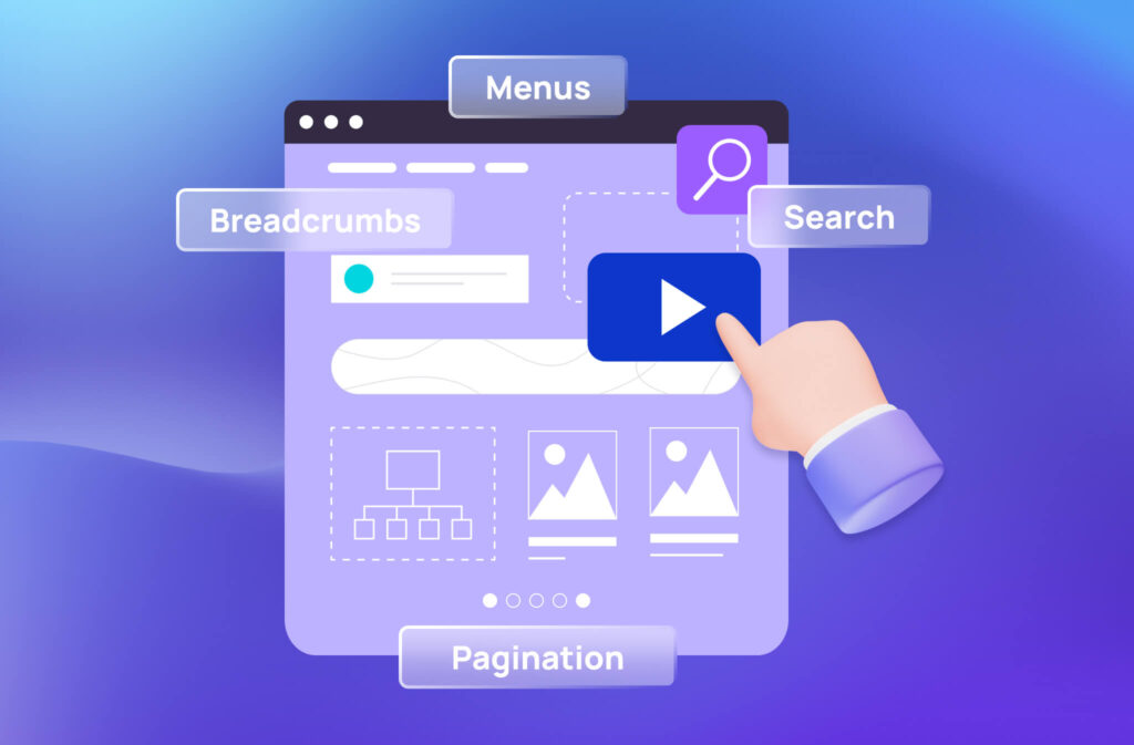
Navigational elements are the components that allow users to move through your interface and access different sections or pages. Some common navigational elements include:
- Menus are lists of options that allow users to navigate to different sections or pages of your interface. When designing menus, consider factors such as organization, labeling, and accessibility to ensure users can easily find what they are looking for.
- Breadcrumbs are a type of secondary navigation that shows users their current location within a hierarchy of pages. When designing breadcrumbs, make sure they are clearly labeled and provide a logical path for users to follow.
- Pagination divides content into multiple pages, allowing users to navigate through large amounts of information. When designing pagination, consider factors such as the number of options per page, the placement of navigation controls, and the use of clear labels.
- Search is a powerful navigational tool that allows users to quickly find specific information within your interface. When designing a search bar, consider factors such as the placement of the search bar, the use of autocomplete or suggestions, and the presentation of search results.
Well-designed navigational elements help users find what they’re looking for quickly and easily. The elements should be intuitive, consistent, and accessible, ensuring that users can navigate your interface without confusion or frustration. Navigational elements are a crucial part of interaction design, as they determine how the user interacts with your digital product.
Helper and informational elements
In addition to input, output, and navigational elements, helper and informational elements provide additional context or guidance to users. Some common helper and informational elements include:
- Tooltips are small pop-up messages that provide additional information about an element when a user hovers over it. When designing tooltips, make sure they are concise and relevant to the element they are associated with.
- Notifications are messages that alert users to important information or updates. When designing notifications, consider factors such as placement, frequency, and tone to ensure they are effective without being intrusive.
- Validation messages provide feedback to users when they have entered incorrect or incomplete information. When designing validation messages, make sure they are clear, specific, and provide guidance on how to correct the issue.
- Help and documentation provide additional resources and information to users who may need assistance or guidance. When designing help and documentation, consider factors such as organization, clarity, and accessibility to ensure users can easily find the information they need.
You should design helper and informational elements to support and enhance the user experience. The elements should be clear, concise, and easily accessible, providing users with the information they need to effectively interact with your interface.
Helper and informational elements are an essential part of the elements of user experience, as they help users understand and navigate your digital product.
Containers and grouping elements
Containers and grouping elements are used to organize and structure content within your interface. Some common containers and grouping elements include:
- Cards are a versatile UI element that can be used to group related information or actions. When designing cards, consider factors such as layout, hierarchy, and visual style to ensure they are effective and engaging.
- Tabs organize content into separate sections within a single page. When designing tabs, make sure they are clearly labeled and provide a logical grouping of content.
- Accordions present large amounts of content in a compact and organized manner. When designing accordions, consider factors such as labeling, icon usage, and the use of whitespace to ensure they are easy to navigate.
- Modal windows are overlays that appear on top of the main content, typically used for important information or actions. When designing modal windows, consider factors such as size, placement, and the use of clear labels and actions.
Containers and grouping elements help create a clear and organized structure for your content. The elements should be designed to support the overall information architecture of your interface, making it easy for users to find and interact with the content they need.
Containers and grouping elements are an essential part of the ultimate web UI set, as they help to organize and present content in a logical and user-friendly manner.
Putting it all together
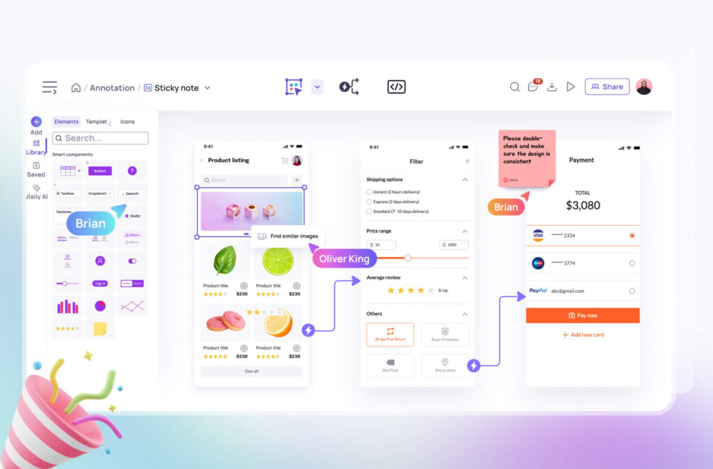
Now that we’ve covered the essential UI elements, you might be wondering how to put them all together. The key is to create a cohesive and consistent design system that guides users through your interface. That’s where tools like Visily come in handy.
With features like wireframing, prototyping, and collaboration, Visily makes it easy for anyone to design and iterate on their UI, ensuring all the elements work together seamlessly.
Our intuitive tools and templates can help you create professional-looking interfaces in no time.
When designing your interface, keep the following best practices in mind:
- Maintaining a consistent visual style and interaction patterns throughout your interface helps create a cohesive experience and reduces cognitive load for users.
- Using visual hierarchy to guide users’ attention to the most important elements on the page can be achieved through factors such as size, color, and placement.
- Keeping your interface simple and intuitive is key. Avoid cluttering your design with unnecessary elements or information, and make sure each element serves a clear purpose.
- Designing your interface with accessibility in mind includes factors such as color contrast, font size, and keyboard navigation. Ensuring that your interface is accessible to all users is not only a best practice but also a legal requirement in many cases.
- Always keeping the user in mind when designing your interface means considering factors such as user goals, needs, and preferences, and designing your interface to support and enhance the user experience.
Following these best practices and leveraging the power of tools like Visily will set you on the path to creating interfaces that are both effective and engaging. Remember, the goal of UI design is to create interfaces that are not only visually appealing but also intuitive and user-friendly.
Conclusion
Congratulations! You now have a solid understanding of the essential UI elements and how they work together to create engaging and intuitive digital experiences.
UI design is not just about individual elements, but how they work together to create a cohesive and enjoyable user experience. Leveraging the power of tools like Visily’s AI-powered design features and UI templates can streamline your design process and help you create interfaces that are both effective and efficient.
As you continue on your UI design journey, keep learning, experimenting, and iterating. Stay up-to-date with the latest design trends and best practices, and don’t be afraid to seek feedback and collaboration from other UX designers in the design community.
With the right tools, knowledge, and mindset, anyone can create amazing user interface designs that delight and engage users. So go forth and design with confidence, and remember, Visily is always here to help you along the way.
User Interface Elements decoded: essential questions
What are the key elements of UI?
The key elements of UI include input elements (e.g., buttons, text fields), output elements (e.g., text, images), navigational elements (e.g., menus, breadcrumbs), and containers and grouping elements (e.g., cards, tabs).
What are the 5 elements of user interface design?
- Input controls
- Navigational components
- Informational components
- Containers
- Action controls
What are the four categories of UI elements?
- Input elements
- Output elements
- Helper and informational elements
- Containers and grouping elements
How to categorize UI elements?
You can categorize UI elements based on their function, such as input elements (for user input), output elements (for displaying information), navigational elements (for moving through the interface), and containers and grouping elements (for organizing content).
What is the difference between UI and UX?
UI (User Interface) refers to the visual elements and interactions of a product, while UX (User Experience) encompasses the overall experience and satisfaction a user has when interacting with a product.
What holds all the elements of a design together?
A clear and consistent design system holds all the elements of a design together. A design system includes guidelines for colors, typography, spacing, and other visual elements, as well as interaction patterns and design elements. Following a design system allows UX designers to ensure that all the elements of a digital product work together seamlessly to create a cohesive and intuitive user experience.
What are some UI elements from the 90s UI?
Some UI elements from the 90s UI include skeuomorphic design elements (e.g., buttons that look like real-world objects), beveled edges, and gradient backgrounds.
While these elements may look dated by today’s standards, they were popular in the early days of web applications and helped to establish many of the UI conventions we still use today.


