Introduction
Tooltips are often considered to be unimportant elements of the user interface but they do have a great power in improving usability. Understanding how to utilize tooltips effectively can greatly enhance your design, offering users guidance without overwhelming them. This article explores practical ways to make the most of tooltips in your projects.
What are Tooltips and why do they matter?
In UI design, the tooltip meaning is a brief, informative message that appears when a user interacts with a UI element, such as hovering over an icon.
These messages provide additional context or explanations, improving the overall user experience. Tooltips enhance feature visibility and accessibility, ensuring that users understand the functionality of various elements without cluttering the interface.
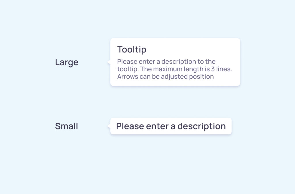
Different types of Tooltips in design
Several types of tooltips can be employed, each serving distinct purposes:
- Basic text tooltips offer simple explanations in text form.
- Interactive tooltips include elements like links or buttons for further action.
- Accessible tooltips that can be moved allow users to reposition them, catering to individual needs.
- Typography with Icon tooltip combines text with icons for a more engaging visual cue.
How to design effective Tooltips?
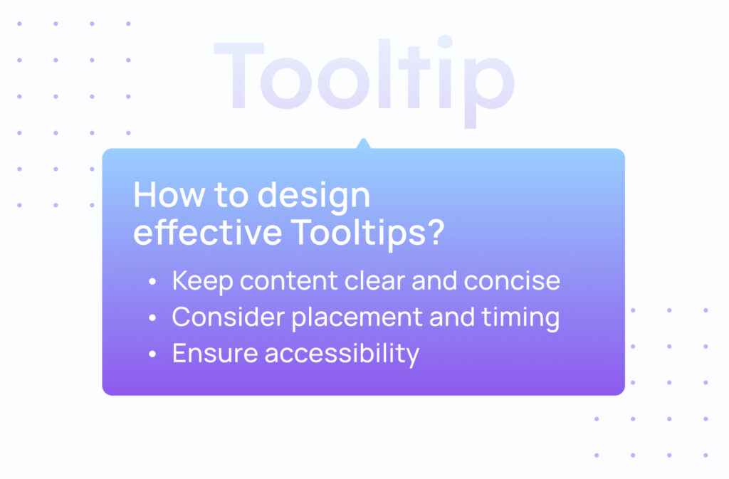
Creating effective tooltips involves careful consideration of several key principles.
Keep content clear and concise
Crafting messages that are straightforward and to the point is essential. Overloading tooltip content with too much information can overwhelm users. Aim for brevity while ensuring the tooltip text conveys the necessary details.
Ensure accessibility
Designing accessible tooltips means they should be usable by everyone, including those relying on screen readers or keyboard navigation. Incorporating feature visibility for accessibility tooltips enhances usability across the board.
- Include ARIA attributes like aria-describedby to link tooltips to their corresponding elements.
- Follow the Web Content Accessibility Guidelines (WCAG) 2.1 and WAI-ARIA specifications to meet accessible tooltip requirements.
- Use proper role=”tooltip” declarations to ensure compatibility with assistive technologies.
Consider placement and timing
Placement is crucial; tooltips should appear close to the element they describe without obstructing important content. Timing also matters—delays can prevent accidental triggers, providing a smoother experience.
- Ensure tooltips appear on pointer hover or keyboard focus.
- Avoid covering essential information when users hover over elements.
Enhancing interaction and accessibility
Maximizing the potential of tooltips involves making them interactive and accessible.
- Keyboard Navigation: Users should be able to access tooltips using the keyboard alone.
- Screen Reader Compatibility: Tooltips need appropriate labels so screen reader users can interpret them correctly.
For assistance in creating accessible designs, consider checking out our Visily’s prototype page, which streamlines the process. You may also watch the video below that showcases tooltip design here:
Can disclaimer text be placed in a Tooltip?
Including disclaimers within tooltips is possible but requires careful handling. Important legal information might be overlooked if tucked away in a tooltip. If choosing to place disclaimer text in tooltip, ensure that it is easily noticeable and accessible to users.
- Use a clear tooltip design to highlight crucial disclaimers.
- Ensure compliance with legal standards when embedding disclaimers in tooltip content.
Common mistakes to avoid in Tooltip design
Avoiding common pitfalls ensures that tooltips serve their intended purpose effectively.
Overusing Tooltips
While tooltips are helpful, excessive use can irritate users. They should augment the user experience, not dominate it. Use them judiciously, only where they add real value.
Neglecting accessibility standards
Ignoring accessible tooltip requirements can exclude users with disabilities. Ensuring compliance with accessibility guidelines such as the Web Content Accessibility Guidelines (WCAG) 2.1 is essential for an inclusive design.
Inconsistent styling
Consistency in design fosters familiarity. Maintaining uniform typography with icon tooltip styles across your application helps users navigate with ease.
Actionable tips for maximizing Tooltip potential
Implementing these strategies can enhance the effectiveness of your tooltips.
- Write messages that are clear and directly address user needs.
- Test tooltips on various devices to ensure they function correctly.
- Regularly update tooltips based on user feedback and evolving needs.
Enhance your design workflow with Visily’s collaboration tools, making teamwork seamless and efficient.
How do Tooltips improve feature visibility?
Tooltips significantly improve feature visibility by providing immediate context. They guide users through unfamiliar interfaces, reducing the learning curve and increasing confidence in using the application.
Making Tooltips accessible to all users
Accessibility is a critical aspect of modern design. To ensure your tooltips are accessible:
- Enable keyboard navigation for users who don’t use a mouse.
- Provide sufficient color contrast between text and background.
- Include ARIA labels such as aria-described for compatibility with assistive technologies and screen reader users.
- Ensure tooltips are triggered on pointer hover or keyboard focus.
- Adhere to the Web Content Accessibility Guidelines (WCAG) 2.1.
Discover how Visily’s wireframing tools can help you create accessible designs from the start.
Conclusion
Tooltips, when thoughtfully implemented, can greatly enhance user experience by providing helpful information without overwhelming the interface. Focusing on clarity, accessibility, and consistent design ensures that tooltips effectively serve their purpose. Applying the tips outlined in this guide can unlock the full potential of tooltips in your designs.
Ready to elevate your projects further? Explore Visily’s prototyping solutions to bring your ideas to life with ease.
Tooltips in digital design: maximizing user engagement
1. Are tooltips beneficial in UX design?
Yes, tooltips enhance user experience by offering additional information subtly, aiding navigation, and reducing confusion.
2. What exactly is a tooltip in UI design?
A tooltip is a brief message appearing when a user interacts with an element, providing extra information or clarification on its function.
3. What advantages do tooltips offer?
They improve feature visibility, support accessibility, guide users through interfaces, and keep designs clean by hiding information until needed.
4. How does a tooltip differ from a hint?
Tooltips appear upon user interaction like hovering, while hints are often visible without any action, offering immediate guidance.
5. How can I ensure my tooltips meet accessibility standards?
Ensure they are keyboard-navigable, compatible with screen readers and assistive technologies, allow users to move them if necessary, and adhere to accessibility guidelines like the Web Content Accessibility Guidelines (WCAG) 2.1 and WAI-ARIA specifications


