Wireframing plays a significant role in the vast universe of design. This key step in the design process allows creative professionals to map out interfaces before development. Wireframing has three types of fidelity: low-fidelity, mid-fidelity, and high-fidelity wireframes.
Each type serves unique purposes and offers advantages. Among them, mid-fidelity wireframes offer an ideal balance between detail and simplicity. The mid-fidelity wireframe emerges as a practical choice in many design scenarios. It introduces graphic elements without overwhelming the viewer with too much information.
In this guide, we will unpack everything there is to know about creating mid-fidelity wireframes.
What is a Wireframe?
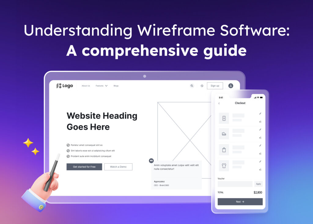
A wireframe acts as a blueprint in the world of web design. This skeletal, three-dimensional model represents a conceptual layout. It’s a tool often used to create website or application wireframes. Its purpose is not to depict the final design. Instead, it focuses on functionality, behavior, and the visual hierarchy of elements.
Designers commonly use a wireframe tool during the planning phase. It helps to ensure that all elements will be placed strategically. It also aids in establishing their interactions and dependencies without the distractions of colors, typeface choices, and other stylistic preferences.
What is Wireframe Fidelity?
Wireframe fidelity refers to the detail level in a wireframe design. It spans from low to high fidelity. There are three levels of wireframe fidelity:
- Low fidelity wireframes
- Mid fidelity wireframes
- High fidelity wireframes
Low-fidelity wireframes are simple sketches. They are typically sketched on paper or using digital wireframing platforms such as Visily.
Medium-fidelity wireframes, on the other hand, are slightly more detailed. They incorporate a bit more information about the layout and function.
High-fidelity wireframes are the most detailed. They are created using digital tools. These represent the actual user interface of a website or an application. They help to gather more valuable feedback from users or stakeholders. Each level addresses different aspects of the design process.
What is a Mid-Fidelity Wireframe?
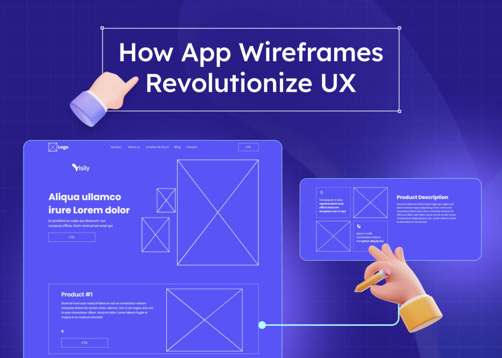
Mid-fidelity wireframes settle in between low and high-fidelity wireframes. They are more detailed than low-fidelity wireframes yet less comprehensive than high-fidelity ones. When creating a mid-fidelity wireframe, you use enough design elements to give an idea of the final layout’s structure and functionality.
This fusion of low and high fidelity allows you to express more design ideas. Unlike the low-fidelity wireframe, a mid-fidelity wireframe incorporates more integrations, functional elements, and interactivity. Unlike the high-fidelity wireframe, mid-fidelity does not contain extreme details like font styles, colors, or images.
This is where the beauty of mid-fidelity wireframes shines. They establish a balance of detail and provide enough insight to encourage constructive feedback. They avoid overwhelming viewers with intricate details.
The mid-fidelity wireframe usually closely resembles the final product. It gives designers, clients, and stakeholders a solid final look and feel concept. It also aids in communicating the key interactions and transitions between screens. If you want to balance the wireframing process, turn to mid-fidelity wireframes for clarity, flexibility, and creativity.
What is the Purpose of Mid-Fidelity Wireframes?
Mid-fidelity (mi-fi) wireframes are like the middle ground in the design world. Mi-fi wireframes are great for non-designers who are not design pros.
Think of mi-fi wireframes as a draft sketch. They show how a website or app might look and work. Without all the fancy details, it’s easy for anyone to look at them and get the big picture.
One of mi-fi’s strong points is showing the content layout. It’s about making sure the main elements are seen first. You don’t need to be a designer to understand this; it’s all about what feels right.
Also, these drafts help map out how users move through a site or app. It’s like connecting the dots, ensuring a smooth journey for the user.
Mi-fi wireframes can be interactive. So, even in this draft phase, you can click through them as if it’s a real site or app. This helps everyone test and give feedback.
People feel more comfortable giving honest suggestions because they look like works in progress. It’s clear it’s a draft, not the final design.
Now, high-fidelity (hi-fi) wireframes are the polished, final look. But mi-fi is the bridge to that, making the design process transparent and easy for everyone to join.
While hi-fi wireframes are the finished art, mi-fi wireframes are the friendly sketches everyone can understand and contribute to.
When Should You Use Mid-Fidelity Wireframes?
Using mid-fidelity wireframes at the right time is crucial for successful design development. These wireframes typically come after you’ve created your initial sketches or low-fidelity wireframes. They refine these early concepts by introducing more accurate depictions and establishing a visual hierarchy.
The appropriate moment to shift to mid-fidelity is when your team has a consensus on the project objectives and layout. It’s useful to have clarity before elevating your wireframes to this level. Mid-fidelity wireframes exhibit a more formal aspect of wireframing. They’re ideal for laying out and presenting ideas.
If your project’s objective or purpose is unclear, it might be wise to stick with low-fidelity wireframes. These are less detailed, easily editable, and better suited for ambiguity or ever-evolving ideas. But when it’s clearer how the design’s structure and function should look, it’s time to create your mid-fidelity wireframes.
For stakeholders who prefer more detail and need to interact closely with the design, consider high-fidelity prototypes instead. They offer a more immersive experience than either mid or lower-fidelity wireframes can provide.
Advantages of Mid-Fidelity Wireframes
Mid-fidelity wireframes offer many advantages in the design process. Here are some key benefits:
- Balance of detail: Medium fidelity wireframes balance low and high fidelity levels. They provide enough detail to capture the design’s architecture without going into the very granular details.
- User flows: Medium-fidelity wireframes are exceptional tools for plotting user flows. They help to understand the steps a user might take to complete a task in the interface design.
- Interactive: Mid-fidelity wireframes can be clickable or interactive. This helps validate the flow and functionality of the product and aids in usability testing.
- Better communication: They serve as an excellent communication tool between designers, developers, and stakeholders. The defined structure and functional elements make the design concept clear to all team members.
- Feedback: Mid-fidelity wireframes promote constructive feedback from users and stakeholders. They are detailed enough to gather insights and abstract enough not to divert attention to design specifics.
- Efficient iteration: Given their moderate detail and polish level, iterations are much faster and economical with medium-fidelity wireframes, resulting in efficient design optimization.
Disadvantages of Mid-Fidelity Wireframing
While mid-fidelity wireframes offer many benefits, they also have certain drawbacks. Understanding these can help you decide when to use them in your design process:
- Time-consuming: Creating medium-fidelity wireframes can be more time-consuming than sketching low-fi wireframes due to the added detail and precision.
- Not fully detailed: While more detailed than low-fi wireframes, a mid-fi wireframe might not capture all the intricate visuals and interactivity of the final product.
- Potential misinterpretation: Mid-fi wireframes occupy a middle ground, which can lead to confusion. Stakeholders might expect them to be fully interactive like hi-fi wireframes, potentially leading to misinterpretations.
- Limited aesthetic representation: Mid-fi wireframes don’t represent aesthetic elements like colors, typography, and images. For projects where visual design is crucial, this could be a limitation.
- Possible overemphasis on the layout: With the increased layout details in medium-fidelity wireframes, there’s a risk of focusing too much on the layout instead of the user flow and function.
- Redundancy: The mid-fi wireframes can become redundant once you move on to high-fidelity wireframes or prototypes. You may need to recreate the design with added details.
Mid-fidelity vs. High-fidelity Wireframes: What’s the difference?
Understanding the difference between medium-fidelity and high-fidelity wireframes is crucial in design. Both play pivotal roles and using them strategically enhances the design outcome.
As the name implies, the mid-fi wireframes occupy an intermediate place in wireframe fidelity progression. They are more detailed than low-fi wireframes, including basic structures, interactions, and, in some cases, a degree of interactivity. The purpose is to express the design’s structure and functionality without delving deep into aesthetic details.
On the other hand, high-fidelity wireframes are more refined and rich in detail. They appear much closer to the final design, including colors, typography, images, and intricate user interactions. Human-computer interaction factors such as reaction times and even error rates start to get analyzed. High-fi wireframes often serve as an interactive prototype to gather comprehensive feedback.
The key difference between the two lies in their level of realism and interactive capabilities. While medium-fidelity wireframes provide a basic, functional overview, high-fidelity wireframes are more polished, interactive, and visually closer to the final product. They serve different purposes in the design process, and knowing when to use each is fundamental to effective UX design.
How to Create Mid-Fidelity Wireframes in Visily?
Here’s a step-by-step guide on how to create mid-fidelity wireframes by using Visily – an AI-powered wireframing & design tool:
Step 1: Define the App’s key features
Start by identifying the main features of your app. This will help you understand what screens you need to design. For example, creating an e-commerce app might require screens for product listings, product details, cart, and checkout.
Step 2: Gather inspiration & sketch out your ideas
Initiate the process by collecting screenshots or seeking inspiration from other apps. Alternatively, sketch your ideas on paper to swiftly visualize your thoughts and make immediate adjustments. Sketch the layout of each screen, including the placement of buttons, images, text, and other elements.
Step 3: Use Visily to turn hand-drawn sketches, app & website screenshots into editable wireframes
Visily’s AI design capabilities quickly transform screenshots and sketches into editable wireframes. This feature allows you to kickstart your design from any source of inspiration, eliminating the need to start from scratch.
Alternatively, explore Visily’s collection of templates as a starting point for your wireframe creation.
Step 4: Add details to your wireframes
Now, you can start adding more details. This includes defining the hierarchy of elements, adding labels to buttons, and specifying other interface elements. To expedite this process, you can take advantage of Visily’s extensive collection of smart components.
Step 5: Connect the pages together to create a flow
Finally, connect your screens together to create a prototype. This shows how users will navigate through your app, from one screen to another.
Final Thoughts
The design process involves varying degrees of wireframe detail, from basic sketches (low-fidelity) to detailed designs (high-fidelity). Each type of wireframe plays a critical role in refining the user experience. At the center of this spectrum, mid-fidelity wireframes provide a flexible approach, allowing for design exploration and defining interactions.
Enter Visily, a game-changing platform that simplifies wireframing across all levels. Whether you’re crafting a basic sketch, a mid-level layout, or a high-definition design, Visily has got you covered.
Not only can you speedily craft mid-fidelity wireframes with Visily, but you can also effortlessly transition between low, mid, and high fidelities. This holistic capability ensures a seamless design journey from the initial idea to the refined final layout.
A highlight of Visily is the Screenshot to Design AI. Imagine taking an existing user interface and instantly converting it into an editable design – that’s the magic of Visily.
Need inspiration? Dive into Visily’s rich template library. With over 1,000 templates tailored for various screen sizes and sectors, your design possibilities are endless. And if you start with a pencil sketch, the Sketch to Design AI will transform your doodles into crisp, high-fidelity designs.
But there’s even more on the horizon. The forthcoming Text to Design AI feature will turn your written ideas into wireframes in real time, bridging the gap between imagination and visualization.
To elevate your design process from mid-fidelity wireframes to complete user interfaces, read our comprehensive guide, which supports every step of your design journey.
Experience the future of wireframing with Visily. And if you’re excited for the launch of Text to Design AI, join the waitlist and be among the first to access this revolutionary feature upon its release.


