TL;DR
- PayBIX is a unified payroll solution for SMEs looking to expand their businesses across Europe. PayBIX’s CTO, Bart Slaets, needed to validate business concepts with customers and communicate UI requirements with his engineering team.
- Visily became Bart’s go-to-tool through its intuitive interface, rich component library and helpful AI features. Despite having no prior design experience, Bart was able to design many screens and flows, including complicated ones like payroll management, dashboard, calendar, and admin portal.
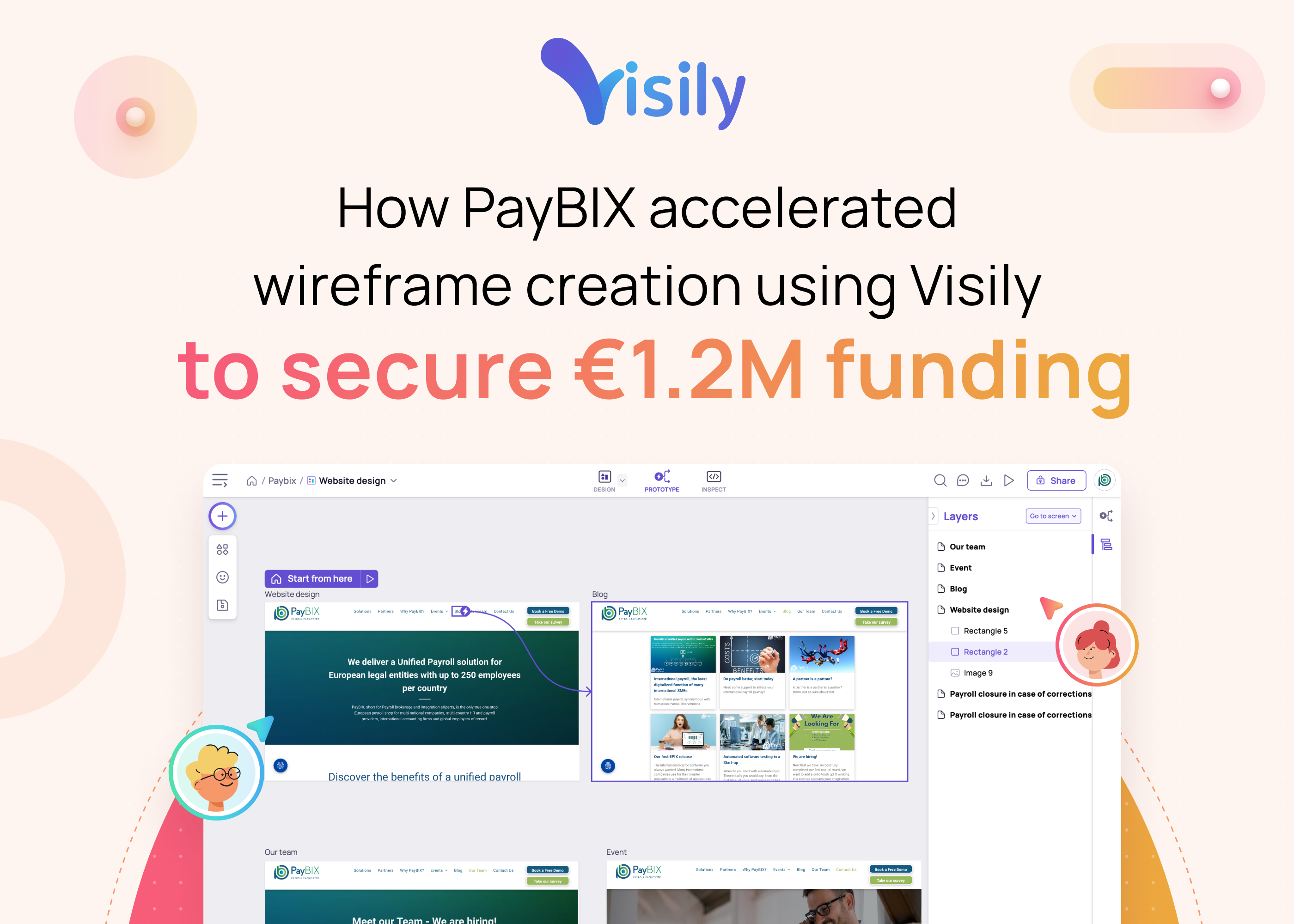
- Visily played a crucial role in helping the PayBIX team effectively communicate their product concepts, design app wireframes and pitch to investors. Within a matter of months, the team was able to secure €1.2M funding to build their software and grow the business.
About PayBIX
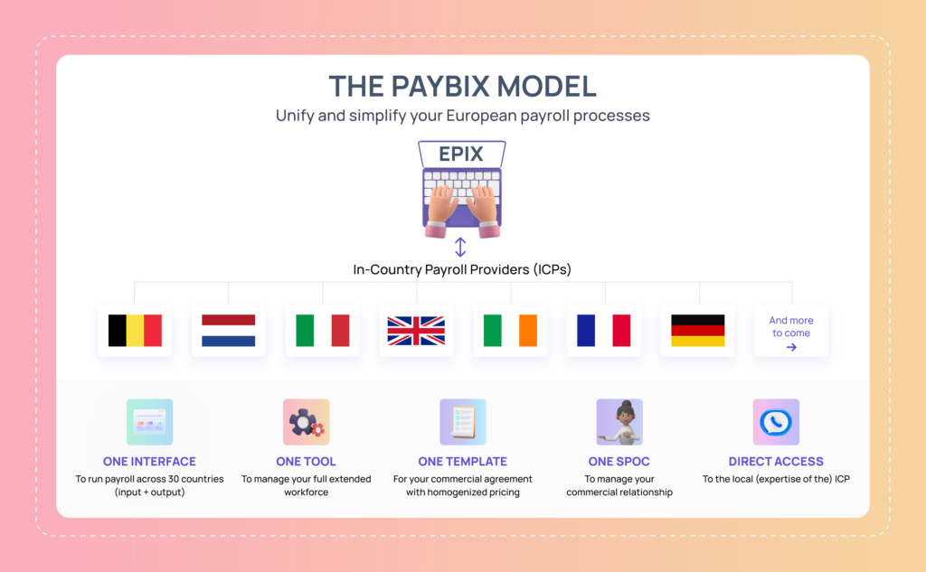
PayBIX provides managed payroll services to SMEs that are looking to expand their businesses across the continent, specifically in 30 European countries. The company builds EPIX, a core HR and digital integration platform that enables Europe-based legal entities with fewer than 250 employees per country to manage their payroll. Additionally, EPIX provides analytics on workforce and labor costs at one’s fingertips. See their next product demo here.
Bart Slaets, CTO at PayBIX, shared with Visily, “I and my two compeers — Hans Joris and Rudi De Roeck, founded PayBIX after realizing two major obstacles that all European SMEs are facing: first, the high cost of purchasing and setting up a payroll management system and second, the complexity of cross-country payroll analytics.”
The challenge
Since its initial release in January 2023, EPIX has been gaining traction with major early adopters. However, like any successful startup, the journey has been a long hard slog, with PayBIX overcoming significant challenges, particularly in relation to selling the product ideas to customers and investors before the product itself was fully developed.
For example, when faced with the challenge of pitching critical features to potential investors and customers, Bart took it upon himself to create wireframes for those features. He sought a UI design tool that would enable him, someone with no UI design experience, to visually conceptualize features and communicate them effectively. Bart also recognized the importance of seamless collaboration with internal and external stakeholders once the product features were added to the roadmap.
And that was how he discovered Visily!
The perfect solution came into play
Bart knew very quickly he had found the compatible tool: “When I first started out with Visily, I just thought ‘a free tool like Visily is perfect for a startup like mine’ but the more I delved into it, the more I realized Visily is way more powerful.”
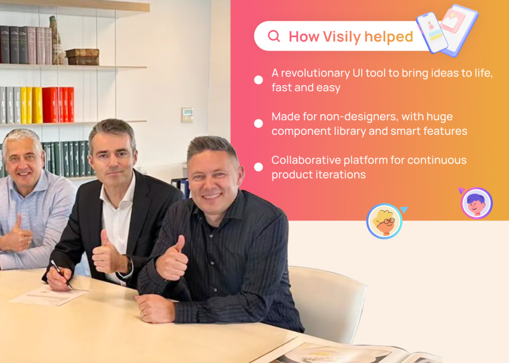
A revolutionary UI tool to quickly bring ideas to life
Back to before their first product release, many EPIX app screens were not yet available. Bart knew if he were to use other software, it could have taken weeks before he could showcase the product wireframes in front of prospective clients and investors.
Bart shared: “Back then, I used to sketch all of my ideas on paper because I couldn’t find any good UI tool to show the rest of what was in my head. Figma, for example, was rather intimidating. Yet the problem with sketching on paper is that if you want to change or tweak something, you must get a new paper and redo everything. But soon after I discovered Visily, I could effortlessly create wireframes and prototypes at amazing speed.”
In fact, Visily proved to be a game changer for PayBIX. With Visily intuitive interface, Bart was able to design app screens very quickly, creating and changing app screens upon discussion with his teammates and even during client presentations.
Furthermore, Bart understood the value of visualizing product ideas, especially when facing numerous user flow decisions in the design process. For instance, he aimed to develop an international calendar system within EPIX that enables users to input country-specific codes for ‘worked’, ‘sick’, and ‘vacation’. Using Visily, he swiftly created various displays and layouts for different settings. It wasn’t until Bart sketched out all high-level screens that he discovered some flaws in the concept. “I knew I made an error somewhere,” he admitted. Luckily Visily wireframes allow him to quickly pinpoint and rectify the errors on the spot. “The key is to identify thinking errors as quickly as possible during wireframing, and Visily’s solution was perfect for that.”
Excited, he went on to design the whole EPIX app flow and invited his colleagues to join his design space in Visily. This was no small feat, as the app contains a lot of complex designs such as dashboard, payroll calendar and analytics.
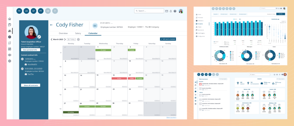
Built for non-designers, with huge component library and smart features
What Bart loves the most about Visily is that it lets him confidently bring product concepts into beautiful designs, without involving much designer’s resources. Bart had a freelance designer establish the guidelines, layouts, and color palettes on Visily. Since then, he just needed to adhere to the guidelines and could create new wireframes using Visily’s intuitive drag-and-drop function and component library.
According to Bart, Visily boasted the largest collection of smart components and templates among the wireframing software he had experienced, which helped him effortlessly design EPIX screens with very little effort.
In addition, Visily’s smart components came in presets of styles, sizes and colors dynamically generated from the PayBIX’s design system and support multiple device interfaces (mobile, tablet and desktop), enabling Bart to quickly customize their look & feel without having to deal with nitty-gritty details such as aspect ratios and color theories.
Better yet, with Visily’s prototyping and presentation capabilities, Bart was capable of demonstrating exactly how different app flows work from an end-user’s perspective. Visily’s smart components are inherently interactive, making Visily’s prototypes appear very close to an actual app, without Bart having to mimic component states and interactions such as hovered and pressed etc.
→ Read more: A Full Visily Review – UI Design Tool For Non-Designers, Powered by AI
Collaborative platform for continuous product iterations
After the first release, all software solutions need regular enhancements and new feature development. As EPIX evolved, Visily fueled the team communication as the collaborative design platform to bounce ideas and iterate on the app UI.
Over the course of product enhancements, the PayBIX team used Visily extensively: “I would adjust the screens and flows based on the inputs I got from my colleagues. Other times, my colleagues took on the designing work themselves.”
For instance, Virginie, a team member with expert knowledge in payroll, used Visily to sketch out product concepts despite her limited experience in IT. She and Bart used Visily’s AI to convert app screenshots they found inspiring into editable wireframes.
Bart told us: “I shared access to Virginie to contribute her ideas on EPIX, because she has a lot of knowledge of the international payroll systems. She actually designed many high-level screens as a non-IT person, then I would take over to work on the details before sharing to developers who would determine the feasibility of certain screens and functionality and estimate implementation effort.”
Working across teams during continuous product improvement has never been this easy and fast.
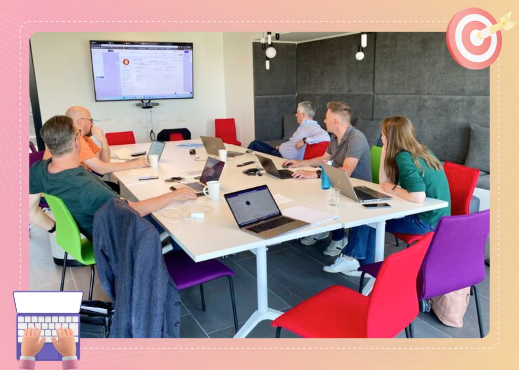
The final result
Visily’s strength was in its ability to help teams like PayBIX ideate at lightning speed through an intuitive UI, rich component & template library and advanced AI features.
We’re thrilled to have a role in PayBIX on their journey! A huge thank you to Bart Slaets for sharing the team’s story with us, and congratulations to PayBIX on their impressive growth!
Ready to bring your app idea to life? Join Visily today and create a stunning app wireframe in just minutes!
