


As the demand for mobile apps explodes, according to a report from Statista, businesses increasingly turn to app development as a strategic move to enhance their reach and engagement. Designing iPhone apps that are user-friendly and intuitive is crucial for ensuring that users enjoy a seamless experience, which can lead to higher retention rates and greater customer satisfaction.
This guide will equip you with the essential learning to create an optimal iPhone app design, taking you from concept to a stunning creation that keeps users engaged.
Why iPhone app design is essential for success
In today’s saturated app market, great design isn’t just a luxury—it’s a necessity. With millions of apps competing for consumers’ attention in the App Store, your iPhone app design can be the decisive factor between gaining loyal users and becoming just another forgotten download. Here are a few reasons why prioritizing exceptional design is crucial for your app’s success:
The first impressions matter
Users decide on an app’s fate quickly. Within seconds of opening your iPhone app, they’ll form an impression that determines whether they become engaged users or uninstall. A well-designed app grabs their attention and makes them feel welcome. Conversely, a cluttered or confusing interface can lead to frustration and a quick deletion. This is why prioritizing an inviting and intuitive initial experience is crucial.
Impact on onboarding
New users form their impression of an iOS app within seconds. A comprehensive guide can be invaluable in helping users understand the app’s features. A clear and intuitive design is crucial in the onboarding process. It helps users understand the app’s features and navigate easily. Confusing layouts or unclear instructions can lead to frustration and app abandonment. Prioritize good design for a smooth onboarding experience – it boosts user activation and keeps them engaged.
Enhancing user retention
User retention is an important metric for any app’s success. A thoughtfully designed iOS app doesn’t just look good; it also ensures that users can navigate it effortlessly. When features are intuitively placed and the overall user experience is smooth and enjoyable, people are naturally inclined to keep using the app.
On the flip side, if users consistently hit roadblocks—like struggling to find key features or facing a visually unappealing design—they won’t hesitate to seek out alternatives. An iOS app that feels challenging or fails to satisfy user expectations risks losing its audience while harming its brand in a competitive industry.
Building trust and credibility
A professional and polished design helps in building trust and credibility with users. People are more likely to trust an iOS app that looks well-made and functions smoothly. High-quality design signals to users that the developers have put effort into creating a reliable product, which can make users more comfortable sharing personal information and making in-app purchases.
Competitive advantage
A standout design in the crowded app market can give you a competitive edge. With thousands of iOS apps available on Apple platforms, users have plenty of choices. A unique and appealing design can differentiate your iOS app from others and make it more attractive to potential users. Investing in good design is not just about aesthetics; it’s a strategic decision that can drive growth and success.
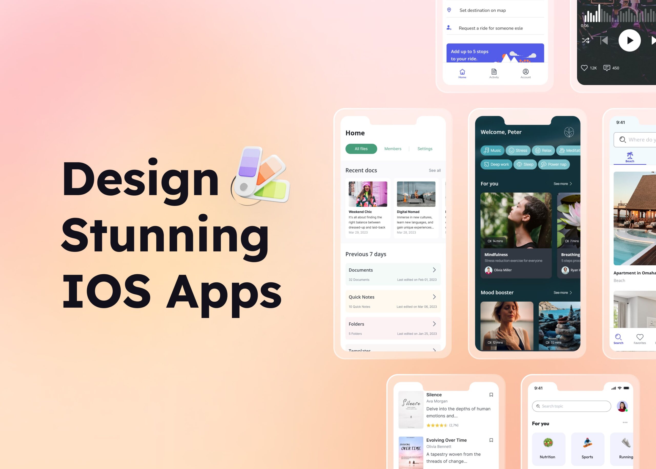
Guide for optimal iOS app design
Define the design layout
When designing an iOS app, considering the variety of screen sizes across different devices, such as iPhones and iPads, is crucial. iOS defines various UI elements and their behavior, including color variants for background color, types of separator colors, and the behavior of the navigation bar in response to user scrolling. Apple offers devices with varying resolutions and aspect ratios, so your design must be responsive to accommodate these variations seamlessly.
Once picking out the screen type, you can start sketching out the basic layout and the overall ideas of the system features, for example, service display, search options, product rating, and more. This helps you visualize how different elements will be arranged and ensure that your design covers all fundamental functions.
Check out the Simple Mobile App Template

Consistent color system
A consistent color system helps create a cohesive look and feel throughout your app. Choose a primary color palette and stick with it throughout the iOS app.
- Primary colors: Choose 2-3 primary colors that represent your brand and use them consistently for key UI elements like buttons, headers, and interactive elements.
- Secondary colors: Incorporate secondary colors sparingly to highlight less prominent elements or specific states, such as error messages or alerts.
- Neutral colors: Use neutral colors for backgrounds and text to ensure readability and maintain focus on primary interactions.

Using a tool like Visily makes it easy to set up and manage your Project Theme, which covers key aspects of a product’s design system such as colors, fonts, shadows, and border-radius. Visily also offers smart options for setting color systems using keywords, images, and more. You can find more details on these features at Visily’s Magic Theme.
Optimize design contrast
After setting up the theme system and applying it to your design, it’s important to check the color contrast. A frequent design contrast issue in iOS apps occurs when the color contrasts are not properly adjusted for different themes, such as light theme and dark theme.
In dark mode, using shades of gray that are too similar can make text blend into the background colors, making it hard to read. Similarly, colors that look good in light mode might be too bright or hard to see against a dark background. Ensuring strong contrast in light mode and dark mode is important for readability and usability.
To simplify the design process, Visily offers a friendly “Color Assistant” to help you fix any design contrast issues in your app. This handy tool lets you spot these issues quickly and provides easy suggestions for adjustments.
Suitable color choice to notify users of possible cases
Colors can be powerful indicators to convey different states or notifications within your app:
- Success: Use green to indicate success or positive actions, such as completing a task or confirming a purchase.
- Error: Red is often associated with errors or critical issues. Use it to alert users to problems that need immediate attention.
- Warning: Yellow can signal caution or warnings, prompting users to pay attention without creating a sense of urgency.
- Information: Blue is commonly used for informational messages or secondary actions, guiding users without overwhelming them.
Using the right color options add depth to your design, making it more appealing and engaging.

Choose the appropriate font & typography
When landing on the app UI, most people skim, not read. Clear organization and easy-to-read fonts are key to making a good first impression and keeping users interested. Meanwhile, typography is the arrangement of written content to be clear, readable, and aesthetically pleasing. This includes choosing the right typeface (font style), size, spacing, line length, and overall layout for the specific context.
Thoughtful typography is crucial for a positive user experience. Ignoring it can hurt your chances of keeping users engaged. Ideally, the dynamic type of font and typography choices should set the tone and work harmoniously with other design elements to create a balanced visual experience.

Make use of icons to communicate with users
Icons are a powerful way to communicate actions and information succinctly, especially on iOS apps with limited space. They enhance the app’s usability by providing visual cues instead of lengthy text descriptions. Remember to incorporate widely recognized icons for standard actions like home, chat, and notification to ensure users easily understand their functions.
For vector icons, consider using SF Symbols, a set of vector icons provided by iOS. Check out Apple’s documentation for more information.
Common components when designing iPhone apps
Understanding the core components of an iOS app is crucial for creating a user-friendly experience. These components act as the building blocks, allowing users to interact with your app and access its features seamlessly.
- Navigation bar: Typically placed at the top of the screen, it aids in navigation through the app with back buttons, titles, and sometimes additional actions.
- Status bar: Positioned at the very top of the screen, it displays crucial system information such as the time, battery life, signal strength, Wi-Fi status, and more.
- Tab bar: Usually located at the bottom, the tab bar allows users to switch between different sections of the app quickly.
- Buttons: Various button styles including text buttons, icon buttons, and combination buttons that initiate actions.
- Labels: Text elements that provide information or instructions to the user.
- Text input: Input fields where users can enter text, such as search bars or forms.
- Sliders: Allow users to select from a range of values by sliding a handle along a bar.
- Switches: Toggle elements that enable or disable options.
- Activity indicators: Show ongoing processes like loading or fetching data

White space is your friend
White space, or negative space, is the area between elements in a design. It’s important for creating a clean and focused layout. Proper use of white space improves readability, highlights key elements, and adds a sense of elegance to the design. Avoid cluttering the interface; instead, allow each element room to breathe.
Boost your mobile app design process with Visily
Designing a mobile app can be challenging, but Visily makes it easier and more efficient. Here’s how you can enhance your design process with Visily:
- Leveraging AI to jumpstart designs: Visily uses AI to transform any app screenshots into polished designs quickly. This feature saves you time on initial setups, allowing you to focus on modifying and showcasing your ideas
- Accessing a vast library of templates: Explore more than 1500+ templates, with tailor-made mobile app templates for various industries to get started quickly.
- Maintaining design consistency: Visily helps you keep a consistent look throughout your project with its theme setups. Define your color schemes, typography, and other elements once, and apply them across all screens effortlessly. Any changes you make update automatically across the project.
- Enjoying an intuitive design experience: Visily offers an intuitive, user-friendly interface that caters to both seasoned designers and beginners. Features like drag-and-drop, real-time collaboration, and extensive tools make the design creation process seamless.
Conclusion
In the competitive world of mobile apps, a stunning and intuitive iOS app design can significantly impact your app’s success. By focusing on layout, color consistency, typography, iconography, common components, and white space, you can create an app that not only looks good but also provides a seamless user experience. Tools like Visily can further enhance your design process, ensuring that your app stands out in the crowded marketplace. Try Visily today and see how it transforms your workflow!


