Introduction
Creating visually appealing and user-friendly interfaces requires a deep understanding of the principles of symmetry and asymmetry. Both concepts play significant roles in achieving visual balance, evoking specific emotions, and guiding the user’s attention.
To effectively use these principles, we need to explain the difference between symmetry and asymmetry in UI design and how to apply them to create engaging user experiences.
The Importance of Visual Balance in UI Design
Visual balance is a fundamental aspect of UI design that greatly influences the overall aesthetics and usability of an interface. A well-balanced UI creates a sense of stability, harmony, and cohesiveness, making it easier for users to navigate and engage with the interface.
There are various types of balance in UI design, including symmetrical, asymmetrical, and radial. Each type offers different ways to distribute visual weight and create balance within a composition.
Symmetry in UI Design
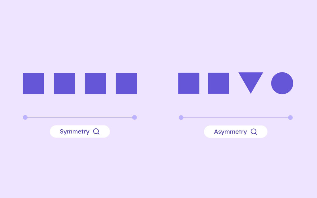
Symmetrical design involves the even distribution of visual weight on either side of a central axis, creating a mirror-like effect—a mirror image. In UI design, symmetry can be achieved through absolute or approximate symmetry.
Absolute symmetry occurs when elements on both sides of the axis are identical, resulting in perfect symmetry, while approximate symmetry allows for slight variations while still maintaining an overall balanced appearance.
Symmetrical balance often evokes feelings of stability, order, and formality. It creates a sense of order and harmony, making it a popular choice for corporate websites, e-commerce product pages, and designs that require a professional and trustworthy appearance.
When using symmetry in your UI designs, consider the following tips:
- Align elements precisely along the central axis to create a strong sense of balance.
- Use consistent spacing and sizing for elements on both sides of the axis.
- Incorporate symmetrical patterns or shapes, such as radial symmetry, to reinforce the balanced composition.
- Be mindful of the overall visual weight and ensure that the symmetrical layout doesn’t feel too rigid or static.
The advantages of bilateral symmetry include its ability to create harmony and familiarity. Humans naturally find symmetrical compositions pleasing due to the bilateral symmetry found in nature and human anatomy.
Asymmetry in UI Design
Asymmetrical design, on the other hand, involves the intentional placement of unequal visual weights within a composition. Creating visual interest, movement, and dynamism, asymmetry breaks away from the predictable nature of symmetry.
Asymmetrical balance in interior design and other creative fields is achieved through the strategic arrangement of elements, considering factors such as size, color, texture, and negative space.
In an asymmetrically balanced composition, designers use differing elements that have equal visual weight to achieve a sense of balance without mirroring them on either side of a central point. This technique often incorporates contrast, tension, and visual hierarchy to create a more engaging and stimulating experience for users.
Asymmetrical designs can evoke feelings of energy, playfulness, and creativity, making them well-suited for portfolios, art galleries, and experimental layouts that aim to push the boundaries of traditional design.
When incorporating asymmetry into your UI designs, keep the following considerations in mind:
- Use contrast in size, color, or typography to create focal points and guide the user’s attention.
- Experiment with the placement of elements to create a sense of movement and flow.
- Utilize negative space effectively to balance the composition and prevent visual clutter.
- Consider the overall visual weight and ensure that the asymmetrical layout feels intentional and harmonious.
Balancing Symmetry and Asymmetry with Visily
Creating balanced and visually appealing UI designs can be a challenging task, especially when juggling between symmetrical and asymmetrical principles. This is where Visily, an all-in-one design platform, becomes invaluable to help you with your asymmetrical vs symmetrical woes.
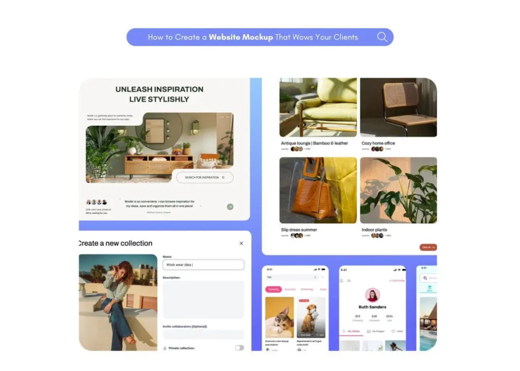
Visily offers a range of tools and features that streamline the UI design process and help you create stunning interfaces, whether you prefer symmetry or asymmetry. With intuitive wireframing tools, you can quickly map out your ideas, experiment with different layouts, and iterate on your designs effortlessly.
One of Visily’s standout features is its AI-powered design suggestions. The platform leverages artificial intelligence to provide intelligent recommendations and design alternatives based on your UI’s content and structure. This functionality can help explore different symmetrical or asymmetrical compositions, assisting in finding the optimal balance for your design.
Collaboration is key when creating effective UI designs, and Visily excels in this area. With real-time collaboration capabilities, you can work seamlessly with your team members, share feedback, and make decisions together. This approach ensures that everyone is aligned and contributes to the creation of a well-balanced and user-centric interface.
If you’re looking for inspiration or a starting point, Visily’s UI templates library is a valuable resource. The templates showcase various examples of symmetrical and asymmetrical UI designs across different industries and design styles. Exploring these templates, customizing them to fit your specific needs, and gaining insights into how symmetry and asymmetry can be effectively applied in different contexts can greatly enhance your design process.
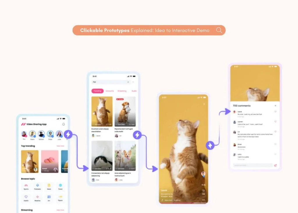
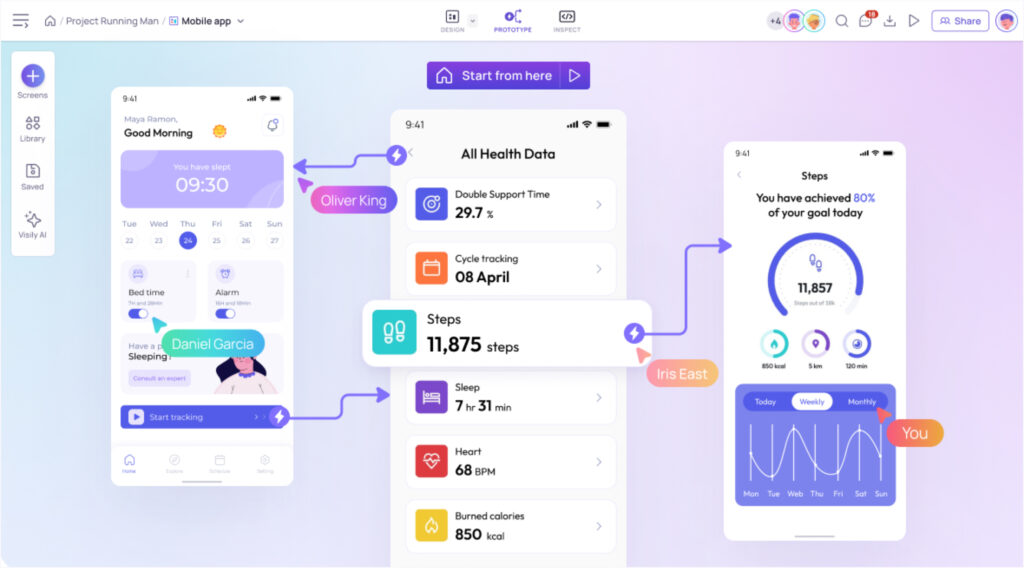
When ready to bring your UI designs to life, Visily’s prototyping tools enable you to create interactive and clickable prototypes. The prototypes allow you to test the usability and flow of your designs, gather user feedback, and make informed decisions about the balance and effectiveness of your interfaces.
Conclusion
Understanding the difference between symmetry and asymmetry is crucial for creating visually balanced and engaging UI designs. Symmetrical balance provides stability, order, and elegance, while asymmetrical design introduces visual interest, movement, and creativity. The choice between symmetrical vs. asymmetrical design depends on factors such as the project’s goals, target audience, brand identity, content hierarchy, and responsive design considerations.
Leveraging tools like Visily, designers can streamline their UI design process, explore different compositions, and collaborate effectively with their team. The key is to find the right balance that aligns with your design objectives and provides an optimal user experience.
Embarking on your UI design journey, keep experimenting, iterating, and seeking feedback. Embrace the flexibility and adaptability of different design principles, and consider combining symmetrical and asymmetrical elements to create unique and captivating interfaces. With practice and a user-centric approach, you’ll be well on your way to crafting UI designs that not only look visually appealing but also enhance the overall user experience.
Balancing visual layouts: Asymmetry vs. Symmetry in modern UI Design
What is the principle of symmetrical balance in UI design?
The principle of symmetrical balance involves distributing visual weight evenly on either side of a central axis, creating a mirror image that conveys stability and harmony.
What is the principle of asymmetry in UI design?
The principle of asymmetry involves creating visual balance through the intentional placement of unequal visual elements, resulting in a composition that is asymmetrically balanced yet engaging.
Which principle of design refers to asymmetry?
The principle of contrast, involving the use of opposing elements such as light and dark, large and small, or different colors, is often used to create asymmetry and visual interest in UI designs.
How can I create symmetrical balance in my UI designs?
Align elements evenly on either side of a central axis, use consistent sizing and spacing, and consider incorporating symmetrical patterns or shapes to achieve symmetrical balance.
What are some advantages of using asymmetry in UI design?
Asymmetry can create visual interest, movement, and dynamism, making compositions more engaging. It also allows for flexibility and is useful in responsive designs catering to different devices.


