Bringing a mobile app idea to life starts with a clear plan and that’s where mobile app wireframes come in. Whether you’re a designer, product manager, or startup founder, knowing how to create wireframes for mobile apps quickly can save you hours of back-and-forth later.
In this guide, we’ll walk you through the process of wireframe design for mobile apps, share real mobile app wireframe examples, and show you how to use a free mobile app wireframe design tool to build clean, user-friendly layouts in no time.
Additionally, we’ll recommend the best wireframing tools for mobile apps to help you start strong and most importantly no design background needed.
What Is A Mobile App Wireframe?
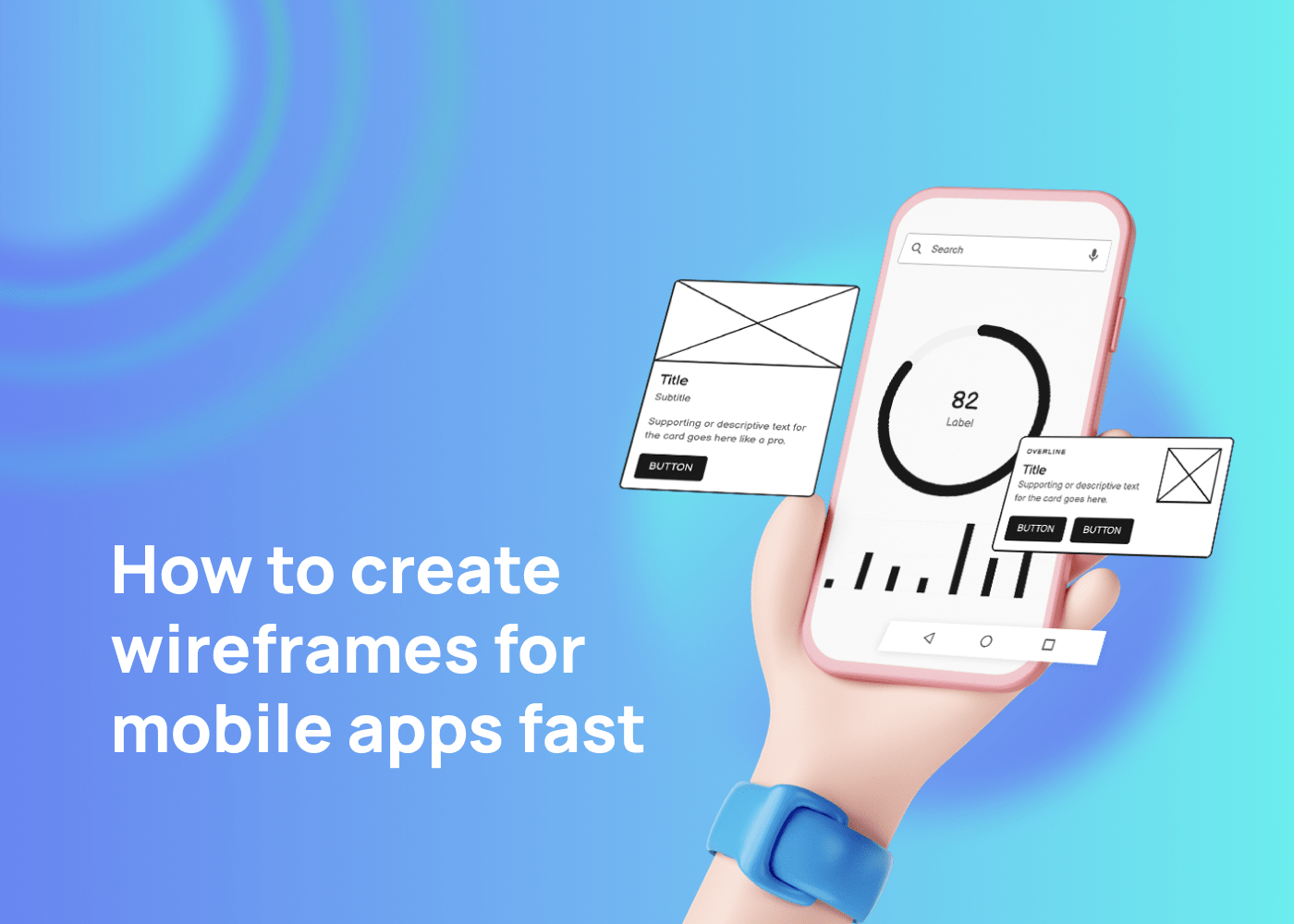
A mobile app wireframe is a visual guide that represents the skeletal framework of a mobile app. It’s a low to mid-fidelity representation of the app’s layout and functionalities, serving as a blueprint for the app’s structure, content, and user flow. Wireframes are typically created in grayscale and avoid stylistic or color elements, focusing instead on functionality, behavior, and content hierarchy.
Wireframes are the backbone of any project, including wireframe design for mobile apps. They serve as a bridge between basic sketches and interactive prototypes, giving designers and stakeholders a shared understanding of the app’s logic and flow. The process of creating a mobile app wireframe can vary, but usually includes steps like sketching, wireframing, building a mockup or prototype, and then development.
Before jumping into wireframing, it’s important to dedicate time to user research. Both qualitative and quantitative insights will guide your design decisions and ensure your wireframes reflect real user needs, behaviors, and expectations.
What's Included In A Mobile App Wireframe?
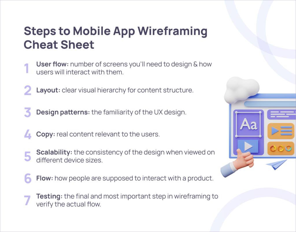
A mobile app wireframe includes several key elements:
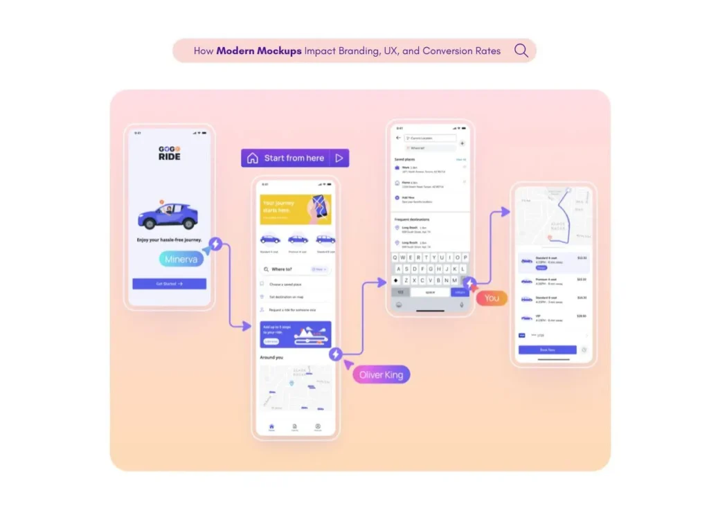
- User flow: Before starting wireframing, you need to have a clear idea of how many screens you’ll need to design and how users will interact with them. A user flow is a series of steps a user takes to achieve a specific goal. User flows help you understand what wireframes you’ll need to create and how they should be connected.
- Layout: In the early stages of wireframing, your goal is to create a clear visual hierarchy by establishing a layout and structure. At this stage, you don’t focus on the content itself, but instead think about how it’s presented. Plan the layout according to how you want your user to process the information.
- Design patterns: Familiarity is one of the most important properties of good UX design. When people see familiar UI elements in a new product, they can rely on their previous experience when interacting with this product. Both Android and iOS have native design patterns that simplify the task of creating a familiar experience for designers.
- Copy: After you are satisfied with your visual hierarchy, start replacing placeholders and dummy text with real content (actual copy or the one that is relevant to the user). An important reason we should avoid dummy text at this stage is that Lorem Ipsum doesn’t communicate how the page supports users in reaching their goals.
- Scalability: If your design looks great on a medium-size phone screen like iPhone XS, it doesn’t mean that iPhone XS Max users will have the same great experience. While it’s absolutely fine to start with a middle size screen when wireframing, it’s also essential to check how content looks on different screen sizes (both smaller and larger screens) and adjust it if required.
- Flow: While it’s possible to ship your design as a collection of individual screens, it’s better to create a flow out of them. UX flows make it easy for the team to understand the details of interaction scenarios since they communicate how people are supposed to interact with a product.
- Testing: Testing is the final (and the most important) step in wireframing. Testing implies user interactions—that’s why this term is often used in the context of prototypes. But it’s still possible to conduct simple testing for a flow created from wireframes.
How To Create Wireframes For Mobile Apps
Creating wireframes for mobile apps can be a swift and efficient process if you follow a structured approach. Here’s a step-by-step guide on how to create wireframes for mobile apps quickly:
Define your app's main features
Start by identifying the main features of your app. This will help you understand what screens you need to design. For example, if you’re creating a shopping app, you might need screens for product listings, product details, cart, and checkout.
Sketch your ideas
Begin by sketching your ideas on paper. This allows you to quickly visualize your thoughts and make immediate changes. Sketch the layout of each screen, including the placement of buttons, images, text, and other elements.
Create low-fidelity wireframes
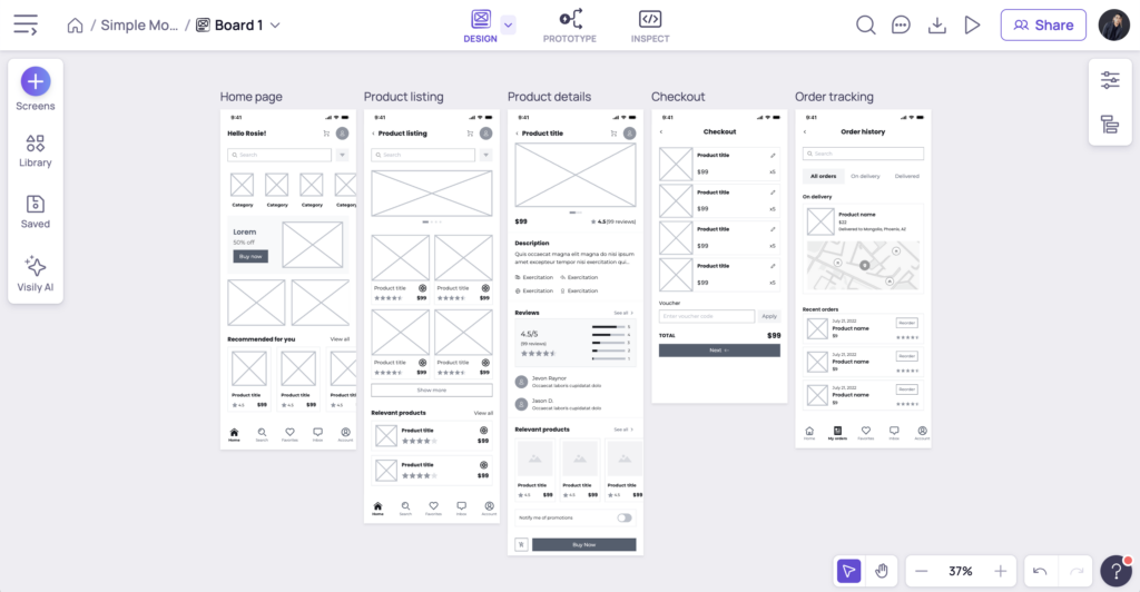
Once you have a basic sketch, you can start creating low-fidelity wireframes. These are basic layouts that include the main elements of each screen. You can use simple shapes to represent different elements. For example, rectangles for images, lines for text, etc.
Add details to your wireframes
After creating low-fidelity wireframes, you can start adding more details. This includes defining the hierarchy of elements, adding labels to buttons, and specifying other interface elements. Remember, at this stage, you’re not focusing on the visual design, but on the structure and functionality.
Review and iterate
Review your wireframes and make necessary changes. It’s important to iterate on your designs until you’re satisfied with the layout and flow of your app.
Use design patterns
Design patterns are standard solutions to common design problems. Using design patterns can help you create more intuitive and user-friendly designs. Look for design patterns in other successful mobile app wireframe examples and consider how you can incorporate them into your own designs.
Ensure your content scales well
Make sure your design can accommodate different amounts of content and different screen sizes. This is especially important for mobile apps, which can be used on a wide range of devices.
Connect the pages together to create a flow
Finally, connect your screens together to create a user flow. This shows how users will navigate through your app, from one screen to another.
If these steps seem too cumbersome, then leveraging an AI-powered tool like Visily might be right for you. Doing so can speed up the mobile app wireframe process in a number of ways.
How Visily Can Accelerate Your Mobile App Wireframe Creation
Visily, an AI-powered wireframing tool, is designed to make the process of creating wireframes for mobile apps fast and efficient.
Here are some of the ways Visily can support your efforts:
AI-powered design
Intuitive interface
Visily’s user-friendly interface makes it easy for both designers and non-designers to navigate and use the platform. You can quickly create wireframes by dragging and dropping elements onto your canvas, saving you time and allowing you to focus more on the design.
Extensive library of elements
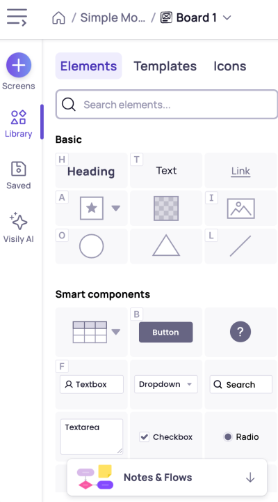
Visily offers a comprehensive library of pre-designed elements, including buttons, form fields, icons, and more. This feature saves you the time and effort of making sketches and designing these elements from scratch.
Collaboration features
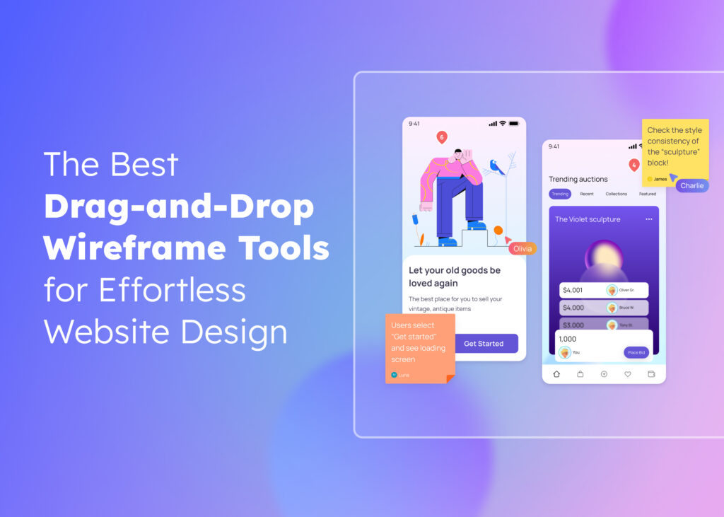
Visily enables real-time collaboration with your team. You can share your wireframes, receive feedback, and make instant changes, speeding up the revision process and eliminating the need for lengthy email exchanges.
Interactive wireframes
With Visily, you can create interactive wireframes that allow you to link different screens and simulate the flow of your app. This feature helps you and your stakeholders get a better understanding of how the app will work, enhancing the decision-making process.
Easy to update
Wireframes created in Visily are easy to update. You can quickly make changes and see them reflected in real-time, which is particularly useful in the early stages of the design process when changes are frequent.
How to Speed Up the Wireframing Process Without Sacrificing Quality?
Speed and quality don’t have to be trade-offs—especially when you’re using the right tools and techniques. To create mobile app wireframes faster without compromising design clarity, start by using a mobile app wireframe template. These pre-built layouts help you skip the blank canvas stage and focus directly on structuring the user flow.
Next, choose a free mobile app wireframe design tool like Visily, which offers AI-powered features to generate smart suggestions, align components, and streamline screen linking. These features significantly reduce manual work and keep your designs consistent across multiple screens.
Another tip is to follow a content-first approach. Use placeholder text and simplified content blocks to map out your app’s core functions before diving into detailed UI elements. This ensures you’re building around user goals, not just visual preferences.
If you’re working in a team, real-time collaboration tools can cut down revision cycles. The best mobile app wireframe tools allow multiple stakeholders to leave feedback directly on the wireframes, speeding up iterations and reducing misunderstandings.
Lastly, lean on mobile app wireframe examples for inspiration—they can help you identify proven patterns and avoid reinventing the wheel. This not only accelerates your process but also helps maintain usability standards.
By combining smart tools, clear templates, and a user-focused mindset, you can build high-quality wireframes—fast.
Conclusion
Visily is not only ideal for starting new design projects, but it’s also great for enhancing the UI of existing apps. Visily’s AI can transform your current app screens into design systems and wireframes to facilitate quick revisions.
By leveraging these features, Visily can significantly speed up the wireframing process, allowing you to create stunning wireframes for your mobile apps in no time. Whether you’re a seasoned designer or a non-designer, Visily equips you with the tools you need to bring your mobile app ideas to life quickly and efficiently.
In conclusion, wireframing is a crucial step in the app development process. It helps you plan the layout and interaction of your app, making it more user-friendly and effective. By using a tool like Visily, you can create wireframes quickly and efficiently, saving you time and resources. So, sign up for free to start wireframing and bring your mobile app idea to life!


