In modern design, user interface (UI) layouts play a pivotal role in determining the success and effectiveness of digital products. Well-crafted UI layouts not only enhance the visual appeal of an application or website but also significantly impact user experience, engagement, and overall satisfaction.
As designers and developers, understanding the UI design importance and how to create effective UI layouts that captivate users and drive conversions is essential.
What exactly is a UI layout?
At its core, a UI layout refers to the strategic arrangement and organization of visual elements on a screen or page. It encompasses the placement and hierarchy of various components, such as buttons, text, images, and navigation elements, to create a cohesive and intuitive design.
The primary goal of a UI layout is to guide users through the interface seamlessly, enabling them to find the information they need and complete their desired actions with ease.
A well-designed UI layout takes into account the user’s journey, anticipating their needs and providing a logical flow that minimizes cognitive load. Carefully considering the placement and relationship between elements allows designers to create layouts that are not only visually appealing but also highly functional and user-friendly.
UI layouts play a crucial role in several key areas of modern design.
First and foremost, a well-designed UI layout enhances usability by making it intuitive for users to navigate and interact with the interface. Placing elements in logical and easily accessible locations reduces friction and improves the overall user experience. When users can quickly find what they need and complete tasks efficiently, they are more likely to engage with the product and return in the future.
Moreover, UI layouts have a significant impact on visual appeal. An attractive and visually appealing UI layout captures user’s attention and creates a positive first impression. Leveraging principles of visual design, such as balance, contrast, and hierarchy, designers can create layouts that are aesthetically pleasing and memorable.
A visually appealing layout not only enhances the perceived value of the product but also helps establish a strong brand identity and emotional connection with users.
Consistency in UI Design
Consistency is another fundamental principle of effective UI design that is closely tied to UI layouts. Maintaining consistent UI layouts across different pages or screens of an application or website creates a sense of familiarity and reduces cognitive load for users.
Consistent layouts help users feel more comfortable and confident while interacting with the interface, as they can easily predict where elements will be located and how they will behave.
Responsive UI
Responsive UI layouts ensure that the design remains functional, visually appealing, and user-friendly across various devices, from desktops to smartphones and tablets.
Prioritizing responsiveness allows designers to provide a consistent and optimized experience for users, regardless of how they access the product.
In today’s mobile-driven world, the importance of responsive UI layouts cannot be overstated. With the proliferation of devices and screen sizes, designing layouts that adapt seamlessly to different viewports is crucial.
What are some common UI layout patterns?
Over time, several common UI layout patterns have emerged in modern design, each serving specific purposes and catering to different user needs. Understanding these patterns can help designers make informed decisions when creating their own layouts.
One popular layout pattern is the F-pattern, which is based on the natural reading behavior of users, particularly in Western cultures. The F-pattern involves placing the most important information along the top and left side of the screen, forming an “F” shape. This pattern is commonly used for text-heavy content, such as articles or blog posts, where users tend to scan the page in an F-shaped pattern.
Another common layout pattern is the Z-pattern, which guides users’ eyes in a zigzag motion, starting from the top-left corner and ending at the bottom-right corner. The Z-pattern is often used for simple designs with minimal elements, such as landing pages or promotional materials.
Strategically placing key information and call-to-action buttons along the Z-pattern allows designers to effectively guide users through the content and encourage desired actions.
Grid-based layouts are also widely used in modern design. Grid layouts organize content into a structured grid of rows and columns, providing a sense of order and visual hierarchy. Grids help designers create balanced and visually appealing layouts by ensuring consistent spacing and alignment of elements. The versatility of grid layouts makes them adaptable to various design styles and content types, making them a popular choice for both web and mobile interfaces.
In recent years, card-based layouts have gained popularity, particularly with the rise of mobile-first design. Cards are self-contained units that encapsulate related information or functionality, such as a product description or a user profile. Card layouts allow for easy scanning and organization of content, as well as flexibility in terms of arrangement and responsiveness. They are well-suited for displaying large amounts of information in a visually engaging and user-friendly manner.
How do layouts affect user experience?
The choice of UI layout has a direct and profound impact on user experience. A poorly designed layout can lead to confusion, frustration, and ultimately, user abandonment. On the other hand, an effective UI layout enhances user satisfaction, increases engagement, and drives conversions.
When designing UI layouts, considering factors such as visual hierarchy, whitespace, consistency, and accessibility is essential to create a positive user experience.
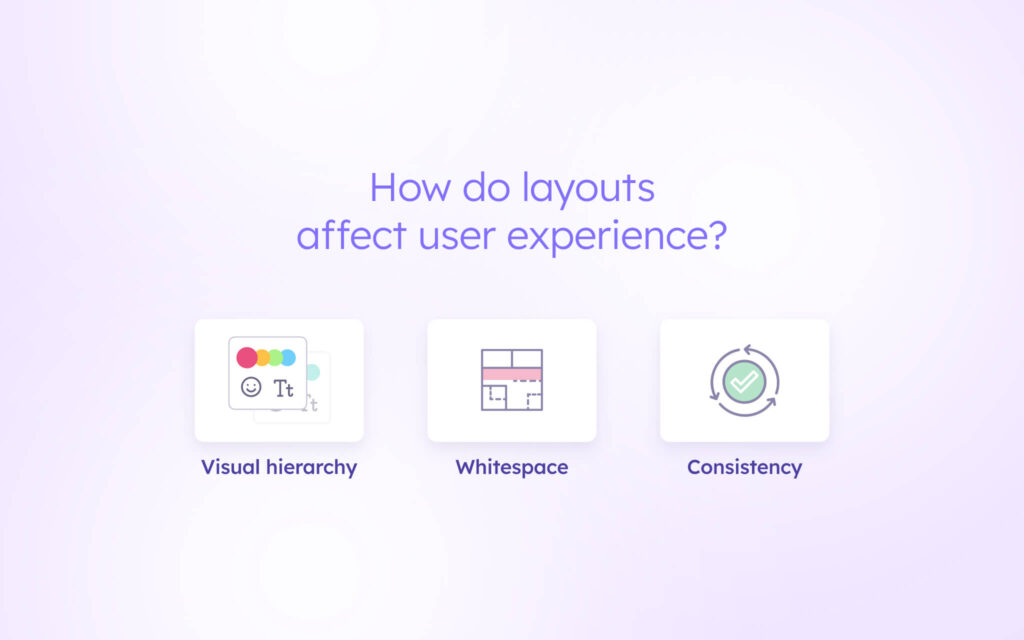
Visual hierarchy and UI design
Visual hierarchy refers to the arrangement and emphasis of elements based on their importance. Using size, color, contrast, and placement, designers can guide users’ attention to the most critical elements of the interface. Effective visual hierarchy helps users quickly understand the structure and purpose of the layout, making it easier for them to navigate and interact with the content.
Using white space in design
Whitespace, also known as negative space, is another crucial aspect of UI layouts. Far from being wasted space, whitespace plays a vital role in improving readability, reducing clutter, and creating visual balance. Incorporating whitespace effectively creates layouts that are visually appealing, easy to scan, and less overwhelming for users. Whitespace also helps to establish a clear separation between different sections or elements, enhancing the overall clarity and usability of the interface.
Consistent layouts
Maintaining consistency across different pages or screens is key to creating a cohesive and intuitive user experience. Consistent layouts, visual styles, and interaction patterns reduce the learning curve for users and foster a sense of familiarity. Consistent layouts help users develop mental models of how the interface works, enabling them to navigate and interact with the product more efficiently. Inconsistent layouts, on the other hand, can lead to confusion and frustration, hindering the overall user experience.
Designing for accessibility
Accessibility is an essential consideration when designing UI layouts. Ensuring that the interface is usable by individuals with diverse abilities, including those with visual, auditory, motor, or cognitive impairments, is crucial.
Following accessibility guidelines and best practices, such as providing sufficient color contrast, using clear and descriptive labels, and ensuring keyboard navigation, allows users to create layouts that are inclusive and accessible to a wider audience. Prioritizing accessibility not only demonstrates a commitment to equal access but also enhances the overall usability of the product for all users.
What tools can you use to create UI layouts?
Creating effective UI layouts requires the right tools and resources. Visily is a powerful platform that simplifies the creation of UI layouts, making it accessible to designers and non-designers alike. With Visily’s extensive collection of UI templates, creating professional-looking layouts without extensive design skills or coding knowledge is possible.
Visily offers a wide range of pre-designed UI templates that cater to various design patterns, styles, and industries. These templates serve as a starting point for layouts, providing a solid foundation that can be easily customized to fit specific needs and branding. Whether designing a website, mobile app, or any other digital product, Visily’s template library has options available.
One of the key advantages of using Visily is its intuitive drag-and-drop interface. With just a few clicks, elements can be added, arranged, and customized in the layout. Visily’s powerful editing tools allow for effortless modification of colors, fonts, images, and other design properties. The platform also supports real-time collaboration, enabling team members to work together seamlessly on the same layout, regardless of their location.
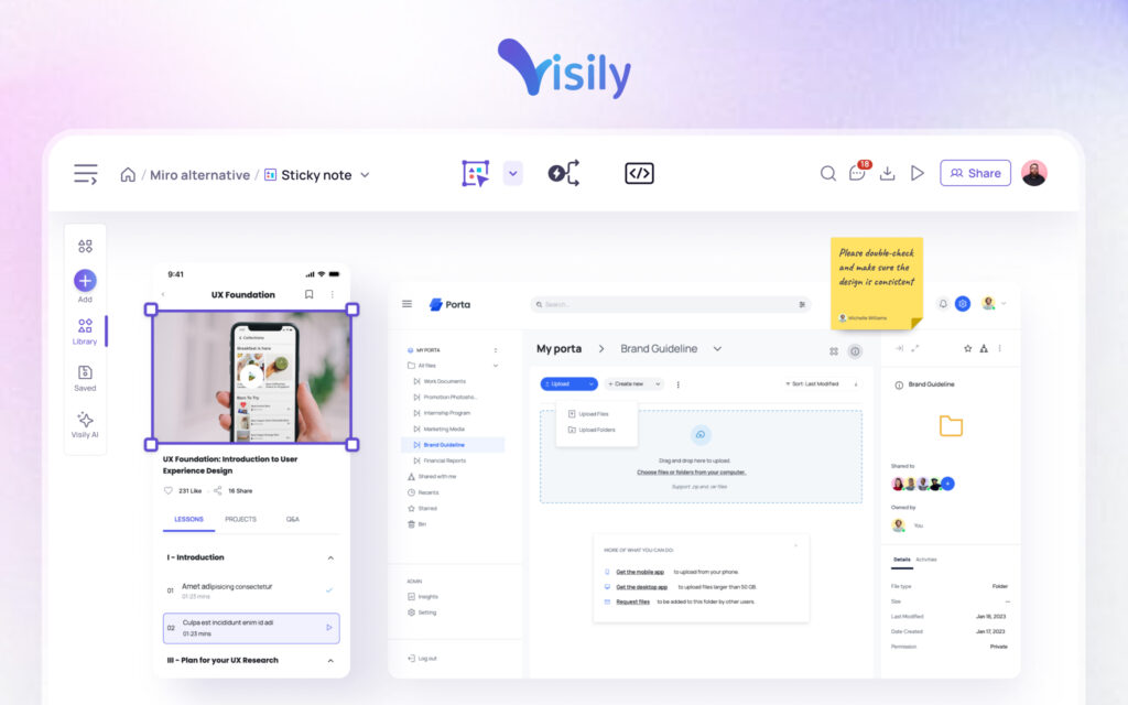
In addition to its user-friendly interface and collaboration features, Visily offers a range of advanced functionalities. Visily offers a theme management system that functions similarly to a design system, maintaining consistent colors, fonts, and styles throughout projects. ‘Workspace Libraries will (soon be released), allow teams to save and share themes, templates, and images across their workspace.
Leveraging tools like Visily allows teams to streamline their workflow, reduce design inconsistencies, and create high-quality UI layouts more efficiently.
Whether a seasoned designer looking to speed up the process or a non-designer seeking to create professional-looking interfaces, Visily provides the tools and resources needed to bring ideas to life.
Tips for creating effective UI layouts
Creating effective UI layouts requires a combination of design principles, user empathy, and iterative testing. Some tips to help create layouts that engage and delight users include:
Understand your users
Before starting the design process, take the time to understand your target audience. Conduct user research to gain insights into their needs, preferences, behaviors, and pain points. Use this knowledge to inform your layout decisions, ensuring that the interface aligns with users’ expectations and goals. Putting yourself in the shoes of your users allows you to create layouts that are intuitive, relevant, and valuable to them.
Prioritize content
Not all content is created equal. Identify the most important content and features of your application or website and give them prominence in your layout. Use visual hierarchy techniques, such as size, color, and placement, to guide users’ attention to these key elements. Prioritizing content based on its relevance and importance allows you to create layouts that are focused, purposeful, and easy to navigate.
Embrace simplicity
Simplicity is often the key to effective UI layouts. Avoid cluttering your interface with unnecessary elements or information. Strive for a clean, uncluttered design that allows users to focus on the essential content and actions.
Use whitespace strategically to create visual breathing room and improve readability. Remember that less is often more when it comes to UI design, and a simple, intuitive layout can go a long way in enhancing the user experience.
Test and iterate
Creating effective UI layouts is an iterative process. Don’t expect to get it perfect on the first try. Conduct user testing to gather feedback on your layouts and identify areas for improvement.
Observe how users interact with your interface, note any confusion or frustration points, and use this feedback to refine your designs. Continuously iterate and test your layouts to ensure they meet user expectations and provide a seamless, enjoyable experience.
Conclusion
UI layouts play a vital role in modern design, directly impacting user experience, engagement, and the overall success of digital products. Understanding the importance of UI layouts, exploring common layout patterns, and considering factors that influence user experience empowers users to create interfaces that are both visually appealing and highly functional.
Visily is a powerful tool that can streamline the process of creating effective UI layouts. With its intuitive interface, extensive collection of UI templates, and collaborative features, Visily enables users and teams to create stunning layouts quickly and efficiently.
To start designing your next UI layout with Visily, simply sign up for a free account and explore the possibilities of creating intuitive and visually appealing interfaces that captivate users and drive engagement. With Visily, you have the tools and resources at your fingertips to bring your design ideas to life and create exceptional user experiences.
UI layouts FAQs: your guide to better design
What are the key elements of a UI layout?
The key elements of a UI layout include buttons, text, images, navigation elements, and the overall structure and hierarchy of the design. These elements work together to create a cohesive and intuitive interface.
How can I ensure my UI layouts are responsive?
To ensure responsive UI layouts:
- Use flexible grids and layouts that adapt to different screen sizes
- Employ media queries to apply different styles based on the viewport dimensions
- Test your layouts on various devices and screen resolutions to ensure consistency
What is the importance of visual hierarchy in UI layouts?
Visual hierarchy helps guide user’s attention to the most important elements of the interface, making it easier for them to navigate and interact with the design.
Establishing a clear hierarchy through size, color, and placement allows designers to create layouts that are intuitive and user-friendly.
How can I improve the accessibility of my UI layouts?
To improve the accessibility of your UI layouts:
- Use sufficient color contrast to ensure readability for users with visual impairments
- Provide alternative text for images and other non-text elements
- Ensure that the layout can be navigated using a keyboard alone
- Follow accessibility guidelines and best practices, such as WCAG (Web Content Accessibility Guidelines)
What are the benefits of using Visily to create UI layouts?
Visily offers an intuitive drag-and-drop interface, a wide range of customizable UI templates, and powerful editing tools. These features enable users to create professional-looking layouts quickly and efficiently, even without extensive design skills. Visily also supports real-time collaboration, making it easy for teams to work together on the same layout.


