UX design can make or break a company’s success. Oftentimes it’s the key factor between a company crashing and burning or taking off to reach new heights.
For example, Amazon made one UX design change—the elimination of the requirement to register before making a purchase—which resulted in an extra $300 million in sales.
However, there are many other companies that have lost tons of money (and customers) because of bad UX design changes.
As UX design becomes more critical, its intricacy is also becoming more difficult.
What this calls for is a strong UX design process to follow. One that can guide you towards growth and not failure.
In this step-by-step guide we’ll walk you through the ins and outs of the UX design process, we’ll take a look at the evolution of the different approaches, and go over our 8-step guide to help you succeed.
What is the UX design process?
The UX (User Experience) design process is a methodological approach that centers around devising gratifying and significant experiences for users when interacting with an application, website, or any digital product.
It requires UX designers to understand what users need, how they act, and what they hope to accomplish, then apply that knowledge to create user-friendly and stimulating user interfaces that address those needs efficiently.
The way this process is carried out can vary, as UX designers have their own preferences and will adjust the focus of the process depending on the particular project. Though the details may differ from team to team or from project to project, the general procedure (law that UX design follows) for design projects includes the following steps:
Research
Analysis
Design
Implementation
Testing
Why use the UX design process?
The UX design process keeps assumptions at bay, maintains standards of quality and consistency, and finds and implements the ideal solution for any challenge—no matter how tough!
The various steps of this procedure encourage multiple iterations of design and testing, while also providing a platform for colleagues and teams to collaborate and work together.
The UX design process makes it simpler for people involved in the project—managers, other team members, and customers—to track the project’s development and keep an eye on its progress, while also making the process more transparent.
The process helps the user get a product designed for them that addresses their specific needs, desires, challenges, and goals. When a product or service meets the needs of the target user, a brand builds a relationship of trust with the user. This encourages brand loyalty, repeat sales, and word-of-mouth or online recommendations.
The evolution of the UX design process
In its original form, UX Design is Waterfall-focused.
A product team working with the Waterfall methodology endeavors to gain as much knowledge as possible before development begins—even for the most basic prototype. This means that it may require months or even years of research for a design team to dictate how they should proceed.
Prior to beginning design, the requirements must be set in stone, and the design must be finalized before development begins. This often made it quite stressful.
There’s no turning back, not until the sequel. That’s just the way the Waterfall flows.
While the Waterfall approach is very time consuming, it’s very precise and predictable.
A few decades ago, the introduction of Agile methodologies broke the Waterfall approach as it offered a flexible and adaptable approach for a product development team.
Agile emphasizes quick cycles of development. It gradually produces and distributes new functionalities on a regular basis, usually within a 2–4-week timeframe, as opposed to introducing them all at once. It’s based on a theory, trial-and-error, blink-and-you-miss-it releases, and keeping a finger on the pulse.
In Agile, there’s no revising phase, and aiming for perfection isn’t necessary. Instead, the definition of done is the fuel that drives this iterative process—and keeps it going till you succed.
Waterfall’s meticulous “count twice, cut once” approach was abandoned quicker than a Nokia phone in a space full of iPhones.
However, there was one massive problem with the Agile approach, which was the complete disregard for the total user experience design process. Ask any budding or professional UX designer if they can do research, map out user flow, or build and test a prototype all within one month, and they’ll all probably tell you it’s insanity.
The other issue with the Agile UX design process is the mentality that perfection isn’t necessary from the get-go. For true UX, this can be detrimental as you want your users to experience the best user journey and product experience so that they can keep coming back. You don’t want to release UX design changes and make adjustments too many times since that can come off as inconsistent and not hierarchical.
While the Waterfall approach was too slow and rigid, the Agile approach was too fast and not detailed enough.
Thankfully, things got a bit better with the introduction of the Lean UX design process.
Jeff Gothelf crafted Lean UX as a revolutionary solution to the challenge of deploying UX in a fast-paced, Agile setting. In his book, he outlines a range of tactics and alignment practices, granting UX the ability to work in Agile’s unpredictable environment and swiftly modify designs based on user feedback.
In contrast to the traditional UX approach of focusing on needs, Lean UX is based on the desired outcomes.
The substantial user feedback that’s received when the product is mature powers the iterative cycle of Lean UX. Lean UX is widely considered the go-to methodology for most established product teams.
However, this also made Lean difficult to adopt for smaller design teams or “fresh-of-the-boat” UX designers and products. This brings us to the modern-day iterative UX approach, which focuses on creating low-fidelity prototypes and then adapting high-fidelity ones based on user feedback. If you are thinking this looks like a mix of Waterfall and Agile, then you’re absolutely right.
We’ll dive deeper into this process a little later; first let’s go over the steps of each approach we mentioned.
The waterfall UX design process
A classic UX design process is still taught to college students, and it’s still useful in certain approaches like small teams and even large ones that must stick to a certain output for their products.
Generally, this system yields adequate outcomes so long as the UX isn’t frequently changed. Nevertheless, numerous mobile app developers who prioritize design opt to refresh their user experience more often. In such a situation, a Waterfall approach isn’t the most appropriate approach. .
At a high level, it goes like this:
Investigate the issue to determine its nature
Create user personas and user flow
Conceive concepts
Create and test a version
Release the product
Assess customer reaction
Start the process again
The Agile UX design process
Agile methodology has become commonly used in engineering practices, particularly when it comes to developing software. Agile is characterized by its cycle of repeated stages and its emphasis on quickly creating completed products or features.
Agile UX merges the concepts of Agile software engineering with UI/UX design. The UX agile methodology calls for the need for strategic planning (to make sure perfection is kept in mind), as well as consistent communication, to guarantee the production of beneficial products at all points throughout the process.
Agile doesn’t follow a systematic approach to UX design like Waterfall, so there isn’t a structured process to follow (a step-by-step guide). Instead, they focus on delivering products and working on them in sprints. A sprint is 2–4 week long, and during this time, the team works on the top features and products that were defined in the sprint planning session.
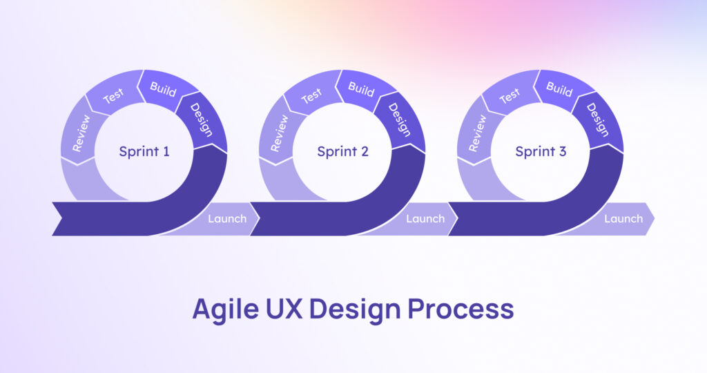
To help you understand how this works, let’s look at a typical Agile (battle scenario) development scenario:
An Agile methodology divides the process into smaller fragments, aka sprints, that are simpler to manage.
Once sprint planning has been finished, communication and teamwork become the main focus as the group collectively brainstorms, come up with ideas, and constructs solutions.
Following the process of evaluating, usability testing, and validating, the feature or site is eventually launched—but then the procedure repeats itself. The motto is to always strive for improvement.
To help steer the project to success, Agile teams use a set of four key principles that help them through product development. These look like this:
People and interactions over processes and tools
Working software over extensive documentation
Customer collaboration over contract negotiation
Responding to change over following a plan
The lean UX design process
Lean UX Design is a process that focuses on the user and follows Lean and Agile principles to reduce waste and construct products that serve the user. The Lean UX design methodology emphasizes collaboration and rapid prototyping and enables for a minimum viable product (MVP) to be tested with users quickly. This way, you can gather golden user feedback at an early stage.
Product teams in the Lean UX model generally consist of representatives from various divisions such as engineers, product managers, and UX designers. Each team is striving to enhance a particular product by zeroing in on refining processes that travel through three stages: Think, Make, and Check.
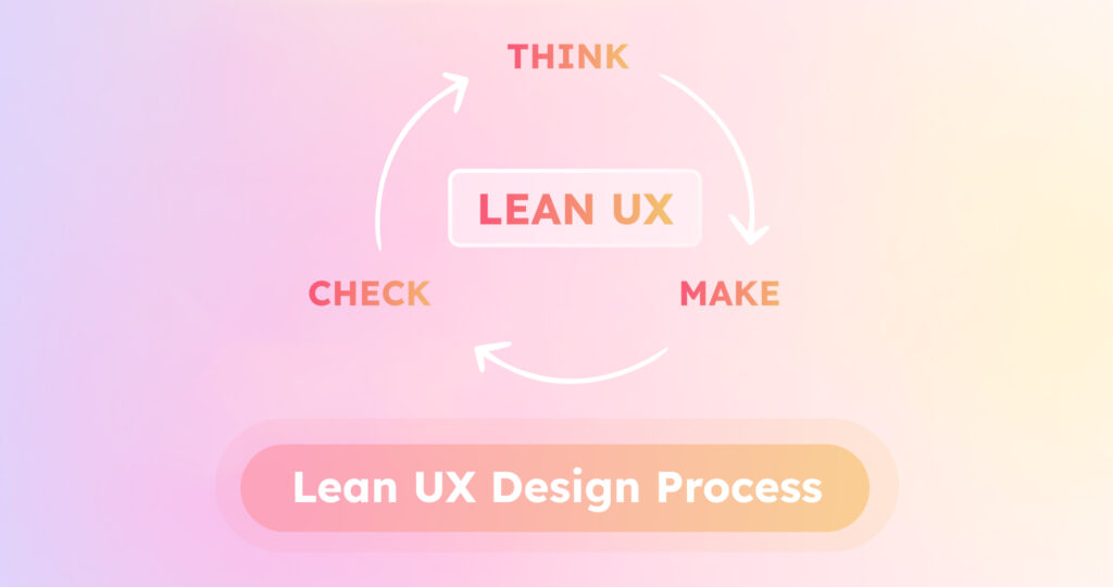
Here’s a high-level overview of the Lean UX design process:
- Think: Teams come up with areas that can be improved upon by looking at customer reviews, conducting customer studies, analyzing competitors, and observing the product in action.They craft a problem statement, then pinpoint the zones to be enhanced.
- Make: Developers and designers work together to create a fresh solution that should resolve an issue and/or enhance the product.
- Check: Product teams use UX surveys and A/B testing as tools to assess if their new feature works, in order to determine if their hypothesis was accurate. If customers have a positive reaction to the new feature, it will be integrated into the new design. If the customer experience does not become better, they’ll go back to the Think stage and come up with something new.
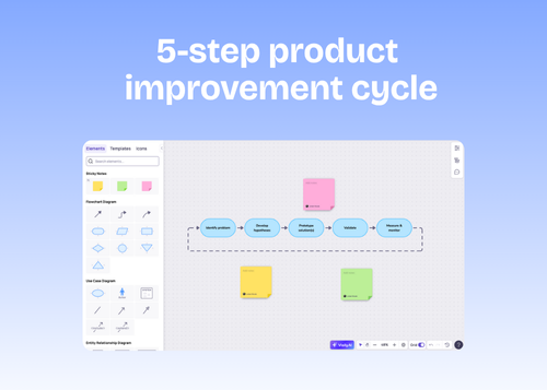
The PDCA cycle from Lean
Within the traditional Lean framework (which comes from the Toyota production factory), you’ll find many tools and processes that can be adapted. One of these processes, which is known as the plan-do-check-act (PDCA) cycle, emphasizes the use of iterative development and planning.
While this approach isn’t as popular as the ones we previously mentioned, it’s still highly effective since it matches so closely with the actual Lean UX design process.
Here’s a high-level look at the PDCA cycle and how it can be applied to UX design:
- Plan: In this phase, you should pinpoint and assess the issue or possibility for change, formulate hypotheses about the source of the issues, and pinpoint one hypothesis to test first.
- Do: Run a test in a controlled environment, so that you can assess the outcome without interrupting the regular operation.
- Check: Once the trial is over, it is time to go over the outcomes and examine them.
- Act: For the last stage, it’s time to take action. If everything goes as expected, you can execute your well-tested plan. If not, you should return to step 1.
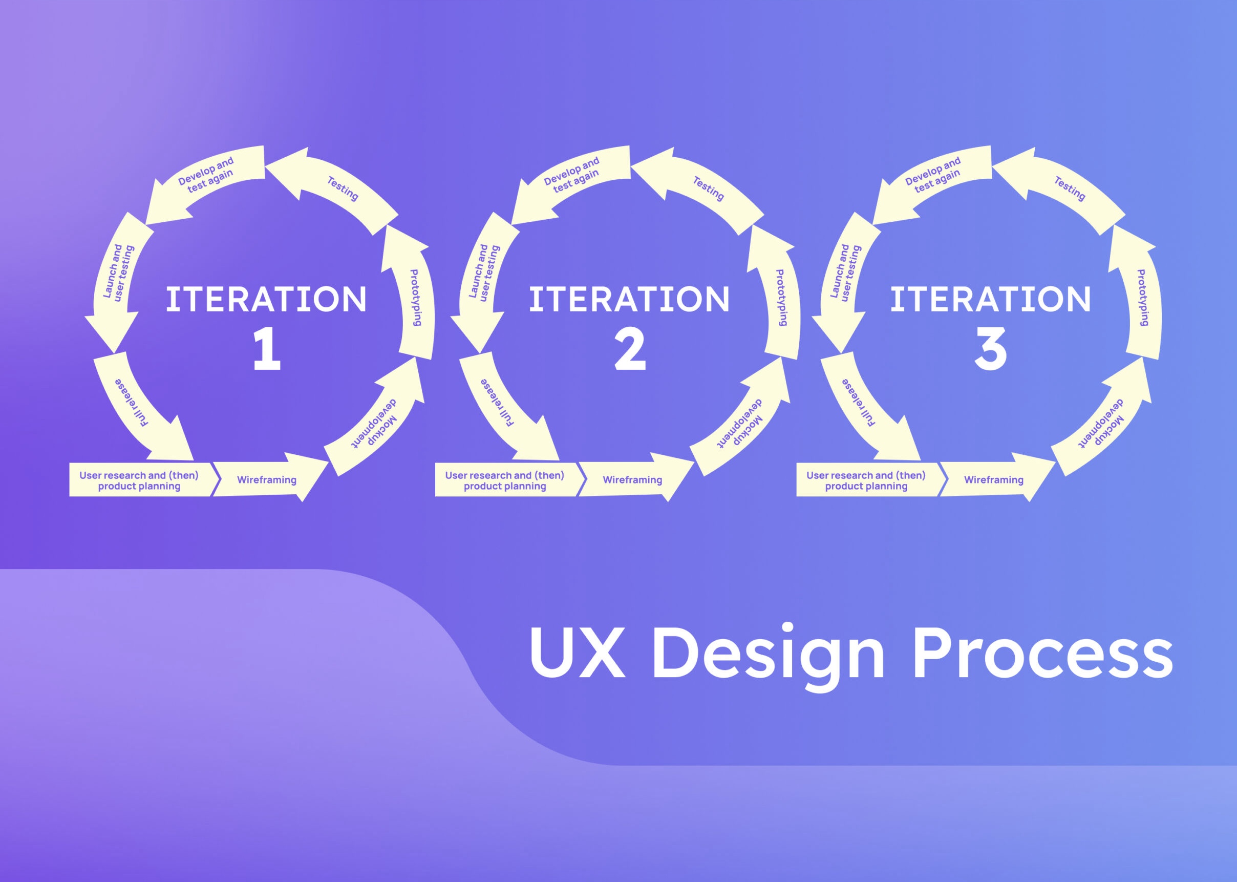
Visily’s iterative 8-step process for UX design
For the last process on this list, we wanted to introduce you to a hybrid model that combines the best of Waterfall and Lean UX design processes into one. This means you follow a semi-rigid process where you can carefully consider the users’ needs and plan out a perfect user experience and journey while also staying flexible enough to adapt at any stage.
The beauty of this framework is that you can use it in any size team or product. It works for small teams with little to no design experience, and it works for large enterprises with hundreds of designers.
The emphasis here (as you’ll see) is thorough testing throughout to make sure you meet user requirements and don’t waste your time on features or products that don’t work.
1. User research and (then) product planning
The first step of our 8-step design process starts with UX research so that you can identify the user behavior and requirements of your target audience. This is done before any wireframes, mock-ups, or prototypes are created or even planned for.
The reason we recommend UX research before planning is that it can save a massive amount of time and effort.
For example, let’s say you are working on a new add-to-cart feature for your product. You did your product planning first, then went through the design, mock-up, and prototyping stages just to find out that the user didn’t resonate with the feature at all when you got to the testing stage.
If you had done proper discovery during the user research phase, you’d have seen that the add-to-cart feature never really interested anyone, and you could then work on a different feature (like buy now) and save yourself a lot of time and effort.
Typically teams will create a UX research plan during the research phase. At a high level, this will break down the target users’ requirements, wants, and how the users interact with similar products or features.
Good things to do to help you conduct user research:
- User interviews
- Usability testing
- Surveys
- Focus groups
- A/B testing
- Create user personas
- Secondary research (a.k.a literature reviews)
- Continuous research (e.g. interviews or surveys)
1.1 Now you plan (ideate)
Once you know what your users want, you can create a product around that understanding.
The ideation phase is where things begin to really take off. This includes a broad range of approaches and techniques for charting and grasping user behavior and goals, displaying design ideas, and arranging product data. The process of finding creative solutions to challenges requires a great deal of teamwork and the participation of people from various departments in brainstorming sessions.
Here, teams will use user maps and storyboards to visualize user interactions. They support teams in comprehending how users are likely to make use of the product in the actual world.
They’ll then start to plan the product’s structure.
Information architecture (IA) is a component of product design, a skill that falls under the same umbrella as UX design. The way you plan out the information related to your product will dictate its structure, which will result in the creation of menus, navigation, hierarchies, and more. Doing this well means the user understands where they are and where they need to go.
With Visily you can easily draw user flows and wireflows so that you can visualize structure and flow of your product.
2. Wireframing
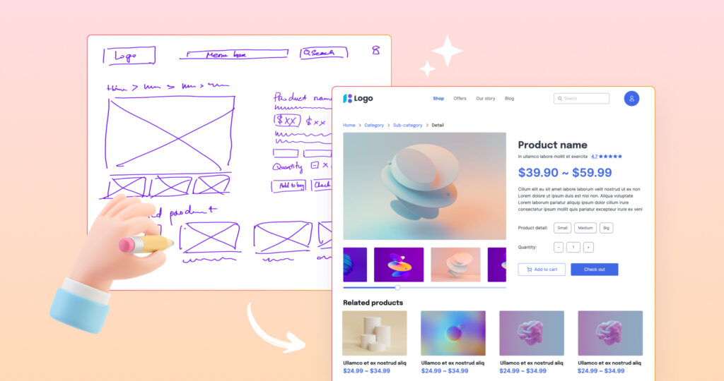
Remember the sketches that we were talking about before? Well, at this stage, you turn them into wireframes.
Wireframes are low-fidelity mockups that illustrate the product’s or feature’s structure, layout, and design hierarchy. They’re usually bare, with logos, visuals, fonts, and colors stripped to focus on the product. They can be used to provide stakeholders with early design guidance, as well as for facilitating communication between diverse teams such as engineers and visual designers.
With Visily’s AI, you can turn hand-drawn sketches into working low-fidelity (or even high-fidelity) wireframes in an instant. Saving you tons of time. Even without AI, you can easily create and edit wireframes with Visily easy-to-use platform.
3. Mockup development
Next in line is the mockup—the outer layer or skin of the wireframe.
Mockups are also strictly visual and are used to see how users will see the product or feature only without interactions. This design works as the middle between a low-fidelity wireframe with limited detail and a highly-fidelity prototype.
Mocks help the team make the design look like the real thing. This lets them talk about constraints, so the product moves faster into development and into the market.
Creating mockups can help the designer envision how the design will look on the web and on mobile devices, enabling them to identify potential issues with color, typography, accessibility, and layout, early on.
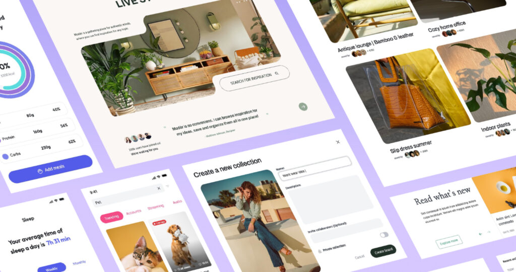
During this stage, the UX designers and product team will collaborate on images, brand, tone, and other key elements they’ll create for the product.
4. Prototyping
The prototype brings your creation to life.
A prototype typically doesn’t appear as a completed item, yet it gives an idea of how the final product will function.
Prototypes can help assess the usability of your interface design, providing you with valuable feedback to ensure the design is headed in the desired direction.
(here we can add a nice example of a Prototype in Visily)
The goal of user experience prototyping is to test key aspects and user journeys so that one can gain a better understanding of the solution and how the end user will interact with it from the start. Depending on the design requirement, a prototype can be either low-fidelity or high-fidelity.
5. Testing
Next, your product team will run user tests to uncover design flaws that could be problematic for users, such as A/B tests, MVT, and split tests.
Your team could discover that:
- The UX is confusing and impedes users from accomplishing their objectives
- Some features are not worth further development as users have no interest in them
- Particular user actions generate friction in the product experience
6. Develop and test again
Once you are done with the testing and fixing of the bugs you might have found, you can move onto development and (you guessed it—more testing!).
At this stage, the front-end development uses HTML, CSS, and other web-based technologies to construct the User Interface (UI) and bring the design to fruition. Designers and developers must work together closely at this stage to guarantee that the vision is accurately executed into a usable product.
Throughout the design and development stage, designers take a user-centric viewpoint, ensuring that each decision is in line with the user’s requirements and objectives. Collecting user feedback and doing regular testing are incorporated to change and perfect the design, guaranteeing that the ultimate output is optimized to guarantee an ideal user experience.
7. Launch and user testing
After designing, testing, and redesigning until your eyes are crossed, you’ll eventually reach a point where all your assets are ready to ship!
It’s time to put it into action—hand off all the materials to the development team who will make a highly accurate version of the user interface.
It will be similar to when you are in the waiting area while your partner is giving birth. You will be anxious and apprehensive, and just praying that the baby doesn’t look strange when it is born.
Once the product arrives, there are various methods to guarantee that it is up to standard (or as near as possible):
- User testing is like the usability test. You watch your target audience use the program.
- Beta release. This is a small release to find bugs before you launch it to the world.
- Internal testing. When your team uses the product to test it out.
It’s important that the development team receives feedback at this time. It is essential that any problems are communicated to all stakeholders and resolved prior to the release of your product.
8. Full release and (many) more iterations
For the last step, you’ll release the full version of the product into the wild and see how it performs.
Of course, the nature of UX design means you’ll never truly be done with a product or feature, but you can celebrate if the user reacts well to it. If not, then you know the drill—back it up, find the problem, and address the solution.
Keep your users at the center of the UX process
UX design can be hard, but it doesn’t have to be if you have the right UX design process in place.
A strong UX design process can help guide you and your team to success and ensure you are always hitting the mark, and if not, you can adjust on the fly.
To make the whole process even easier, we recommend using a tool that can help you bring your concepts and ideas to life with minimal effort, like Visily.
Visily houses 1,500+ templates that you can choose from, an AI assistant that can help you whip up designs, wireframes, and wireflows in seconds, and many other smart features that can greatly simplify the entire process for your team.
Sign up for your free Visily account.
Understanding the UX Design Process: Top FAQs Answered
What is the user experience design process?
The UX design process is a methodical approach focused on creating meaningful experiences for users when they interact with digital products. The process requires designers to understand user needs, behaviors, and goals, and then apply this knowledge to create user-friendly interfaces that effectively address these requirements.
What are the 5 design processes in UX?
The five fundamental steps in UX design are:
- Research: Understanding user needs and behaviors
- Analysis: Evaluating collected data and insights
- Design: Creating solutions based on findings
- Implementation: Building the designed solutions
- Testing: Validating the effectiveness of the design
What are the 8 stages of the UX design process?
Visily’s iterative 8-step UX design process includes:
- User research and product planning
- Ideation and concept development
- Wireframing
- Mockup development
- Prototyping
- Testing
- Development and retesting
- Full release and iterations
Why is following a UX process important?
Following a UX design process is crucial because it eliminates assumptions, maintains quality standards, and helps find optimal solutions to design challenges. The process enables multiple design iterations, facilitates team collaboration, and makes project progress transparent for all stakeholders.
How does the UI design process support the UX process?
The UI design process complements UX by focusing on the visual implementation of user-friendly interfaces. During mockup development and prototyping stages, UI designers work on elements like color, typography, and layout to ensure the final product not only functions well but also looks appealing and maintains accessibility standards.


