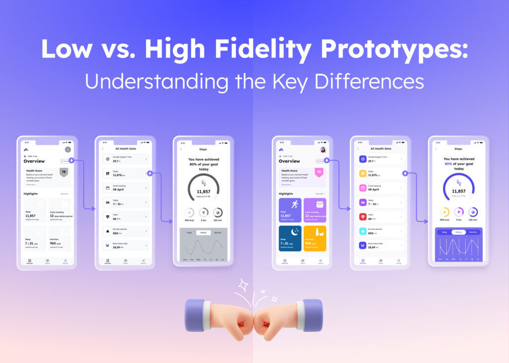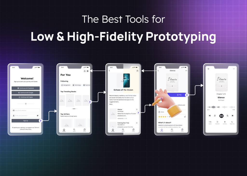
Wireframing is an important part of designing interfaces that are user-friendly and easy to use. Whether you’re an experienced UI UX designer or just a beginner, mastering the 6-step to create an impactful wireframe is important.
In this article, we will take you through the six simple steps that will help you master the art of wireframing. By following these steps, you’ll be able to create wireframes that showcase your business vision and provide a strong fundamental structure for your design projects. So, let’s get started and discover the power of wireframing!Wireframing is the process of outlining and making an outline for a webpage or an app. A wireframe is commonly a two-dimensional drawing skeleton outlining the page structure, content, and functionality. Based on business goals, this outline helps define the user’s journey when experiencing a product. The outcome of wireframing is usually a one-page summary showcasing the overall picture of your webpage (or application). Wireframes can be manually sketched on paper or digitally constructed.
Moreover, a wireframe is considered as a sample to present the product concept to the stakeholders, such as designers, developers, researchers, and investors, before the interface is built out with code.
A wireframe can also be seen as an initial brief document for the stakeholders. In short, they are the foundation for when you want to build a product — this product can be a website, web app, or app.
You can read more about wireframe definitions here.
Why is Wireframing Important?
Wireframing helps to walk stakeholders through the overall structure of the app (or the webpage) without being overwhelmed by distracting elements, such as colors and images.
To elaborate further, here are the key benefits of wireframing for the stakeholders:
- Save time for the web developers since all stakeholders are on the same page before processing the next step.
- Reduce costs and save money because the company won’t have to pay for many different trials.
- Realize the ideas of designers, and translate them into the real world.
- Test the user experience before the final prototype.
- Bring clarity to the project so that everyone can be on the same grounds of understanding.
- Setting clear goals and focus priorities before getting started.
- Optimize teamwork effort and reduce countless back-and-forth revisions.
- Deliver the core message of the product effectively to everyone.
- Gather feedback and adjust accordingly at the stage.
- Help the stakeholders to have a brief overview of their tasks from the early stage.
In short, wireframing sets well-structured thinking for stakeholders to understand, follow and execute accordingly. Some might even say that wireframe is the key to successful app design and development.
However, everything has two sides. Wireframing also has downsides that we might discuss below. But please note that wireframing’s advantages outweigh the disadvantages.
Designing wireframes can be a time-consuming process. Creating a wireframe also requires multiple changes during the process. However, it may be helpful to sketch them by hand or use a wireframing tool. Still, this process is worth your time since the overall picture needs to be clear before it can be polished and designed at a pixel-perfect level.
In the beginning, you may find it challenging to explain wireframes to clients or non-technical team members. And you will have to clarify the difference between wireframes and prototypes, and even mockups, more than once during your career.
How to Create a Wireframe in 6 Simple Steps:
Before wireframing, be mindful of why you need to do it first. Just remember: Wireframing means planning your design strategically. Once the course is set, everyone can follow it accordingly without any second thoughts happen. When creating a wireframe, constantly ask yourself these three questions:
- Why does this wireframe play an important role in your project?
- What are you trying to focus on?
- How will this benefit the user?
Now, without further ado, let’s dive into 6 steps on how to create a wireframe.
Step 1: Collect customer data
In order to produce a wireframe that truly resonates with the end user, it is vitally important to have a deep understanding of their customer persona, as well as their unique pain points. Without this crucial insight, any ideas generated may fall short of effectively addressing the specific concerns and needs of the intended audience.
So, take the time to truly get to know your customer and their perspective.
Step 2: Identify your user flow
At this point, you should identify the user flows to structure the features on each page. This step will help you to limit the options and reduce error-prone situations.
Moreover, understanding customer flow will benefit you in aligning team members. It provides them with a clear focus on which to aim their efforts, ensuring that all of the ideas are relevant and will address the issue at hand.
Step 3: Build the structure and organize the features
In the upcoming phase, you will determine the layout of the page and which features should be incorporated. There are multiple options for arranging these features, but it’s essential to align them with the user journey and data gathered in the previous step.
However, constantly modifying the features can be a time-consuming task. Examining your competitor’s interfaces can assist in streamlining the process and minimizing ambiguity. During this stage, design principles will be utilized to present content in a way that captures the user’s interest.
Step 4: Create the wireframe
There are two ways to create the wireframe. The first is hand-drawn sketches on paper with a pen. It’s fast and flexible. Since the purpose of the wireframes is to learn rather than to be the final designs, it enables you to make adjustments easily. The other way is to use a digital platform, like a UI design software or a wireframe creation tool, to keep everything clear and stay organized.
Step 5: Test your wireframe
We have now come to user testing. You can use a digital or hand-drawn wireframe to create a single prototype. The main purpose of this step is to collect data that will help you improve the following set of wireframes.
Our final goal is to utilize the user’s experience. Bear in mind these questions:
- Do they understand how to navigate through the page?
- Do they recognize the features?
- Do they get stuck? Are they confused by the sequence of pages because of the content on previous pages?
Step 6:Transition to a mock-up
The transition of the wireframe into a UI mockup is the last step in the process. A mock-up is a visual simulation of the final website. Since it contains the actual graphics, text, and color of the final product, this version is no longer regarded as a wireframe. The usability testing ends, and the team now hands over the files to developers. Finally, the step when you include all of the measurements for the features and their placement is known as redlining.
Conclusion:
Wireframing is the best technique to communicate your first design concept to your team or work together with other designers and project stakeholders. This simple technique can be the key factor in solving complex design problems as long as it goes with the right tool.
Make your design stunning apps/website wireframes at light speed with Visily.
Visily was specifically created (and continues to be innovated) for anyone who wants to quickly design a UI interface, focusing on wireframing, prototyping, and mockup, without having to invest too much time and resources into learning UI Design skills (or hiring a UI Designer).
Through a combination of rich components, beautiful templates, intuitive UI, and advanced AI models for intelligent design assistance, Visily helps non-designers unleash their creativity and channel it into creating beautiful screen designs.
Join the thousands of non-designers creating UI wireframe and mockups today. Visily is the best wireframe tool that you can find on the market.


